Now, about that new car…

Honda FitIn my previous post (written an hour or so ago) I mentioned car dealerships calling me.

That’s because, as I prepare to start a new job in the suburbs, I find I must, with regret, say goodbye to light rail transit and return to the world of commuting by car. Since we presently have only one car (the 2000 Civic I bought the last time I started a new job in the suburbs), and with the added scheduling complexity of life with kids, it’s time to get another one.

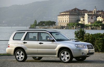
Thinking “family,” we had been eyeing the Subaru Forester for quite some time. It has lots of room to haul kids and their attendant necessities, and it’s not a minivan or monstrous SUV, which we’ve tried to avoid. But then we took a really close look at one for the first time and fell out of love. The salesman mentioning, almost in his first breath, the “significant depreciation” they suffer the moment you drive them off the lot didn’t really help either. So we kept it in mind but decided to take a drive through the lot of a nearby Honda dealership.

We’ve owned a total of four cars in our dozen-ish years of marriage, and they’ve all been Hondas. So with Honda, we know what we’re getting, and we like it. But we don’t want another Civic, and we don’t really want an Accord. We considered the Element and the CR-V, but then we saw…

The Fit.

The Fit is it! (The only thing I don’t like is “The Fit is go!” But I expect slogans to be stupid.) So unbelievably small (looking) on the outside, but get inside and it’s like the tents at the Quidditch World Cup in Harry Potter and the Goblet of Fire. (OK, maybe I shouldn’t admit how easily that reference comes to mind.) It is truly a marvel of design. There’s just about as much passenger and cargo space in it as in the Forester, but it is small and low and unobtrusive (which is how we like it, contrary to many Americans these days, it would seem). And it gets an extra 10 miles per gallon. Besides, it just looks cooler. I mean, come on. You can take a picture of the Forester in every picturesque city on the Adriatic that you want, that doesn’t make it look any better. (Even if that seaside village seems to be straight out of Project Gotham Racing 2. Am I right?)

So, the search is on. I’ve talked to a few dealerships in the area. Soon the test drives and the purchase and the financing and the payments. And the driving!

Ah crap, I wanted to surprise my parents with it though, like they always do to us when they get a new car. Dad, stop reading this! Too late.

So long, Santana; the dream was already gone

Kirby Puckett rookie cardThere was a time in my life (I happened to be 13) when I was a huge baseball fan. I had the giant baseball card collection to prove it. I even chewed the nasty gum a few times.

My enthusiasm was richly rewarded in 1987 when my hometown Minnesota Twins won their first World Series. Life was good.

But eventually I moved on. My brief, albeit intense, interest in baseball (and pro sports in general) faded in high school, and although I still enjoy going to a game once in a while, it’s just too expensive and too corporate, and I’m too cynical, to sustain that kind of passionate enthusiasm. So when it was announced that Johann Santana was traded to the Mets, I barely even raised an eyebrow.

It wasn’t until I read Nick Coleman’s column on the matter that it really hit me what this means, especially in the context of the Twins’ controversial new stadium:

[W]hen you’re a kid, your town’s team manipulates your immature emotions in order to get you to tug on daddy’s sleeve and beg him to buy a pair of $50 tickets and a souvenir jersey so Dad can go to his grave knowing that his boy will remember him through misty eyes and support the next billion-dollar stadium proposal when the stadium opening in 2010 needs to be replaced a few years later.

He’s right. And he goes on to show just how trivial a slice of the pie, given the ludicrous sums of money floating around in the world of professional sports, Santana’s salary really is. It’s the stars like Santana and Torii Hunter that make a team like the Twins worth going to see. Which is where the money comes from in the first place.

The R’s have it… “It” being the most distinguishable difference between Helvetica and Arial

The R’s have itWhether or not my aesthetic sense and artistic ability really warrant the appellation “designer,” design has been a part of what I do for my entire career, and I’ve had the eye for detail (minutiae?) since I was a kid. It follows naturally that I have an unhealthy fixation on fonts. Just ask anyone how I feel about Verdana to erase all doubts on that point.

My obsessions seem slightly less unhealthy working in the publishing field, and they’re downright validated at moments like last Friday, when the recent documentary honoring the 50th anniversary of Helvetica was screened in our boardroom over lunch. I loved it.

While I unequivocally loathe Verdana (unless, that is, it’s displayed at such a small point size that it’s hard to tell what it is), I hold Helvetica in high regard. It’s rather plain, I’ll admit, but it’s just such a perfectly realized vision that in its relatively short lifetime it has become the norm. Helvetica is just how letters should look, and any other font’s uniqueness is judged most clearly by how it differs from that norm.

Unfortunately, on-screen type is a world of its own. Although with the advent of Mac OS X, system-wide anti-aliasing has made smooth font rendering possible, most computer systems still look better when fonts are specially tooled for the low-resolution environment of a CRT or LCD display. And for the most part, Helvetica has never really fared too well in such an environment.

So when, in the mid-’90s, Microsoft made what might have been their single most thoroughly positive contribution to the world by releasing a set of standard fonts to be used on web pages that look (reasonably) good on computer screens, I embraced them wholeheartedly (Verdana notwithstanding).

The closest counterpart to Helvetica in this set of fonts is Arial. Many people hate Arial, for reasons generally too arcane even for me to appreciate, but ultimately, for me, the fact that it doesn’t quite hit the mark of being a pure Helvetica clone, it tends to render much better on-screen than Helvetica does, and it’s become my own personal standard (along with another of the Microsoft web fonts, Georgia) for web design.

But this Helvetica movie has turned my world on its ear. For the last week I’ve been hyper-sensitive to fonts, noticing Helvetica everywhere I turn all day long, and becoming acutely aware of every slight difference between Helvetica and its web font doppelgänger, Arial. I think I’ve hit upon the most easily identifiable difference between the two fonts: the right “foot” of the capital R.

To be honest, I don’t really like the capital R in Helvetica. That wavy little foot seems too jaunty, too incongruously immoderate next to its supremely efficient and utilitarian siblings. But if anything is worse than the capital R in Helvetica, it’s the capital R in Arial! What the heck is that? It’s almost enough to make me want to give Verdana another chance. (After all, it’s even used on the Helvetica site.)

OK, follow my train of thought here…

The other day, for reasons I’d best not get into, I was listening to the Steven Wright tracks from the Reservoir Dogs soundtrack. If you’ve seen the movie, you know that the soundtrack is interspersed with segments of deadpan comic Steven Wright‘s voice as a DJ on “KBILLY’s Super Sounds of the ’70s Weekend.” Listening to those tracks in sequence with absolutely no music in between them is a surreal experience.

In addition to the long-buried ’70s gems that made it onto the soundtrack, a slew of other songs did not appear, but did however get a mention from Steven Wright, tantalizingly conjuring a world beyond the details of the film, where a radio station that actually plays all of this crazy stuff exists! (Granted, this film predates the Jack FM phenomenon by a solid decade, but Jack rarely plays stuff this obscure.)

One of the titles Steven Wright mentions caught my attention: “Love Grows (Where My Rosemary Goes)” by Edison Lighthouse. (Anyone who knows me personally will know why that got my attention.) So I listened to a bit of it on iTunes, and it jogged a vague memory of this one-hit wonder from 1970. Then I headed over to YouTube, where I was delighted to find the music video:

Now many people of my generation or younger — or older for that matter — may not realize that they made music videos back in 1970 (and even earlier). I still have no idea where these things actually got played in a pre-MTV world. Of course, I don’t know where today’s music videos get played either, given that they sure as hell aren’t on MTV anymore.

Groovy.

Top 5 Albums of 2007

Wow, I can’t believe this is already the fourth year I’ve been doing this. I am truly an old fart because the years really are flying by now. That’s what happens when you’ve made 34 trips around the sun. I’m just scared to think what it’ll feel like when I’m 60.

Well enough angst. Let’s talk music. And there’s a lot to talk about: 2007 has, for my tastes at least, been an unparalleled year for new music. I would have a hard time identifying a year that’s produced more great music without going all the way back to 1971. (And I wasn’t around to experience that firsthand.) So, without further ado, here we go.

5. Rush: Snakes and Arrows
I’ve been a Rush-head for over half my life now. A sad fact of a band this long-lived and prolific is watching the quality of their output deteriorate over time. The band’s last full-length album, 2002’s Vapor Trails, was surprisingly good musically, but suffered from some of the worst production in the last several decades. The band had been enthusiastically touting Snakes and Arrows for several months before its release, and with good reason. The album is phenomenal. Easily their best work since 1984’s Grace Under Pressure. Great, rocking music, with more dynamics and variety than we’ve heard from the boys in years; lyrics with surprisingly deep insight into the woes of early 21st century American society; first-rate production; and… well what can I say? Three instrumentals. It just doesn’t get much better in the Rush canon.
4. Michael Brecker: Pilgrimage
Michael Brecker was at the pinnacle of the post-Coltrane jazz world for upwards of 30 years. Late last year he was diagnosed with terminal leukemia, and with less than 5 months to live, he put together a final farewell to those of us who’ve followed his brilliant music over the years. This album is full of moments of profound beauty and intense burning jazz as full of life as anything he’d ever done. Sadly he did not survive to see the album released, but it remains a fitting good-bye to this jazz legend.
3. Wilco: Sky Blue Sky
I’ve enjoyed Wilco’s music since Yankee Hotel Foxtrot, and have been fascinated to hear the evolution of the band’s sound on each album. This is very much back-to-basics, and it works extraordinarily well. It’s simply not possible to listen to this music and not feel good. In a good way.
2. Radiohead: In Rainbows
This is the album it seems everyone was talking about in October. It may still see a traditional release in stores in 2008, but so far it’s only available as a pay-what-you-want download from the band’s website. But that in no way means it’s inferior work. The band has covered some challenging musical ground in the past decade since the release of their masterpiece, OK Computer, and this album bookends that one nicely. (There’s plenty of speculation out there that the albums really were intended to integrate in Wizard of Oz/Dark Side of the Moon style, but I’ll leave that to the stoners to prove.) If you haven’t already, download it now. What are you waiting for? (I assume you are wondering what, if anything, I paid for it. Well, I sucked it up and bought the £40 deluxe package, which should be arriving next month.
1. Foo Fighters: Echoes, Silence, Patience & Grace
I loved In Your Honor so I was eagerly awaiting the release of this album and it did not disappoint! From the lead single “The Pretender” straight on through, the band displays brilliant songwriting, impeccable chops (these guys can really play, and if you doubt that, be sure also to check out drummer Taylor Hawkins’ guest work on Coheed and Cambria’s No World for Tomorrow), and a wide stylistic and dynamic range. Dave Grohl’s voice matches the music perfectly, from a delicate whisper to a larynx-shredding scream. The best album of a great year of music.

As I said, it’s been a great year for music. It was hard to narrow the list down to 5. Here, in no particular order (OK, they’re alphabetical by artist), are some of the other great albums I enjoyed this year:

The Bad Plus: Prog
Beastie Boys: The Mix-Up
Circa Survive: On Letting Go
Coheed and Cambria: No World for Tomorrow
Dream Theater: Systematic Chaos
LCD Soundsystem: Sound of Silver
Minus the Bear: Planet of Ice
Nine Inch Nails: Year Zero
Pinback: Autumn of the Seraphs
Porcupine Tree: Fear of a Blank Planet
Room 34: Highway 34 Revisited (Had to put in a bit of self-promotion!)

And there are a few others that just missed the cut, like The Dear Hunter and Portugal. The Man. (“Portugal. The Man.” is one band. You have to give them credit just for the audacity of that band name.)