Come on Apple, give me more control over the stupid crap I don’t want in your interfaces

I can sometimes get hung up on small, seemingly trivial details of things. A perfect example of that is the absolutely stupid “bounce” animation on Liquid Glass on/off toggles in the “26” OSes.

I have been wanting a tidy way to get rid of that annoying nonsense from the moment I first saw it. It’s one of many things about Liquid Glass that annoyed me enough that, as soon as the “27” OS betas were available, I immediately installed them on all of my devices — my Mac, my iPad, and my iPhone. Even though betas can be unstable. I’d rather have instability than the hideous mess that macOS 26, in particular, has been for the past several months.

So anyway, I’m not entirely sure if the “Reduce Motion” option had this particular effect in 26, but in 27, one of the (many) things it changes in the interface is that it removes the bounce. Yes!

I don’t really like some of the other motion reductions, especially the transitions between apps and the home screen in iOS, but I’ll live with it.

Unfortunately, and honestly quite surprisingly, I discovered that one of the things it reduces is animation in web pages. Including animated effects I might be working on within websites I’m building for clients. While in the Block Editor on a site I’m currently building, I noticed the following alert:

So, in other words, the only way I can get my Mac to not have that dumb bounce effect on OS interface toggles is to turn off my ability to see animated effects I’m creating in websites I’m building.

This is a very small problem in the grand scheme of everything in the world going completely off the rails. And yet, it’s a part of it.


I also don’t like the fact that Pages and Numbers have AI auto-suggested filenames when saving new documents. Just stop.

I nearly fell for a phishing scam. They’re getting more sophisticated (or I’m getting less)

A couple of days ago, I received an email from a client whose site I’ve been managing for over a decade, but who doesn’t have much reason to contact me on a regular basis, because, not to brag, but generally when I build something, it just works.

The subject line was BID PROPOSAL (in all caps), so my immediate thought was, ah crap, they’re planning to redo their website and they’re not just automatically giving the project to me. Bummer. But at least they still want to consider me.

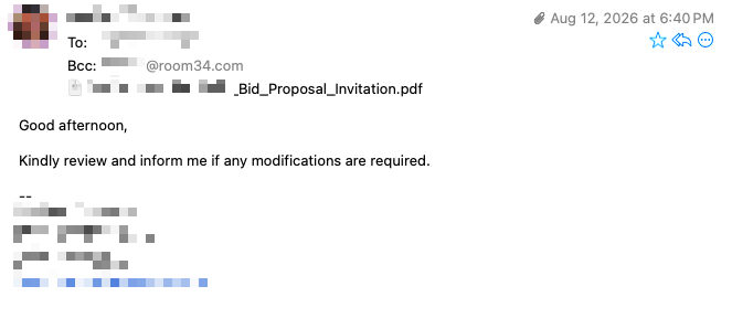
Here’s the message:

I should have immediately suspected the curious phrasing of “Kindly review” but I was too concerned about the nature of the message to focus on that detail. In retrospect, I also should have been suspicious that the “To” field was addressed to herself and I was listed in the “Bcc” field but, then again… if you’re blasting this out to a bunch of different people, that would be the easiest way to do it.

Of course, if that was the case, the “inform me if any modifications are required” bit wouldn’t make any sense. Never mind any of that though, this was late in the afternoon and I was sitting on a beach reading this, so I wasn’t exactly giving it my full level of concentration.

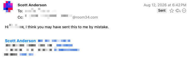
I opened the PDF and was confused, because it looked like a special invitation to some kind of private event. I became convinced that the client meant to send this to someone else who has my same first name — that happens to me a lot. So, not yet thinking anything was untoward (which, again, I probably should have already), I replied:

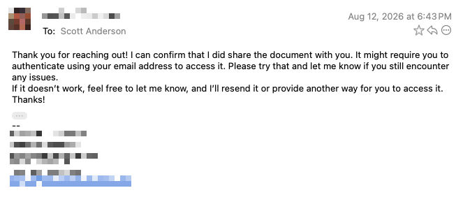
Very quickly she replied:

OK, so, at this point, I was finally starting to get suspicious, but mostly I was just so confused by it all that I wasn’t thinking clearly. “Thank you for reaching out!” certainly seemed odd.

Anyway, I took another look at the PDF, was still confused by the vague wording of it and the fact that it didn’t come right out and say what I would be submitting a proposal for, but since this isn’t a client I want to lose, I ignored the nagging feeling that something wasn’t right.

There was a link in the PDF to access the full details, so I clicked it. (Again, it’s all so obviously “off” in hindsight, but in the moment I kind of just went with it.)

The link initially went to a Cloudflare CAPTCHA page, which wasn’t entirely surprising, and I was mainly thinking, wow, they are really being excessively cautious with this whole thing.

And then it happened. The moment that shook me out of my beach vibes stupor. It took me to the Google account login screen. Or, at least, a page that fully appeared to be the official Google account login screen. Hence that bit in the last email about having to “authenticate using your email address.”

Uh yeah… no way. Sorry phishing scammers. I may be getting old and clueless, but I’m not that old and clueless. I immediately closed the window, deleted my cookies, cleared my cache, and even restarted my computer for good measure.

Then I checked the raw source of the original email, and it did appear to originate from this client’s legit email account, so it was obvious at that point that she must have gotten hacked. Instead of replying any further to the email chain, I sent an email to her boss, saying I had just gotten a really suspicious email from her and asking if she had been hacked.

The next day he replied, confirming that was the case.

Now, of course, I suppose it’s possible that I got infected with a virus by even opening that PDF, but… I doubt it. These scams are all about social engineering. Why bother writing a virus when you can just convince someone to hand you their Google login credentials?

Stupid CSS Selector Tricks

I’m impressed with the logical capabilities of modern CSS, even if it does result in mind-bending selectors like this:

li:not(:has(> a:hover))

I just wrote that bit of CSS to resolve an issue I have with dropdown menus on a site I’m working on.

The top-level nav items need to have a dark blue background and white text when you’re hovering directly over the link itself. They also have an accessibility toggle caret next to (but not inside) the link.

When you’re hovering over the accessibility toggle, or the submenu — i.e. anywhere within the li that isn’t the a directly inside it — then the top-level item needs to have a light blue background with dark blue text.

The problem I had was, the caret was staying white when I hovered over any part of the li.

This CSS selector is perfect for styling the li under all conditions except when the user is hovering over the direct descendant a tag. If you’re hovering somewhere within the li itself, i.e. the caret, or anywhere at all inside the nested ul for the submenu (even on a link within that submenu), then the above condition applies.

Now that I think about it though, this selector is not quite accessible enough. It really should be this:

li:not(:has(> a:is(:focus, :hover)))

😵‍💫

Don’t even get me started on :is vs. :where.

Two-factor authentication is proof we are living in hell

If you’ve never encountered the following screen, consider yourself lucky.

Network Solutions login two-factor authentication screen

I hate it. I hate it so much.

No normal human understands how DNS works. Or wants to. Or needs to. But that means that freaks like me have to understand how it works, because we take care of all of this nonsense for them.

Enshittification is everywhere in 2026, of course, but I don’t think it’s so acutely, painfully present as it is in having to log into someone else’s domain registrar account.

Domain names are pretty sensitive. It makes sense that the tools for managing them need robust security. But they also need to be accessible not just to the non-technical owner of the domain, but the geek that owner is paying to do the geeky stuff for them.

Most good registrars (ha! there are no good registrars, just less-bad ones) have set up mechanisms for domain owners to grant access to technical users. Network Solutions was late to that party, and even though they do finally offer it, their underlying, archaic systems are so fucked up and incompatible with each other that the process is still fundamentally broken.

This morning I needed to get into this client’s Network Solutions account. Of course, the email address associated with their account — the one that gets the initial 2FA verification code — is long-since out of use. (Yeah, this is going to open up a whole new world of pain for them at some point in the future, but I’m not dealing with it today.) Fortunately they do have their cell phone associated with the account, so I was able to have the code texted to them instead.

Then it’s a race against the clock. Are they checking their texts? Will they respond within the tight 10-minute window before the code expires? Of course not, so I waste a half hour trying new codes and hoping I can get in touch with them.

Finally, I’m in. And the first thing I do is go to the team settings and add myself as a user on the account.

When the confirmation email comes in, with a verification link for me to click, I hastily click it, forgetting that it’s going to open in the same browser I am already using, kicking me out of the existing Network Solutions session I have open with the client’s user ID in the process.

No big deal. Now that I’m in with my own account, I can just use it instead. Only… the client has two different domain names, and for some reason the account I’ve been granted access to only sees one of them. And of course, it’s not the domain I need to edit.

Back to trying to log into the client’s account so I can try to sort out my own access. Now, in the past, Network Solutions did not require re-entering a 2FA code if you logged back into the same account within 24 hours. Of course that has been changed.

And, at this moment, I am in another half-hour-plus cycle of requesting a code, hoping the client will reply, and… oh wait. Shit.

Your code has expired and no more resend attempts are available. You may request a new code tomorrow.

THIS IS HELL!

P.S. I already complained about this five years ago and if anything it has only gotten worse since then. How could it get worse???

Betas are for finding (and fixing) bugs

First, yes… I know you’re taking your chances when you install a beta OS on your primary device. As it happens, I was willing to take that chance with the macOS 27 Developer Beta on my primary Mac, because a) I had heard (and have seen myself) that it is very stable for a beta OS, and b) the Liquid Glass UI nonsense in macOS 26 was so bad that I was willing to risk running unstable software to get away from it.

And so, I have been running the macOS 27 Developer Beta for the past month, with very few problems. Oh, definitely not no problems. With an earlier build, Final Cut Pro — one of Apple’s own apps — was an absolute crash fest. In the process of editing a fairly simple video, I had it crash at least two hundred times in a single day. Fortunately, Final Cut is constantly saving your work, so I never lost a single bit of my project through all of those crashes… although it was definitely challenge to keep my ADHD brain focused to remember what it was I had just been working on 5 seconds ago.

The whole purpose of a Developer Beta OS is for developers to test their software against the new OS and see if there are any bugs they need to fix. I’m pleased to say, Apple’s own Final Cut team is certainly doing that, and with the latest beta, Final Cut seems to be back to its usual rock-solid stability.

Now granted, it may not technically be the purpose of a Developer Beta for users to test third-party developers’ software against the new version of the OS, but guess what… it’s gonna happen.

There are a couple of apps I rely on constantly throughout my workday, both of which have exhibited a couple of bugs with the new OS. They’re not showstoppers, just minor inconveniences.

I don’t want to name the companies, but let’s just say, one is a relative newcomer, building a client app for Gmail. The other is one of the most storied indie Mac development companies around, and I’ve been using their FTP client for literal decades. But frankly, they seem a lot more interested in their bright yellow handheld video game device than in supporting their crusty old Mac software at this point.

I submitted bug reports to the two companies a day or two ago, and I received responses from both of them within a half hour of each other today.

The mail client company thanked me for submitting my bug report, and let me know that there was already an update available that should fix the issue. I ran it, and it does.

The FTP client company sent me a cursory response linking to an FAQ page on their website that basically says, “hey dumb-dumb, don’t complain to us if things don’t work when you’re stupid enough to be running a beta OS.” OK, it maybe wasn’t quite that mean-spirited, but it felt that way.

Here’s the thing… maybe neither of these companies really wants or expects user feedback during the Developer Beta period, since they are — or at least should be — conducting their own extensive testing of their apps with the beta OS. But when they get that feedback, they should at least have the courtesy to feign appreciation, rather than assuming the worst about their own user base and dismissing their very legitimate concerns that bugs in an app that’s critical to their workflow may not be resolved before the final OS release.

Honestly, at this point I would have long since given up on that company’s FTP client, but sadly, the market for FTP clients is pretty slim. What am I supposed to use, Filezilla? Yuck. At least this is, in John Gruber’s words, a “Mac-assed app,” even if it’s buggy and feeling a bit neglected these days. Kind of like me.