Bleeding-edge web design, circa 1994

Microsof’s home page in 1994... don’t cut yourself!
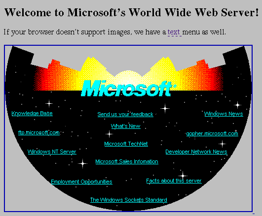
A recently-departed (as in left for another company) coworker stopped by my desk on his last day to drop off a backup CD I had burned back in 2001. Today I popped it into the drive to see what curiosities lurked within. I was delighted to discover one of my trademark “Miscellany” folders, with a bunch of random stuff in it. Unquestionably the most interesting artifact was a screenshot of Microsoft’s website, as it appeared in 1994.

I’m simply at a loss to explain this design. Clearly many most all web designs from that early need to be cut a little slack, and I doubt any of them have truly aged well. But even through that lens, this site is inexplicably hideous.

I’m certainly not the first person to look back in time and mock this design, of course. But “usability guru” Jakob Nielsen used it in an article he wrote back at the time, and it’s still lingering on his site with a new introduction written in 1997. (Frighteningly enough, if the conclusion I draw from my brief perusal of the long and boring highly usable article is correct, he’s actually praising this design.) Personally I think Nielsen’s views are overrated, and that if he really knew as much about usability as he is supposed to, his website would look a lot different (and he’d also realize he no longer needs to cater to the bandwidth limitations of those running 28.8 kbps modems — but I digress; besides, these guys rip into him much better than I care to). But it’s still an interesting look back in time.

The R’s have it… “It” being the most distinguishable difference between Helvetica and Arial

The R’s have itWhether or not my aesthetic sense and artistic ability really warrant the appellation “designer,” design has been a part of what I do for my entire career, and I’ve had the eye for detail (minutiae?) since I was a kid. It follows naturally that I have an unhealthy fixation on fonts. Just ask anyone how I feel about Verdana to erase all doubts on that point.

My obsessions seem slightly less unhealthy working in the publishing field, and they’re downright validated at moments like last Friday, when the recent documentary honoring the 50th anniversary of Helvetica was screened in our boardroom over lunch. I loved it.

While I unequivocally loathe Verdana (unless, that is, it’s displayed at such a small point size that it’s hard to tell what it is), I hold Helvetica in high regard. It’s rather plain, I’ll admit, but it’s just such a perfectly realized vision that in its relatively short lifetime it has become the norm. Helvetica is just how letters should look, and any other font’s uniqueness is judged most clearly by how it differs from that norm.

Unfortunately, on-screen type is a world of its own. Although with the advent of Mac OS X, system-wide anti-aliasing has made smooth font rendering possible, most computer systems still look better when fonts are specially tooled for the low-resolution environment of a CRT or LCD display. And for the most part, Helvetica has never really fared too well in such an environment.

So when, in the mid-’90s, Microsoft made what might have been their single most thoroughly positive contribution to the world by releasing a set of standard fonts to be used on web pages that look (reasonably) good on computer screens, I embraced them wholeheartedly (Verdana notwithstanding).

The closest counterpart to Helvetica in this set of fonts is Arial. Many people hate Arial, for reasons generally too arcane even for me to appreciate, but ultimately, for me, the fact that it doesn’t quite hit the mark of being a pure Helvetica clone, it tends to render much better on-screen than Helvetica does, and it’s become my own personal standard (along with another of the Microsoft web fonts, Georgia) for web design.

But this Helvetica movie has turned my world on its ear. For the last week I’ve been hyper-sensitive to fonts, noticing Helvetica everywhere I turn all day long, and becoming acutely aware of every slight difference between Helvetica and its web font doppelgänger, Arial. I think I’ve hit upon the most easily identifiable difference between the two fonts: the right “foot” of the capital R.

To be honest, I don’t really like the capital R in Helvetica. That wavy little foot seems too jaunty, too incongruously immoderate next to its supremely efficient and utilitarian siblings. But if anything is worse than the capital R in Helvetica, it’s the capital R in Arial! What the heck is that? It’s almost enough to make me want to give Verdana another chance. (After all, it’s even used on the Helvetica site.)

Web 2.0 — opening up a whole new world of Internet Explorer quirks!

Just when I needed it least, Internet Explorer has thrown me another curveball.

I’m hard at work trying to seem like less of a 20th Century web dinosaur by acquiring new skills with these techniques that are loosely lumped together into what some call “Web 2.0.” Key among these is an approach called AJAX (Asynchronous JavaScript and XML). Fun stuff. I’ve been working for the past several days on an interactive registration form for a site at work, using AJAX. Of course, as usual, I’m plugging away in Safari and Firefox, but eventually I decided to check out how things are looking in Internet Explorer.

[When I figure out an emoticon that represents my head exploding, I’ll insert it here.]

IE is consistently barfing on what it claims is a syntax error that I eventually tracked down to the evalScripts function in prototype.js. Well, at least it’s not my own code that’s making it crap out this time. Or is it? With IE you never can tell. Maybe evalScripts is buggy (even though I can find no evidence to that effect) or maybe it’s just the code in my script that’s being thrown at it. Whatever the case, once again all forward progress has come to a grinding halt while I scour the Internet fruitlessly for a solution.

Although this turned out not to be a solution to my problem, I just have to refer you to this developer’s blog entry on a typical IE workaround. Yes, I tried this, even though I was almost positive his problem was completely unrelated to my own (which was the case). Nevertheless, when a problem does arise in IE, the most likely eventual result of one or more days’ worth of sleuthing is the resigned acceptance of such hokey code bloat, rather than anything even remotely satisfying (or even logical).

There you have it. As for my own problem using prototype.js with IE, I did find a solution. Yes, it was my code, and it was something I had seen previously that was pretty much staring me in the face, if I had just bothered to heed Thomas Fuchs’s sage advice.

It all comes down to standard practice for wrapping <script> tags in HTML. I still have the habit of doing it this way:

<!–
//–>

The funny thing about that is that I know it’s completely pointless these days. It’s done so that browsers that don’t support JavaScript don’t inadvertently display the JavaScript code in the web page. But every browser has supported JavaScript since about 1997, so it’s pretty ridiculous to keep doing that. Especially given that, the way the sites I’m working on are so utterly dependent upon JavaScript, you’d never even get to the page in question without it.

However, with XMLHttpRequest (which is at the heart of AJAX), and just the increasing complexity of JavaScript in general, it’s become necessary to wrap script code in a new tag to ensure that browsers handle the code properly. To wit:

// <![CDATA[
// ]]>

Just as Thomas Fuchs said. And just as has been lingering in the back of my mind for the past several weeks, since I first discovered his wonderful tool based on prototype.js, Scriptaculous. I’ve learned my lesson.

More stupid web tricks coming your way…

I realize I’ve been working with PHP for too long when I get an idea like “I wonder exactly how birth rate affects population levels” and the first thing I think of is, “well why don’t I just build a PHP app to figure it out?”

This is the result of such thinking: Population Trajectory Calculator. It’s the newest addition to my Stupid Web Tricks page, and the first that’s not just JavaScript triggering an irritating pop-up.

This is probably just as pointless though, but it was a fun little exercise, and it’s starting to give me more ideas, which is always dangerous. Before long I’ll have built a web-based version of Oregon Trail.

I’m not kidding.

(Well, OK, I hope I am.)

A nifty little tool…

For web geeks like me whose design ambitions occasionally outpace our abilities, it’s always fun to come across tools like this:

Color Palette Generator

Just give it the URL of any image anywhere on the web (such as, for example on your own site) and it generates color palettes for you to use in your design, based on the colors in the image.

Look for yet another new Room 34 site redesign in the near (or not-so-near) future using this tool!