 Whether or not my aesthetic sense and artistic ability really warrant the appellation “designer,” design has been a part of what I do for my entire career, and I’ve had the eye for detail (minutiae?) since I was a kid. It follows naturally that I have an unhealthy fixation on fonts. Just ask anyone how I feel about Verdana to erase all doubts on that point.
My obsessions seem slightly less unhealthy working in the publishing field, and they’re downright validated at moments like last Friday, when the recent documentary honoring the 50th anniversary of Helvetica was screened in our boardroom over lunch. I loved it.
While I unequivocally loathe Verdana (unless, that is, it’s displayed at such a small point size that it’s hard to tell what it is), I hold Helvetica in high regard. It’s rather plain, I’ll admit, but it’s just such a perfectly realized vision that in its relatively short lifetime it has become the norm. Helvetica is just how letters should look, and any other font’s uniqueness is judged most clearly by how it differs from that norm.
Unfortunately, on-screen type is a world of its own. Although with the advent of Mac OS X, system-wide anti-aliasing has made smooth font rendering possible, most computer systems still look better when fonts are specially tooled for the low-resolution environment of a CRT or LCD display. And for the most part, Helvetica has never really fared too well in such an environment.
So when, in the mid-’90s, Microsoft made what might have been their single most thoroughly positive contribution to the world by releasing a set of standard fonts to be used on web pages that look (reasonably) good on computer screens, I embraced them wholeheartedly (Verdana notwithstanding).
The closest counterpart to Helvetica in this set of fonts is Arial. Many people hate Arial, for reasons generally too arcane even for me to appreciate, but ultimately, for me, the fact that it doesn’t quite hit the mark of being a pure Helvetica clone, it tends to render much better on-screen than Helvetica does, and it’s become my own personal standard (along with another of the Microsoft web fonts, Georgia) for web design.
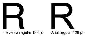
But this Helvetica movie has turned my world on its ear. For the last week I’ve been hyper-sensitive to fonts, noticing Helvetica everywhere I turn all day long, and becoming acutely aware of every slight difference between Helvetica and its web font doppelgänger, Arial. I think I’ve hit upon the most easily identifiable difference between the two fonts: the right “foot” of the capital R.
To be honest, I don’t really like the capital R in Helvetica. That wavy little foot seems too jaunty, too incongruously immoderate next to its supremely efficient and utilitarian siblings. But if anything is worse than the capital R in Helvetica, it’s the capital R in Arial! What the heck is that? It’s almost enough to make me want to give Verdana another chance. (After all, it’s even used on the Helvetica site.)
 Even though I love all things Google (and, more and more, Google is all things), I have always hated their logo. Ugly font, garish colors, outdated-five-years-ago Photoshop 101 effects (Bevel & Emboss… Drop Shadow… how original!).
 I was pretty proud of myself when I came up with the solution for the dropdown menus I use in the navigation bar in my current site design. They don’t require all of the cockamamie JavaScript most older solutions did. They surely don’t work in older browsers (I’m guessing), but that really doesn’t matter now. Most significantly to me, though, I had never seen a solution that worked like what I am doing.