The folly of blog-centric “author” functionality in the context of a modern WordPress-based, non-blog website
This week’s article on The Verge about the latest messy drama in the WordPress world (tl;dr it’s Matt Mullenweg vs. WP Engine, and if you’ve read any of my previous writings about WordPress you can probably guess whose side I’m on in that fight) got me thinking once again about how Matt really doesn’t understand his creation.
And yes, I’m personifying the entire core team in Matt. But, let’s be serious. He kind of does that himself.
Anyway, today I got an email from a long-time client who uses WordPress and WooCommerce — which, fun fact, is now owned by Automattic, the company that not only is the primary supporter of the open source WordPress project, but is “cleverly” named after Matt himself! — describing a weird situation.
This client’s WooCommerce site has been running for ages. Well over a decade. And a lot of their products have been on the site with minimal edits for years. But this client noticed a few days ago that a large number of those products had suddenly lost their images, and he was hoping I could get to the bottom of it.
Fortunately, I have the excellent Simple History plugin installed on the site, so I was able to go back and investigate the recent activity.
Much to my surprise, I found that this client himself had deleted all of those product images a week ago. At first I jumped to the conclusion that his account had been compromised. But I noticed that the IP address he was logged in from matched the local ISP his business uses. So, it sure seemed to be him.
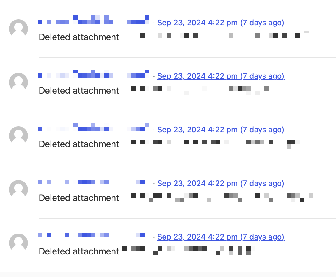
I scrolled through pages and pages of logs just like this, all with timestamps in a span of 3 minutes:

Finally, at the end of that list, there was this:

Now I understood what was going on.
Once again it’s a situation where the origins of WordPress as blogging software come back to bite it. Or rather, me. And my clients.
There’s a lot of functionality around “authors” in WordPress that really only makes sense if the site is a blog — a blog with multiple authors. Like the fact that author archive pages exist. Even if your site isn’t a blog. And that, unless you take steps to shut these off, e.g. with a plugin, every user with author- or higher access automatically has an author archive page that shows all of the posts they published on the site.
Do you want that? Do you even know it exists? I’ve made my living in the WordPress ecosystem for more than a decade and even I usually forget it’s a thing.
But there’s something even worse…

Uh-oh.
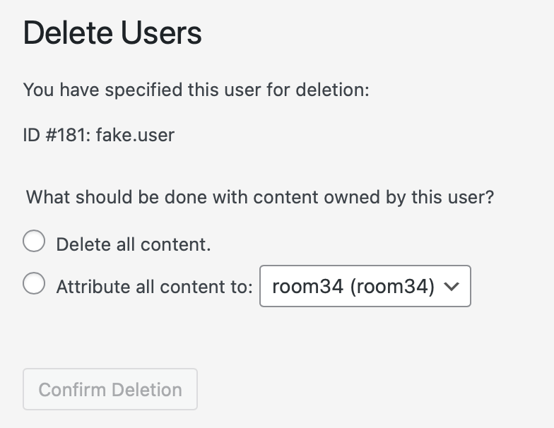
Does the average WordPress site admin (not developer, just an ordinary site admin) really understand what content ownership means in WordPress?
Is it reasonable to assume that someone faced with this screen truly understands that clicking that Delete all content radio button is going to delete all of the images in the Media Library that this user ever uploaded, even to posts (and remember, WooCommerce products are “posts”) that they didn’t initially create?
Because that’s what it’s about to do.
In fact, that is exactly what it did do to my client last week. And now I’m working on a way to restore those deleted images.
Well, what should WordPress do in this situation?
For starters, the text of the options could be a lot more explicit about the implications of the choice. The radio button for attributing the content to another user — ideally whatever Administrator-role account’s email address matches the primary admin email, if one exists — could be pre-selected as the default. There absolutely should be a confirmation dialog warning, in scary language, that anything the user ever created, including file uploads to the Media Library, will be deleted permanently.
Or, maybe it could be “smarter” on a whole other level, and adapt contextually so that when the site is clearly not using the blog author functionality, it would not even present this option. Just un-assign the authorship meta data, but keep the content. At least for Media Library files.
So, now what?
Fortunately, the site is hosted at WP Engine (remember them?) and they automatically make daily backups of every site. Downloading the backup from the day before all this went down was the easy part. But since a week has gone by and the client has been busy updating the site, I can’t just restore the backup… they’d lose all their work (plus all of the details of orders that came in over the same week). So I need to find a way to reimport the relevant images and remap them to the products.
Also fortunately, I’ve done a ton of direct, hands-on work in MySQL databases over the years, so I think I’ll be able to pretty quickly narrow down the list of products that “lost” their images last week, as well as which images those were. Getting them reassigned where they belong though may not be so easy.
And all because 43.3% of all websites that currently exist have put their faith in the house of cards that is WordPress. Speaking of cards…

That’s been Matt’s cute little tagline on his own WordPress blog since the dawn of time, but I feel like we’re the unlucky ones.
Update, a while later: Instead of leaving this post as an unresolved rant, I decided to make something constructive out of it and write up how I restored the images.
First I went into WP Engine’s Backups section, and used the Prepare ZIP option on the backups from both the day before and the day after the incident. I chose to download the database and the uploads directory. I left the plugins and themes directories out of it, because they’re not relevant here, and I’ve got enough to deal with already.
Once I downloaded and extracted the two zip files, which — no joke — took over a half hour even on my fiber gigabit connection, I put them into two adjacent folders on my Mac desktop, and then in Terminal I ran the following command:
diff -rq folder1 folder2 > differences.txt
The actual folder names should be subbed in for the black text. This gave me a file called differences.txt that listed all of the files in the old archive that were not in the new archive. I opened the file in BBEdit for further processing.
Of course, this list included all of the scaled-down versions of the images, and I only really want the source images. WordPress appends the dimensions of each scaled-down image into the filename before the extension, so I was able to use BBEdit’s Process Lines Containing… tool to filter those out with a grep. (Note: This regular expression is a little rough, because it assumes that you didn’t upload any images that included a string consisting of a hyphen, some digits, an x, some more digits, and a period.)
-[0-9]+x[0-9]+\.
Since I’m on a Mac and had already been mucking around in those folders in the Finder, I also had to run the tool again to delete the inevitable .DS_Store files.
Inside the parent folder for the old archive, adjacent to the uploads directory, I created a new director called images-to-restore where I intended to put all of the images I… need to restore. Then I ran a find-and replace on the remaining lines in the text file in BBEdit to turn it into a series of commands in this format:
cp uploads/2023/03/filename.png images-to-restore/
Obviously the part in black was unique for each line. And, of course, this is assuming they never uploaded files with the same filename in different months. (Hint: They did, of course they did, and I won’t realize that until much later in the process.) I will leave it for the reader to determine the most efficient way to modify this cp command to avoid overwriting duplicates.
I saved this to a new file in that same directory called script.sh and in the Terminal, gave it execute permission. Then… I ran it. Boom, within a second, the 531 deleted images were all gathered in one place, ready to upload back into the Media Library.
This is where I stopped for the night. It was already 6 PM, and I needed a fresh start to figure out the database portion.
Update #2, the next morning: OK, how is this database portion going to work? All 531 images are now in the Media Library, but I have two main challenges here:
- Figuring out how WooCommerce handles the main Product Image. Is it just a relabeling of the standard Featured Image, as it seems to be? Answer: Yes. So, how are those handled in the database? In the
wp_postmetatable, there are records with the product ID in thepost_idfield,'_thumbnail_id'in themeta_keyfield, and the attachment ID in themeta_valuefield. Knowing that, I can move on to… - Figuring out how to map the new attachment IDs for the re-uploaded images to the correct product IDs. This is involved enough that I need to break out of the ordered list, so… here we go, back to regular paragraphs.
Before I continue… if you are getting the impression that I’m writing this as I go through the process, you’re absolutely correct. And that will come back to bite me.
Along with the images themselves, I downloaded copies of the database from the days immediately before and after the incident. The problem is, running a diff in BBEdit on two large (360 MB) SQL files is not going to be very useful. I need to just load those tables into a sandbox database and run some queries against them.
First, I used BBEdit to cut out just the tables I need (wp_posts and wp_postmeta), from the rest of the SQL files. I also did a find-and-replace to change the table prefixes so I could put both versions into the same database and easily tell them apart. I used wp22_ and wp24_ as the prefixes, to match the before-and-after dates.
There are two ways I could handle this next step. Since I have a list of the filenames I re-uploaded, I could search on those. Or, I could search for attachment-type posts in wp22_ that are missing in wp24_. I went with that approach since it’s much cleaner:
SELECT ID, guid FROM wp22_posts WHERE post_type = 'attachment' AND ID NOT IN (SELECT ID FROM wp24_posts WHERE post_type = 'attachment');
(Note: I conventionally wrap table and field names in backticks, but that’s not technically required — unless their names match a SQL command keyword, which good database designers know not to do anyway — and since the Block Editor uses the backtick character as a shortcut to jump into and out of “inline code” mode, I had to omit them here.)
All I really needed was the ID field, but I brought in the guid field as well so I can do a sanity check. That field contains the full direct URLs to the images in the Media Library.
This query only returned 529 records, not the 531 I was expecting, but I’m not too worried about that. Even if I’ve lost the mapping for two images along the way, this is going to get my client back 99.6% of the missing images. Eventually they’ll find the two products that still don’t have images, and since those images are back in the Media Library now, it’ll be easy to fix them manually. (Or, it’s possible that only 529 products are missing images and the other two images are something random.)
Of course, I also need to know the new attachment IDs for the re-uploads. So I went into the current version of the database and extracted the wp_posts and wp_postmeta tables there too. (I left their prefixes unchanged.) There’s a useful record in the wp_postmeta table, with a meta_key of '_wp_attached_file'. That’s the relative URI for the original image file, under the site’s wp-content/uploads directory.
In the “current” table, I’m just going to search for attachments I (user ID 1) uploaded yesterday:
SELECT ID, guid FROM wp_posts WHERE post_type = 'attachment' AND post_author = '1' AND post_date LIKE '2024-09-30%';
The trick of course is that the guid records are not going to be the same, thanks to how WordPress sorts uploads into year- and month-based subdirectories. (Also, I’m assuming they never uploaded two images with the same filename in different months. But again we’re back to just trying to resolve the bulk of the problem. I’m not going for 100% perfection.)
What I need is a way to find just the filename portion of the guid URL value. Fortunately, there’s a way to do that in MySQL, and even though my SQL skills are rusty, my googling1 skills aren’t, so I found a solution courtesy of StackOverflow. It’s the SUBSTRING_INDEX() function.
So, here’s my way of finding a mapping of the old attachment IDs to the new attachment IDs, using that function. Note that I’m only bothering with using the second of the above queries (reduced to one operand to avoid MySQL error #1241) in narrowing down the list, because that’s all I really need to do with an INNER JOIN.
SELECT wp22_posts.post_parent AS product_id, SUBSTRING_INDEX(wp22_posts.guid, '/', -1) AS filename, wp22_posts.ID AS old_id, wp22_posts.guid AS old_guid, wp_posts.ID AS new_id, wp_posts.guid AS new_guid FROM wp22_posts INNER JOIN wp_posts INNER JOIN wp22_postmeta ON wp22_postmeta.post_id = wp22_posts.ID AND wp22_postmeta.meta_key = '_wp_attached_file' WHERE SUBSTRING_INDEX(wp22_posts.guid, '/', -1) = SUBSTRING_INDEX(wp_posts.guid, '/', -1) AND wp_posts.ID IN (SELECT ID FROM wp_posts WHERE post_type = 'attachment' AND post_author = '1' AND post_date LIKE '2024-09-30%');
RRRRRRRRRRIP…
That was the moment when I realized that the client did, in fact, upload quite a few different images with the same filename over the years. And since I didn’t account for that in my shell script yesterday, those got flattened down to just one instance each. Fortunately, the problem isn’t as bad as I initially feared. This mapping query returned 558 results. That’s 29 more than I expected, and it corresponds to 29 duplicate filenames. But, the wp22_posts.post_parent field (labeled as product_id for clarity for myself), which corresponds to the product records the images are actually attached to, returned a lot of 0 values. What that means is, the products those images were associated with had already been deleted at some point. That was 205 of the total 558 records, bringing the number of products I actually need to “fix” down to 353, and among those I was only able to find 7 duplicate filenames. So we’re at 98.0% now.
Most importantly, with this narrowed down list, I also now have a direct mapping of the product IDs to the new attachment IDs. I copied just the product_id and new_id columns from the spreadsheet and pasted them into BBEdit, to generate my list of SQL UPDATE statements.
Maybe there’s a better way to do this, but this is how I’ve always handled it. Now I have a text document in BBEdit with a pair of numbers on each line, with some tabs in between. Some careful use of find-and-replace can turn those tabs and line breaks into a series of individual UPDATEs that will look like this:
UPDATE wp_posts SET post_parent = 111528 WHERE ID = 118861 AND post_parent = 0 LIMIT 1;
The AND parent_id = 0 LIMIT 1 portion is just kind of a safety check. It means that I won’t modify any records that already have a post_parent set, and that each update will only affect one row. (I mean, that’s really redundant because the WHERE ID = clause necessarily limits it to one row since ID is the primary key of the table. But better safe than sorry.
I ran the batch of UPDATEs in my sandbox database first and did some spot checks to make sure the correct post_parent values had gotten assigned to the newly re-uploaded image records. It checked out, so I went ahead and ran it on the live database. Fingers crossed…
Oh, but before I ran it on the live database, I backed up the table. That’s a lesson I learned the hard way, many years ago.
And…
It didn’t work.
Well now, hang on a second. Maybe the problem is that I missed a step. That’s right, back to #1 from today’s to-do list. I need to create those '_thumbnail_id' records in the wp_postmeta table.
Back to the old database to cross-reference these:
SELECT post_id as product_id, meta_value as old_id FROM wp22_postmeta WHERE meta_key = '_thumbnail_id' AND meta_value IN (SELECT ID FROM wp22_posts WHERE post_type = 'attachment' AND ID NOT IN (SELECT ID FROM wp24_posts WHERE post_type = 'attachment'));
Now that’s the simple version, just to make it reasonable to grasp what’s going on. It’s only returning the product IDs along with the old attachment ID associated as the featured image. But I need to map these to the new image IDs. That’s going to require merging in that really complicated query from above.
Honestly, trying to think that through started to melt my brain, so I decided to take a novel approach. You can make up whatever meta data you want. So I decided to insert a new type of meta data in the current database, to store the mappings of the old IDs to the new ones. Back to my BBEdit find-and-replace approach, pulling the old and new IDs in and generating a set of INSERT statements like this:
INSERT INTO wp_postmeta (meta_key, meta_value, post_id) VALUES ('_recovery_20240930_old_id', old_id, new_id);
With that step completed, I’m able to short-circuit further exploration and jump straight to the following update statement. In the interest of time, I once again blasted through a BBEdit find-and-replace. I believe it’s possible to do this with a single UPDATE statement with the correctly chosen subqueries, but I’m running out of time so I need to resort to the quick-and-dirty approach. (Note, this turned out not to require those '_recovery_20240930_old_id' meta data records at all, but they’re nice to have for possible future reference anyway… and they’d be essential to the smarter, single-query solution.)
I discovered that as I had worked with a few of the products, their meta records for _thumbnail_id had already been deleted, so the best approach was to delete all of the associated _thumbnail_id records, and then insert new ones.
DELETE FROM wp_postmeta WHERE meta_key = '_thumbnail_id' AND meta_value IN (…) LIMIT 353;
The ellipses should be replaced with a comma-delimited list of the “old” attachment IDs. Then, blast through BBEdit find-and-replace again to create insert statements like the following, mapping the new attachment IDs to the associated product IDs:
INSERT INTO wp_postmeta (meta_key, post_id, meta_value) VALUES ('_thumbnail_id', 114396, 118771);
It worked! Of course, there are a bunch of products with multiple images and those are not yet reassigned to the WooCommerce galleries, but at least all — or almost all — of the products now have a featured image again so the WooCommerce “missing image” placeholder isn’t showing up everywhere.
- Of course I actually use DuckDuckGo. ↩︎


