I do not like Adobe. That is probably an understatement, but I’ll leave it at that for now.
Adobe software is inextricably connected to my career throughout my adult life. When I first started to learn web design and development in college in 1994 (entirely on my own, in my spare time — this was not something one did, or even could, study at that point), the two applications I installed on my Macintosh LC475 were BBEdit and Photoshop.
I still use BBEdit every day to write code. But I stopped using Photoshop in 2016. My opinion of Adobe had long since soured, but what finally did the relationship in was their switch to a subscription model. I didn’t enjoy spending over $1000 on a Creative Suite license, but I did it, because it was what you needed to do if you were a design professional. Then came the subscriptions. They eased you in at first — $25/seat. My business was growing, so at one point I subscribed to 3 seats. $75/month seemed like a lot to pay, but I was willing to do it.
Then the introductory rates ended, and I was suddenly paying $225/month.
Then my employees moved on, and I decided not to replace them. Now I was paying $225/month just for myself.
Then, I discovered the true insidious, Comcast-esque evil of Adobe’s subscription model. Oh yes, it is extremely easy to add more seats to your business account. You can do it online, at any time. It takes less than a minute. Boom! But if you want to cancel any of those seats, you can only do it within one month of your annual subscription renewal. Otherwise, you have to pay half of the remaining annual balance for early termination. Oh, and you have to call them on the phone to cancel, so the rep can read their hard-sell script to try to persuade you to stay.
I discovered this when I had 6 months left in my 2016 subscription period. So, I could continue my subscription for those 6 months, and pay another $1350, or I could cancel now and pay $675. I chose the latter. Then I spent another $100 buying one-time licenses for Affinity Photo and Affinity Designer.
Eight years later, I’ve spent a total of $100 more on Affinity software, to upgrade both apps when version 2 was released.
In the meantime, I have also paid another $800 to Adobe. Because even though I canceled my Creative Cloud subscription, I still needed Typekit, since I was using their fonts all over client websites. And by that point, Typekit had become Adobe Fonts.
You can no longer just subscribe to Typekit/Adobe Fonts. But if you subscribe to any Adobe product, Adobe Fonts comes with the subscription for free. So I subscribed to Adobe XD, their cheapest annual subscription. I never use XD. I guess it’s actually related to what I do (web design), but it’s not part of my workflow at all. I think I’ve maybe opened it twice. It’s really just about the fonts.
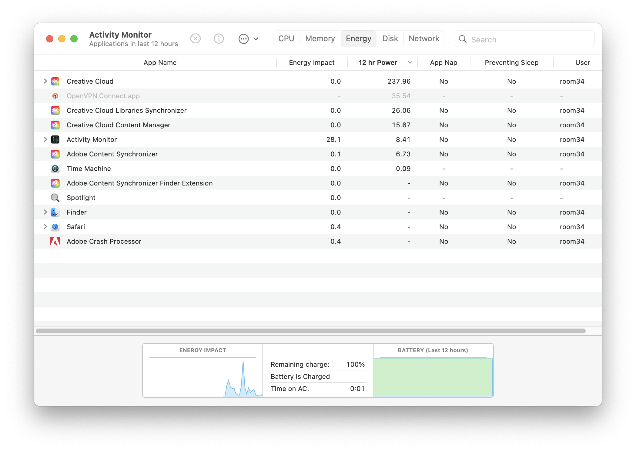
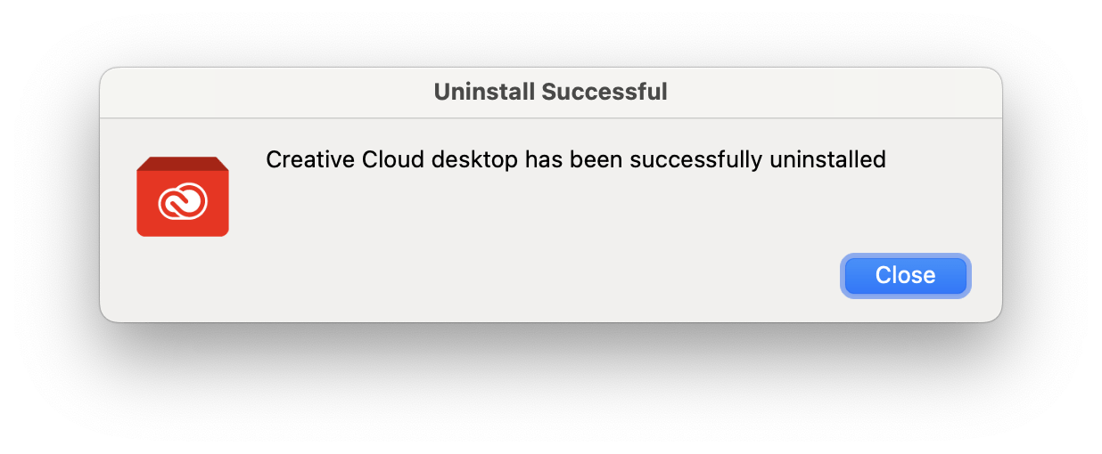
But I really hate having to have the Creative Cloud Desktop app on my Mac. It’s constantly running in the background, using up resources for… what, exactly? Sadly, you can only install fonts from Adobe on the desktop if you have it running. If you uninstall the app, or even just quit the app, the fonts stop working.
Well, how badly do I really need those fonts? I’m about to find out. I do use some of them quite frequently, but I would consider very few of them truly essential to my work, except for Aktiv Grotesk. I use it in all of my business documents as a slightly more unique alternative to Helvetica. But a recent Linus Boman video turned me on to Rubik instead. (At the time of writing, that’s the font you’re reading these words in.)
So maybe I’ll just continue my increasing reliance on free open source fonts from Google Fonts, combined with, you know, just licensing commercial fonts from the foundries when there’s a really good one that I can only otherwise get on Adobe Fonts.
With that decision settled, I was able to make this happen:
But I’m still paying for Adobe Fonts (in the form of an XD subscription) for now. I went through my Adobe Fonts web projects yesterday and culled about 1/3 of the ones that are no longer in use, either because we redesigned the client’s site or because they’re no longer working with me. But I still have 55 web projects set up. If I were to cancel my subscription, effectively shutting off Typekit access for those sites, I suspect at least half of the clients wouldn’t even notice their sites were falling back to browser default fonts. But I’m not inclined to do that… yet.
I’m going to try living for a while without Adobe Fonts on the desktop. And if it turns out I truly no longer need them, then I will happily work out a way to phase out those fonts on my clients’ websites too, and cancel my subscription altogether. But for now I just consider it an improvement that Adobe is not sapping resources on my MacBook Pro for whatever they were doing on it.