Bill, I really don’t have time for this.
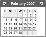
Internet Explorer 6 is incapable of properly rendering CSS applied to a <div> tag when the only child element in the <div> is a table. It sticks arbitrary margins in the document below the table. Here’s an example from a site I’m working on (colors removed to [sort of] protect anonymity). This is how it should look, as rendered by Safari:
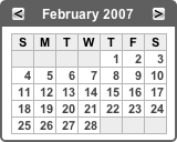
The concern is the content in the dark title bar. The bar itself is a <div> and the two buttons plus the month/year text is contained in a table. Here’s how it looks in Internet Explorer 6 (note the gap below the header bar):
OK. So let’s see, maybe there’s a semi-logical CSS workaround. I already have margin: 0 defined for the class the <div> uses. So I added it to any tables contained within that class as well. No luck. Then I did something really off the wall and added a display: inline property for tables contained in that class. It still didn’t work. So then, appropos of nothing, I added a just so there would be something in the <div> besides the table. And here’s the kicker… I actually added it before the table (retaining the display: inline property of the table:
Once again, it’s good that the windows in my office don’t open, or there would be one less PC in this building right now.
Of course the solution is not satisfactory to me. The search goes on. Because, you know Bill, I really have nothing better to do when I’m working on a Saturday morning.
At this point another alternative occurs to me: it’s possible to use the CSS float property to position the buttons and eliminate the table altogether. That fixes the problem in Internet Explorer, but…
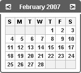
Steve, I’ve got a few words for you as well! Look what happens in Safari when I remove the table in the header:
Sure, that makes perfect sense. Especially since I have a width="100%" attribute right there in the calendar table. Oh, and did I mention that the width of the panel body is explicitly defined in pixels in the CSS? How is it, how can it be possible, that removing a table from a separate (albeit adjacent) <div> could affect the width of this table?
Now where’s my glass cutter? I think there are one too many PCs and one too many Macs in this office.
After a bit more head scratching, I’ve discovered that the cause of the Safari issue is that I neglected to remove the aforementioned display: inline property I added to my CSS in the midst of the numerous futile experiments I undertook to resolve the initial IE problem. Steve, you’re off the hook.
So, in the end, it turns out that the solution to my problem is to abandon the old-school table-based method of layout and go strictly CSS. I’m sure that’s precisely what Bill wants me to do.
 Not to be confused with stinky feet, sticky footers are a CSS technique whereby a page footer always appears at the bottom of the page/window, even if the content of the page isn’t tall enough to fill the window completely. (For you HTML-phobes out there, normally all of the content on a web page flows vertically one element after another, meaning that your page “footer” can potentially end up in the middle of the window, with a bunch of blank space below it, if your page content is too short. Not to be confused with Too Short.)