So cool, and yet so… not.

Amazon.com has a big announcement for us today: its new product, the Kindle. I want to like this thing, mainly because it’s the first major consumer product (that I know of) to feature electronic paper. This is not just a high-resolution backlit LCD; it’s a completely new and revolutionary kind of display that apparently (I’ve never seen it in person) really does look like printed paper. But what’s printed on it can change, electronically. And it’s actually usable in the form of flexible sheets, albeit quite a bit thicker than regular paper.

Cool.

One natural application of this technology is to combine it with that languishing gadget category, the e-book reader. You could even have a reader that has multiple pages (literally) of electronic paper. (Think about spreads spanning multiple pages.) Now we’re getting somewhere.

So then, why does the Kindle suck so much?

If I had to pin it on one flaw, it’s the overall form factor: so big; so much extra space on the sides and top of the display (for no apparent reason), the weird angles, etc.

It just looks… weird. And retro-futuristic (in a bad way) like something Atari would’ve prototyped in 1983. On top of that, it’s expensive ($400). This already disappointing picture is apparently even further sullied by the snare of DRM. But most of all, the Kindle lets me down on the coolest aspect of electronic paper (other than the fact that it exists at all): the flexibility. No “sheets.” No fold-out spreads. No bendy. I want bendy.

In the end, I’m reminded of early electric and hybrid cars: though I have no proof of this, I remain convinced that the auto makers deliberately made them goofy looking to discourage sales, ensuring that there would not be a market for them. The difference is, I can see in that case how someone (the oil companies) could stand to profit from forestalling innovation. I’m not sure what the model is where someone would strongly benefit from killing the e-book.

Of course, what it comes down to is that I just want my electronic paper. I want it everywhere. A coworker was telling me about how another potential use not far down the line (once costs drop) is to use electronic paper for multimedia business cards. Savoring that possibility, it just occurred to me that the day may not be that far off when the wonders of J.K. Rowlings’ chocolate frog cards will finally be available to us Muggles.

But not today.
Thanks, Bill… this is just how I wanted to spend my Saturday

Bill, I really don’t have time for this.

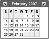
Internet Explorer 6 is incapable of properly rendering CSS applied to a <div> tag when the only child element in the <div> is a table. It sticks arbitrary margins in the document below the table. Here’s an example from a site I’m working on (colors removed to [sort of] protect anonymity). This is how it should look, as rendered by Safari:

Safari screenshot

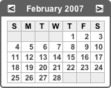
The concern is the content in the dark title bar. The bar itself is a <div> and the two buttons plus the month/year text is contained in a table. Here’s how it looks in Internet Explorer 6 (note the gap below the header bar):

Internet Explorer screenshot 1

OK. So let’s see, maybe there’s a semi-logical CSS workaround. I already have margin: 0 defined for the class the <div> uses. So I added it to any tables contained within that class as well. No luck. Then I did something really off the wall and added a display: inline property for tables contained in that class. It still didn’t work. So then, appropos of nothing, I added a &nbsp; just so there would be something in the <div> besides the table. And here’s the kicker… I actually added it before the table (retaining the display: inline property of the table:

Internet Explorer screenshot 2

Once again, it’s good that the windows in my office don’t open, or there would be one less PC in this building right now.

Of course the &nbsp; solution is not satisfactory to me. The search goes on. Because, you know Bill, I really have nothing better to do when I’m working on a Saturday morning.

At this point another alternative occurs to me: it’s possible to use the CSS float property to position the buttons and eliminate the table altogether. That fixes the problem in Internet Explorer, but…

Steve, I’ve got a few words for you as well! Look what happens in Safari when I remove the table in the header:

Safari Screenshot 2

Sure, that makes perfect sense. Especially since I have a width="100%" attribute right there in the calendar table. Oh, and did I mention that the width of the panel body is explicitly defined in pixels in the CSS? How is it, how can it be possible, that removing a table from a separate (albeit adjacent) <div> could affect the width of this table?

Now where’s my glass cutter? I think there are one too many PCs and one too many Macs in this office.

After a bit more head scratching, I’ve discovered that the cause of the Safari issue is that I neglected to remove the aforementioned display: inline property I added to my CSS in the midst of the numerous futile experiments I undertook to resolve the initial IE problem. Steve, you’re off the hook.

So, in the end, it turns out that the solution to my problem is to abandon the old-school table-based method of layout and go strictly CSS. I’m sure that’s precisely what Bill wants me to do.

This one just may take the cake…

First, a qualification: Since I got a flat-panel display at work, I no longer have my PC connected directly to the display; I view the PC’s video output via Remote Desktop Connection on my Mac. I’ve learned over time that RDC does not provide a direct, unaltered feed of the PC’s video. For understandable reasons (faster screen refresh), but by perhaps unjustifiable methods, RDC re-renders parts of the video display. The result is that you do not see a pixel-perfect (or even simply downsampled) representation of the actual PC video; it appears to be redrawn completely for network transmission.

In particular, this does funky things with Internet Explorer’s output. Last year I spent a few hours trying to figure out why borders around my buttons were extending by one pixel both down and to the right, until I realized that on the actual PC’s display this wasn’t happening… it was just an RDC quirk.

With that out of the way, I have to admit that perhaps my current problem is an issue with RDC and not with Internet Explorer. But either way, it’s a Microsoft problem.

After making some CSS adjustments to a page I was working on, I noticed that the main body seemed to be extending 3 pixels wider than it should be. Further testing revealed this only happened on certain pages, and after resorting to commenting out each CSS class one-by-one, I tracked this down to an inline class that simply italicizes text. So, for whatever reason in the grand Microsoft scheme, a word or two in italics can cause a much larger section of the page (at least 2 or 3 levels up in the document tree) to expand by 3 pixels.

Again I ask… WHY???

And again my cry for explanation goes unheeded. Time for another lame workaround?

Addendum: As it turns out, in this particular case a workaround will not be needed. I went to our test PC and confirmed that this is an RDC glitch, and not an Internet Explorer one.