On IKEA’s sad validation of Verdana

IKEA 2010 catalog, set in... GAACK! VerdanaAny use of a font is a validation of its aesthetics, and since I find the aesthetics of Verdana appalling, I am sad to see it get validation from the likes of IKEA.

I feel like I got a bit of a scoop here, because I first noticed the use of Verdana at IKEA about a month ago. At the time I thought it was a fluke — I saw it on one of their vertical banners, posted near the cafe, and it appeared to be a locally-produced sign advertising some particular regional specialty they were temporarily adding to the menu. It looked like someone at the local store had tried to design a banner to match the corporate standard, but was ignorant of the nuances of fonts, and used Verdana because they either didn’t have Futura or couldn’t tell the difference (gasp!)… or both.

But then earlier this week I was leafing through the 2010 IKEA catalog that was sitting on our coffee table, when it struck me that the whole bloody thing was set in Verdana. How could this be?!

As I said, I feel like I got a bit of a scoop here, because I mentioned this observation on Twitter three days ago, and only now is it showing up on Daring Fireball via lonelysandwich via Hunk-O-Mass via jhn brssndn via hellaposer via Typophile. And apparently Typophile does not yet have the bandwidth to handle being “fireballed” and “sandwiched” (and… uh… “34ed”… yeah, that’s it), since I can’t get it to load right now.

I feel like I’m in good company though, because these guys are echoing my longstanding sentiments towards Verdana. From Gruber:

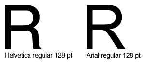
I have never seen Verdana look good in any way other than in small sizes on-screen.

And, even more on-the-money, from Lisagor:

Sure, Gruber uses it tastefully, but at anything larger than 11pt, it feels to me a bit squat and dopey. Friendly and readable, but a little bit simple, in the way you’d say a person is simple, but only behind his back.

Well played. Part of IKEA’s rationale is that “they want to be able to give the same visual impression both in print and the web.” Well, that can be done without resorting to this abominable solution. Especially with the imminent ascension of @font-face.

Here’s hoping 2011 will bring a return to sanity.

The R’s have it… “It” being the most distinguishable difference between Helvetica and Arial

The R’s have itWhether or not my aesthetic sense and artistic ability really warrant the appellation “designer,” design has been a part of what I do for my entire career, and I’ve had the eye for detail (minutiae?) since I was a kid. It follows naturally that I have an unhealthy fixation on fonts. Just ask anyone how I feel about Verdana to erase all doubts on that point.

My obsessions seem slightly less unhealthy working in the publishing field, and they’re downright validated at moments like last Friday, when the recent documentary honoring the 50th anniversary of Helvetica was screened in our boardroom over lunch. I loved it.

While I unequivocally loathe Verdana (unless, that is, it’s displayed at such a small point size that it’s hard to tell what it is), I hold Helvetica in high regard. It’s rather plain, I’ll admit, but it’s just such a perfectly realized vision that in its relatively short lifetime it has become the norm. Helvetica is just how letters should look, and any other font’s uniqueness is judged most clearly by how it differs from that norm.

Unfortunately, on-screen type is a world of its own. Although with the advent of Mac OS X, system-wide anti-aliasing has made smooth font rendering possible, most computer systems still look better when fonts are specially tooled for the low-resolution environment of a CRT or LCD display. And for the most part, Helvetica has never really fared too well in such an environment.

So when, in the mid-’90s, Microsoft made what might have been their single most thoroughly positive contribution to the world by releasing a set of standard fonts to be used on web pages that look (reasonably) good on computer screens, I embraced them wholeheartedly (Verdana notwithstanding).

The closest counterpart to Helvetica in this set of fonts is Arial. Many people hate Arial, for reasons generally too arcane even for me to appreciate, but ultimately, for me, the fact that it doesn’t quite hit the mark of being a pure Helvetica clone, it tends to render much better on-screen than Helvetica does, and it’s become my own personal standard (along with another of the Microsoft web fonts, Georgia) for web design.

But this Helvetica movie has turned my world on its ear. For the last week I’ve been hyper-sensitive to fonts, noticing Helvetica everywhere I turn all day long, and becoming acutely aware of every slight difference between Helvetica and its web font doppelgänger, Arial. I think I’ve hit upon the most easily identifiable difference between the two fonts: the right “foot” of the capital R.

To be honest, I don’t really like the capital R in Helvetica. That wavy little foot seems too jaunty, too incongruously immoderate next to its supremely efficient and utilitarian siblings. But if anything is worse than the capital R in Helvetica, it’s the capital R in Arial! What the heck is that? It’s almost enough to make me want to give Verdana another chance. (After all, it’s even used on the Helvetica site.)