Get Gmail to scale inline images to fit the browser window (in Chrome and Safari)

If you use Gmail on the web as your main email platform, and your work often involves people sending you emails with large high-resolution images (which ideally would be attachments, but are often embedded inline in the message), you know this problem. The images are frigging huge in the browser window, and the viewing panel ends up with a horizontal scrollbar, with paragraph text trailing off the screen. Having to scroll horizontally to read emails is really awkward and irritating! Why doesn’t Gmail at least offer an option to auto-scale inline images to fit the width of the window?

I discovered there’s a Chrome extension to fix this. If you’re a Chrome user, just download it and you’re done.

But I don’t use Chrome, I use Safari. And there doesn’t appear to be an equivalent Safari extension. I did, however, continue down the trail to the CSS file in the GitHub project for that Chrome extension. The CSS is quite simple:

[data-message-id] > div:nth-child(2) img:not([role=button]):not([role=menu]):not([width]) {
max-width: 100%;
width: auto !important;
height: auto !important;
}

That’s all it takes to get Gmail to shrink inline images in an email to fit the window. But how do you get Safari to apply that CSS? This is not so hard, either.

First, save the above CSS code into a file, maybe called gmail.css so you’ll remember what it’s for, and save it somewhere that makes sense to you, such as your Documents folder.

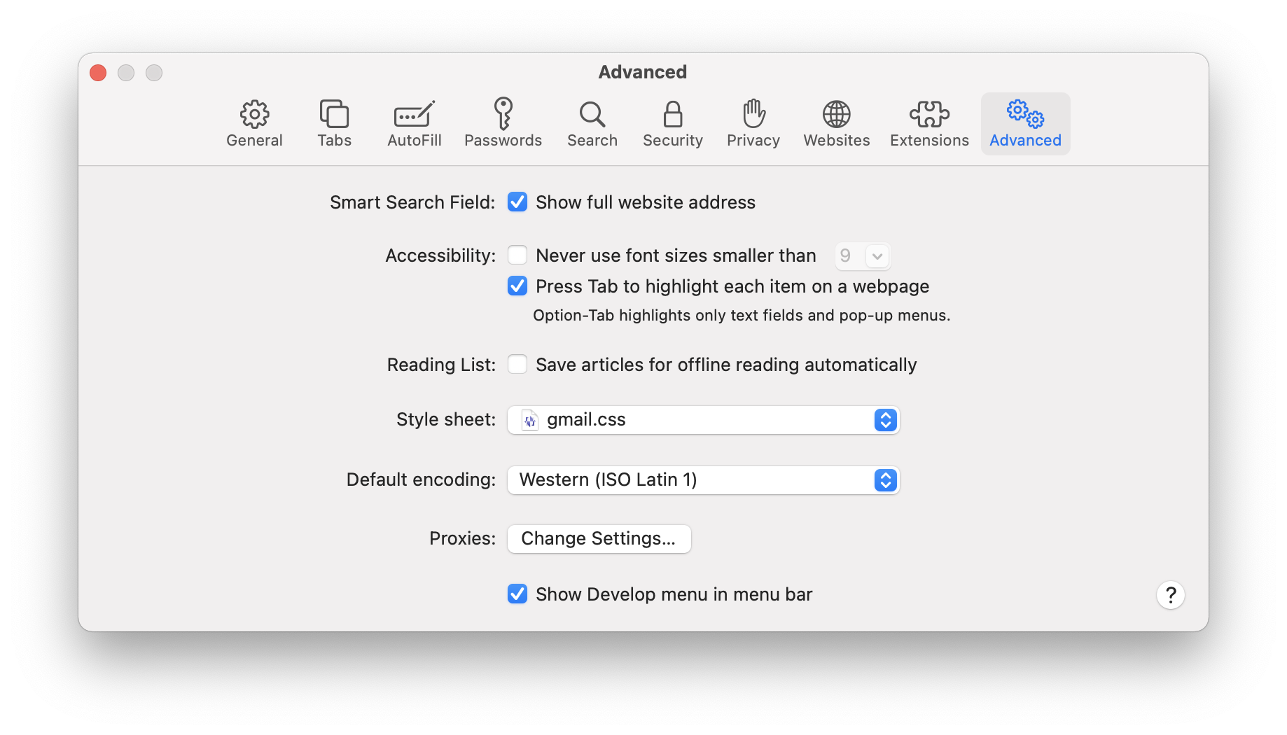
Next, open the Safari preferences, and click on the Advanced tab.

Click on the Style sheet dropdown and navigate to the gmail.css file you saved. That’s it! If you have a Gmail message containing a huge image open in Safari while you’re doing this, you should immediately notice the image pop down to a reasonable size. Huzzah!

CSS text-transform can’t do “sentence case” but there’s a really simple alternative

Need to capitalize just the first letter of a text string? CSS text-transform has capitalize but that capitalizes every word.

Fortunately, you can use the ::first-letter pseudo element! In my case, I wanted all of the links in my navigation to definitely start with a capital letter, so I went with this:

#primary_navigation a::first-letter {
  text-transform: uppercase;
}

Slick!

Please, web font vendors, learn how to use CSS @font-face properly!

This has been bugging me for years and I can’t believe it’s still happening.

Being able to use custom fonts has been a huge boon to web design. And font hosting services like Typekit (sorry, I will never call it Adobe Fonts) and Google Fonts make using custom fonts easy.

But sometimes you still buy a font license that involves hosting the font files directly on your own server, and that’s where things get absolutely maddening because, for some reason, someone early on grossly misinterpreted how to use @font-face and that error has been perpetuated by countless unthinking others.

(Yes, I’m being harsh. But this is really not that complicated. And getting it right makes writing your CSS and HTML so much easier.)

Here’s an example of some font-specifying CSS you might receive from a font vendor:

@font-face {
    font-family: 'Font-Name-Regular';
    src: url('Font-Name/Font-Name-Regular.woff2') format('woff2'),
         url('Font-Name/Font-Name-Regular.woff') format('woff');
    font-weight: normal;
    }
.Font-Name-Regular {
    font-family: 'Font-Name-Regular';
    }

@font-face {
    font-family: 'Font-Name-Regular';
    src: url('Font-Name/Font-Name-Regular-Italic.woff2') format('woff2'),
         url('Font-Name/Font-Name-Regular-Italic.woff') format('woff');
    font-weight: normal;
    font-style: italic;
    }
.Font-Name-Regular-Italic {
    font-family: 'Font-Name-Regular';
    font-style: italic;
    }

@font-face {
    font-family: 'Font-Name-Bold';
    src: url('Font-Name/Font-Name-Bold.woff2') format('woff2'),
         url('Font-Name/Font-Name-Bold.woff') format('woff');
    font-weight: normal;
    }
.Font-Name-Bold {
    font-family: 'Font-Name-Bold';
    }

@font-face {
    font-family: 'Font-Name-Bold';
    src: url('Font-Name/Font-Name-Bold-Italic.woff2') format('woff2'),
         url('Font-Name/Font-Name-Bold-Italic.woff') format('woff');
    font-weight: normal;
    font-style: italic;
    }
.Font-Name-Bold-Italic {
    font-family: 'Font-Name-Bold';
    font-style: italic;
    }

This is, in fact, the exact code I just received yesterday from a font vendor when I purchased a license, with the actual font name removed to protect the guilty innocent.

What’s so bad about this, you might ask? Aside from the conventions I dislike of indenting the closing } and using 4 spaces instead of tabs, there are two glaring problems with this:

  1. Because the font-family name defined for each weight and style is different, when you go to use this font, you need to specify the font-family every time you want to use bold or italics in your HTML, or at least use the custom CSS classes defined here. No! No no no! You should not have to apply a class to get bold or italics to render properly. The <strong> and <em> tags should do that on their own!
  2. Don’t f***ing define a bold font with font-weight: normal;! If you don’t realize from this, alone, that something is wrong with your approach, stop coding right now.

So, how should this be done, you ask?

Well, it’s simple. Each @font-face declaration has four properties. One is src: which tells the browser where to find the correct font file(s) for this face. The other three properties work together to define the context in which this particular src should be used: any time this combination of font-family, font-weight and font-style come together.

You can use the same font-family in different @font-face declarations as long as font-weight and font-style are different. In fact, you’re supposed to! That’s the way it’s designed to work!!!

When you do this properly, you don’t need any custom CSS classes. Try this on for size:

@font-face {
    font-family: 'Font-Name';
    src: url('Font-Name/Font-Name-Regular.woff2') format('woff2'),
         url('Font-Name/Font-Name-Regular.woff') format('woff');
    font-weight: normal;
}

@font-face {
    font-family: 'Font-Name';
    src: url('Font-Name/Font-Name-Regular-Italic.woff2') format('woff2'),
         url('Font-Name/Font-Name-Regular-Italic.woff') format('woff');
    font-weight: normal;
    font-style: italic;
}

@font-face {
    font-family: 'Font-Name';
    src: url('Font-Name/Font-Name-Bold.woff2') format('woff2'),
         url('Font-Name/Font-Name-Bold.woff') format('woff');
    font-weight: bold;
}

@font-face {
    font-family: 'Font-Name';
    src: url('Font-Name/Font-Name-Bold-Italic.woff2') format('woff2'),
         url('Font-Name/Font-Name-Bold-Italic.woff') format('woff');
    font-weight: bold;
    font-style: italic;
}

Aside from the fact that this eliminates 1/3 of the lines of code, it also will make your HTML much cleaner and more properly separates content from styling.

Here’s an example of some HTML you might have to write using the first approach:

<p class="Font-Name-Regular">This is some regular text, which also
includes a bit of <em class="Font-Name-Regular-Italic">italics</em>
and even a dash of <strong class="Font-Name-Bold">bold</strong>.</p>

Now, granted, my version does require you to define the font-family for your <p> tags in your CSS file. But guess what… you’re supposed to do that! Put this in your CSS:

p { font-family: 'Font-Name'; }

With that in place, the proper HTML for the same appearance becomes this:

<p>This is some regular text, which also
includes a bit of <em>italics</em>
and even a dash of <strong>bold</strong>.</p>

So, again… when thinking about @font-face, just remember these two simple things:

  1. All @font-face declarations for the same font family should have the same font-family. (Seems kind of obvious when I put it that way, doesn’t it?)
  2. The value for font-weight should be the actual weight of the font. Only the “regular” weight should have font-weight: normal; or font-weight: 400;. If you’re using font-weight: normal; on a bold font, you’ve done something wrong.

This change makes for cleaner code, easier maintenance, and proper separation of content from design.

Addendum

Shortly after I posted this, I went back and looked at the unnamed font vendor’s sample page, because I knew it referenced “the @font-face standard since 2017”. I could not believe that this approach was actually a “standard,” so I tracked down the source, an article Bram Stein published on A List Apart in 2017 called Using Webfonts.

Guess what… Bram Stein’s examples do it the right way!

I do know one place where I’ve consistently seen this wrong way I’m railing against… it’s the code generated on FontSquirrel (no link, on principle) whenever you download a font. Other “web font generator” sites like FontSquirrel probably do it to. They’re all wrong… but Bram Stein isn’t. Don’t drag him down with this bad code!

Responsive horizontal scrolling tables for phones in CSS with no additional HTML

For some reason I always forget how to do this, and most tutorials out there suggest wrapping your table in a container <div> tag but as long as you’re using <tbody> (and, ideally, not using <thead> or <tfoot>) then it’s easy with a small bit of CSS and no HTML changes at all.

The trick is to display your <table> as a block, and your <tbody> as a table!

Here’s the code. Fit it into whichever breakpoint makes sense for your site. Mine shown here is the standard phone width breakpoint for WordPress (782 pixels):

@media screen and (max-width: 782px) {

  table {
    display: block;
    overflow-x: auto;
    width: 100%;
  }

  table tbody {
    display: table;
    width: auto;
  }

}

Of course, right after I posted this I found that I had already written about it two years ago with a slightly different solution. Never hurts to have a slightly different perspective.

It’s REALLY SIMPLE to add horizontal scroll to a table in CSS

Noted for future reference (by me). Tables aren’t that common on websites anymore, but sometimes they’re legitimately needed (you know, for tabular information).

One thing that I always struggle with is adding horizontal scroll to tables on responsive phone layouts. I know it involves overflow, but for some reason I always make the solution way more complicated than it needs to be.

You don’t need a container element. All you need to do is add these two CSS properties to your tables:

table {
  display: block;
  overflow-x: auto;
}

The StackOverflow post that illuminated the answer also has you add white-space: nowrap; but that can be problematic if your cells have enough text that they need to wrap. I found a better solution was to set a minimum width on cells:

th, td {
  min-width: 120px;
}

You may want to experiment on any given site to see what min-width works best.