 For the past couple of years I’ve been working on a rapidly evolving CMS project called, not-so-creatively, cms34. It’s built on the open source CakePHP framework.
I love CakePHP. I’ve dabbled with a couple of other frameworks (notably, Zend Framework), and while CakePHP certainly isn’t perfect, I’ve found it by far the easiest to jump into and quickly get a powerful and reliable web application running.
When I started cms34 in late 2008, it was using CakePHP 1.2.0. Since then I’ve kept up with most of the minor point releases, upgrading as far as the current version, 1.2.7, as easily as simply swapping out the cake directory. And in that time, cms34 itself has gone through several major and minor revisions, currently up to what I’m calling version 3.2.
In preparation for version 3.3, I’ve decided to take the plunge and upgrade from CakePHP 1.2.x to the newly released CakePHP 1.3.0. Version 1.3 offers a number of improvements, but it also includes the kinds of changes typical of a major point release that mean an upgrade is not such a simple task. I’ve run into a few issues with the migration from 1.2.x to 1.3.x, many of which are not covered in the project’s official migration documentation, partly due to the incompleteness of the documentation, and partly due to some idiosyncrasies of my application that I wouldn’t expect the documentation to cover. But since I’m probably not in this boat alone, I thought I’d share some of the problems I encountered, and the solutions I found.
Getting started: RTFM
First things first. Download CakePHP 1.3.0. Be sure to get the release version (the one in the list with no hyphenated qualifiers after “1.3.0”). Unzip it and then follow the migration instructions to get started. For the most part this means swapping out the cake directory along with a couple of other files, and then going through all of the notes and making any necessary changes to your application.
In my own experience, I didn’t have to change much: I’ve been trying to keep up with the recommendations in the version 1.2 docs, so I haven’t been using any functionality that got dropped or deprecated. The writing has been on the wall for some time with most of these features and unless your application started with version 1.1 or 1.0, you’re probably not using any of these dead methods anyway.
A few specific issues I did need to address:
- Unlike with minor 1.2.x updates, there are a few files outside of the
cakedirectory that need to be replaced. I found it best to just go through the entire release package and replace all files (except those I had modified) with their new versions. - Update your
config/core.phpfile, using the new version as a model. Mine had lots of changes, and I had stripped out all of the instructional comments to make the file less cumbersome to deal with. I wanted to keep those comments stripped out, so I just updated my file with what I needed, and then I kept the distribution’s version of the file inconfigascore.dist.phpso I can refer back to it in the future if I run into any issues. - There are some mixed messages in the documentation regarding the deprecation of AjaxHelper: the migration appendix says it’s deprecated but the main documentation doesn’t indicate that. I’m using it a fair amount and don’t want to have to rework all of that code, so for now I’m leaving it alone.
- JavascriptHelper is another matter, but since it appears there are perfect replacements for its functions now in HtmlHelper, I just did a straight-up find-and-replace, changing all instances of
$javascript->link()to$html->script()and$javascript->codeBlock()to$html->scriptBlock(). I should note that so far I haven’t really tested any of this functionality to ensure that it’s still working, but no obvious errors have cropped up.
But wait, there’s more!
After following the migration docs, I was overly optimistic that things would just work. They didn’t. First up, I encountered this:
Notice (8): Undefined property: PagesController::$Session
[APP/controllers/app_controller.php, line 383]
Your line number will probably be different, but if you’re using sessions at all (and why wouldn’t you be?), you’ll get this error somewhere. It’s not mentioned in the migration docs, but I found out here that the Session component and helper are not instantiated automatically anymore. The solution is quite easy though. In app_controller.php just make sure that you add 'Session' to the arrays defined for var $components and var $helpers.
That was the biggest and most obvious problem I encountered. Once I had fixed that, I could at least get (some) pages to load, albeit with a few other issues. Namely, my theme was not being applied to the site. I’ll get to that in a minute though, because the problem I decided to fix next came in my CMS admin interface.
Pagination (even if you don’t want it)
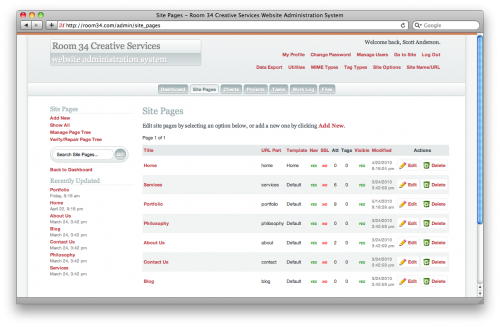
I use the PaginatorHelper a lot, especially in the CMS admin. My CMS is modular: there’s a “module” (my term for any model-view-controller group) for pages, a module for blog posts, a module for uploaded files, a module for project porfolios, a module for the event calendar, etc. Each module is represented in the admin interface by a navigation tab, which when clicked takes the user to an index page with a paginated, tabular list of all of the records in the database for that module. In practice (on my own site — yes, I use my CMS to run my own site, of course!), it looks like this:
Unfortunately, the pagination was mysteriously hosed, with the following error:
Unsupported operand types in CAKE/libs/view/helpers/paginator.php
on line 616
What the…? Well, as it turns out, the methods $paginator->prev(), $paginator->next() and $paginator->numbers() have had changes to their input parameters that are currently not very well documented, in that the documentation doesn’t mention that they exist. They are mentioned in the API, but as usually happens when I refer to the API, I found it wanting, to the point that I resorted to digging into the source code directly to try to make sense of what these methods actually do.
In short, where you could previously pass these methods a URL as a string (as the second parameter for prev() and next() and the first for numbers()), now they expect arrays. And numbers(), in particular, really doesn’t like that parameter to be a string (because at one point it uses the += operator to merge two arrays, one of which is the first input parameter), resulting in the Unsupported operand type error.
Fortunately, in my case at least, I found that I didn’t need to pass the URL into any of these methods at all, and that just removing them altogether from the calls fixed the problem.
There was an ancillary problem once I got past the PHP error: inactive “Previous” and “Next” links were appearing on the page when there was no pagination. This was an unwanted addition, but I quickly realized this was an intentional change, and is well-documented. I was able quite easily to make them go away with a little CSS:
span.prev, span.next { display: none; }
With that minor crisis resolved, I could move back to the matter of the theme not showing up.
Changing themes
First, some background on my CMS: I’ve built the application so that I can have a single “core” system that works for numerous client websites, organized in a way that it’s easy to deploy updates across a number of separate sites. The system is also built to support multiple sites running on a single installation (by way of a Site model, with every piece of data in every other model having a site_id field keying the content to the proper site).
There are two key features of CakePHP that I rely on to make this all work: the look-and-feel (and site-specific view functionality) of each site is managed using Themes, and any site-specific controllers and views are handled with Plugins.
It is documented, unfortunately not in the migration appendix, that version 1.3 of CakePHP has changed how theme assets (static files like images, JavaScript and CSS) are organized. Now, instead of placing these in a directory under app/webroot/themed, you create a webroot directory inside the appropriate theme folder in app/views/themed. This is nice, in that now all of the files for a theme are in one location. It can cause a performance hit though, as these files are now being processed through PHP. You can still put the files under app/webroot to avoid this performance hit, but, annoyingly, the path has changed, as noted in the documentation. I decided to go with the new approach under app/views, as performance is not a major issue with the current implementations of my CMS, and the benefit of a single, consolidated directory for each theme is worth the trade-off. If performance does become an issue, though, at least now I know what to do about it.
More to come…?
After completing the above changes, I spent some time exploring my test application, both the user-facing site and the CMS admin interface, and so far I haven’t come across any other problems. Which is not to say I’m ready to roll this out to all of my clients tomorrow morning. I want to make the switch soon, as maintaining two separate code bases is a cumbersome task for a solo freelancer. But while things look good for now, this kind of major upgrade requires some solid testing and troubleshooting. If I run across any other issues, I’ll post them in Part Two.

 I’m sure I’m not the only child of the ’80s who watched
 ![We [heart] Choice](http://blog.room34.com/wp-content/uploads/underdog/marquee_792x200-499x126.jpg)
![We [brick] Adobe](http://blog.room34.com/wp-content/uploads/underdog/scaled-500x287.png)

 I’m not a super hardcore gamer. I don’t spend any time in

