New CSS to fix Chrome breaking old CSS (image size/aspect ratio)

Last week I had several clients report to me that their websites were suddenly displaying images at the wrong size — too small. I checked their sites (in Safari, my default browser), and everything looked fine.

Then I realized, it was a bug in the new version of Chrome. (At least, it seems like a bug to me, when CSS code I’ve been using consistently for over a decade suddenly doesn’t render properly in just one browser, right after that browser has been updated.)

Here’s the code I had been using:

img {
  height: auto;
  width: auto;
  max-width: 100%;
}

I discovered that by just removing the width: auto; line, the images rendered at the intended size, and this didn’t seem to break anything in other browsers either. Sweet!

Unfortunately today I had a client contact me with what I initially thought was the same issue. But then they said it was affecting Firefox and Edge as well. (Windows user!) Sure enough it’s also a problem in Safari.

But this time, it’s not that the images are rendering too small; it’s that they’re getting stretched and distorted. Then I realized I had already applied my fix for that client’s site, and it was causing this new issue.

Fortunately there’s another simple CSS fix. (I briefly considered the aspect-ratio property, but that’s not flexible enough for what I’m trying to do.) It’s a newer CSS property that I haven’t used much: object-fit.

It’s really quite simple though. Here’s the new code I’m using that seems to resolve the issue completely. But I suppose I’ll get another email from someone next week describing another edge case where it doesn’t work. Stay tuned…

img {
  height: auto;
  max-width: 100%;
  object-fit: contain;
}

Update (11/21/2024): OK, so maybe as with the PNG-to-HEIC-to-JPEG glitch, this was actually more of a WordPress 6.7 issue. By the way, I reported the PNG glitch and it got patched in 6.7.1, as did this issue… assuming it’s the same issue I’m describing here, which kind of sounds like it. In retrospect it does seem kind of odd that Chrome and WordPress would both introduce image-related issues on the same day. Much more likely that WordPress introduced multiple issues — or, well, maybe just revealed browser issues, but still. Gotta blame someone.

Coming soon: On the ethics and economics of open source software

If you are the regular reader of my blog, you may notice that I’ve unpublished a recent series of rants over the current and escalating war between Automattic (really, Matt Mullenweg himself) and WP Engine.

I’ve unpublished them because they were angry and unfocused rants, as I struggled to get a handle on why what is happening is happening, and what it really means to (and for) me, as well as the larger WordPress community.

This afternoon I channeled that frustration into some long-overdue household tasks — fixing a kitchen cabinet door, shampooing the carpet in the upstairs hallway, clearing out the clogged drain of a bathroom sink — and those few hours of manual labor gave me time to sift through the thoughts and feelings piling up in my brain.

I realized that the heart of the matter is a lack of common agreement on the nature of free open source software (FOSS) — specifically, both the ethics and the economics of FOSS. Now that I’ve realized what is at the heart of my recent frustration and anger, I can start thinking — and writing — more constructively about it, rather than firing off aimless missives.

A more coherent mini-essay on this topic is forthcoming. But for now, the earlier angry posts are unpublished. Gone, but not forgotten. And, well, not really gone. Thanks to WordPress.

Stay tuned…

In the meantime, read this. Then this. Then consider this.

Elementor and the popularity feedback loop

I hate Elementor.

If you don’t know what Elementor is, good. If you do, you probably either hate it too, or else you’ve never used WordPress without it. (And even if you haven’t ever used WordPress without it, you still might hate it.)

In my experience, Elementor is hot garbage, and it makes the overall WordPress experience bad.

It’s not just Elementor. There are several “page builder” plugins for WordPress, and they’re all terrible. Divi, WP Bakery, Beaver Builder, etc. They all deviate wildly from the way WordPress is intended to work. Since 2018 WordPress has had the Block Editor (a.k.a. Gutenberg) built-in, which is essentially a page builder itself. Now that Gutenberg has matured enough to be useful, those other page builders are completely unnecessary.

Among the page builders, I think Elementor is the worst. Why? Mainly because of its ubiquity.

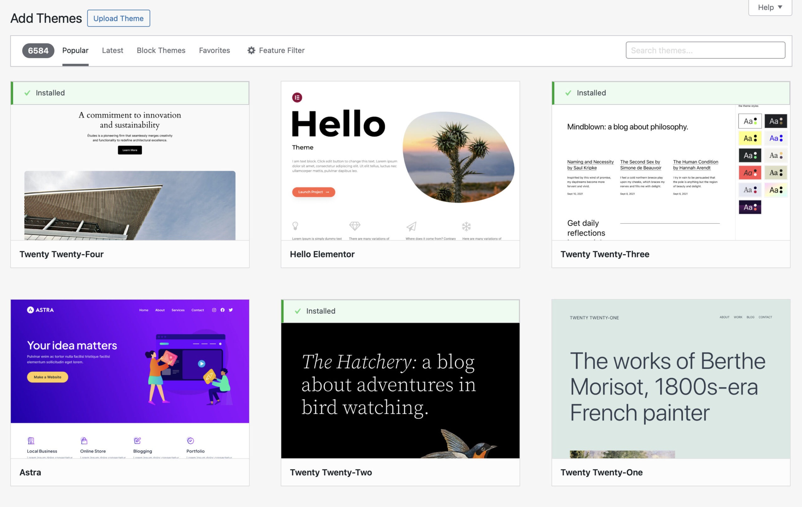
Elementor is extremely popular, in part because there’s a companion theme/gateway drug called Hello Elementor. It is the most popular third-party WordPress theme, as evidenced by its lofty position at the top of the WordPress theme download screen, surrounded by the official annual themes and one other third-party theme, Astra. (I actually really like Astra, because for the most part, it does things the WordPress way.)

Why is Hello Elementor so popular? Presumably people do like it. But I think it is also an example of what I would call the popularity feedback loop. It’s a natural, and harmful, side effect of a page like this, also commonly seen on e-commerce sites.

If you sort things by popularity, with the most popular items at the top, those are what people are going to see first. And most people don’t want to spend a lot of time considering options. They may trust popular opinion, or they may be too impatient to consider their options carefully, or they may just not care at all. So they click on the first thing that catches their attention, thereby making the popular thing even more popular, and dooming less popular options to oblivion, regardless of their quality.

The people choosing to default these lists to ranking by popularity may think they’re making an objectively straightforward choice, but they’re not considering how the popularity feedback loop might have much more of an effect on the rankings than quality, because they’re falsely assuming that people are making careful, rational choices.

There’s another reason in this specific context why it matters. New users don’t understand the WordPress ecosystem. They don’t know about third-party themes and plugins. They don’t know what does or does not adhere to “the WordPress way.”

So, a new user comes in and wants to pick a theme for their site. Their eye is drawn to the Hello Elementor screenshot, which has been carefully designed to be attention-grabbing, especially compared to the rather pedestrian appearance of the official themes.

That’s all fine in and of itself. Third-party themes are great! But when you activate the Hello Elementor theme, it immediately starts prompting you to install the Elementor page builder plugin as well. If you’re not an experienced user, what are you supposed to do with this? You probably install it, of course. And now you’re in page builder land. It’s not WordPress anymore. The experience is completely different.

But what is it about page builders that’s so bad? (And this part really applies to Gutenberg to a large extent as well.) They’re supposed to be making it easier to design your web pages, right? Well… there’s only so much you can do to make designing a web page easier. There’s no way to deal with things like margins or padding without understanding what margins and padding are. The page builders end up being CSS GUIs. Maybe you’re not writing the code, but you still need to know the concepts to get anywhere. So you end up either creating a convoluted mess, or at best you do learn the concepts, but in a compromised way, that is inextricably tied to that page builder plugin. It’s lock-in.

I could go on, but I think there are two main ways to address the problem of the popularity feedback loop, at least as it applies specifically to WordPress themes, but also more generally:

  1. Don’t default to a “most popular” view. I know it takes a lot more work, and is a lot more subjective, but the best default would be a “recommended” view. Some editorial decisions need to be made. Consider popularity, of course, but also consider context. Which themes are the best for a newcomer? Which ones offer the most pure WordPress experience?
  2. Make the “most popular” list conditional. This is a more automated version of #1. Maybe you don’t have a carefully curated editorial list of recommendations, but at the very least, determine some criteria that can restrict what shows up in the list. For starters, maybe a theme cannot load with an admin notice pushing users to install a plugin. Would Hello Elementor be such a problem if it didn’t immediately lure new users into installing a page builder plugin too? Probably not.

Ultimately, I have my own selfish motivations in all of this. I develop a number of WordPress plugins myself, and I need to provide user support for them. And a significant percentage of my overall user support load — I would say it’s around 15-20% — is around conflicts with Elementor.

An even dumber workaround for how dumb CSS hyphenation is

Look, it’s all well and good that CSS has a hyphens property. The problem is, that property is really dumb. It’s all-or-nothing, with no rhyme or reason to whether a word absolutely needs to be hyphenated. It will literally hyphenate any and every multi-syllable word at the end of a line.

You really almost never want that.

In my particular case, I’m looking at a very specific situation. Specific, but I am guessing probably the most common situation where a web developer wants a browser to hyphenate words: words in large headings that are too long to fit on a line. What I mean here is individual words that are by themselves too long to fit on a line, typically in a mobile browser, in headings with large or extra-wide fonts.

There are proposals to improve this, but there is currently nothing with broad browser support. So I invented my own.

This is a crafty little combination of CSS and JavaScript. (OK, technically it’s jQuery, but you could reasonably adapt this to vanilla JavaScript if that’s your thing. Since I’m deeply immersed in the jQuery world of WordPress, I just went with jQuery because it’s simpler for me that way.)

The first thing you need is a special CSS class for hyphenation. Since I only want it to apply on mobile devices, I gave it a logical name, and defined it in my CSS media query for the mobile breakpoint:

@media screen and (max-width: 782px) {
    .hyphenate-on-mobile {
        -webkit-hyphens: auto;
        hyphens: auto;
    }
}

OK, with that set up, then we just need a little jQuery function to determine where it’s going to be applied. I want it to get added automatically to any h1, h2, h3 or h4 tag. (I’m skipping h5 and h6 because they’re small enough text that we shouldn’t need it.) I also made the somewhat arbitrary decision to set the minimum word length at 15 letters. This is something you may need to adjust based on your font size. Here’s the jQuery:

jQuery('h1, h2, h3, h4').each(function() {
    var words = jQuery(this).text().split(' ');
    var i = 0;
    var hyphenate = false;
    while (i < words.length) {
        if (words[i].length >= 15) { hyphenate = true; break; }
        i++;
    }
    if (hyphenate) {
        jQuery(this).addClass('hyphenate-on-mobile');
    }
});

And then you just want to make sure that jQuery gets fired off when the page loads. It works!

The final (?) verdict: Gutenberg (a.k.a. the WordPress “Block Editor”) is fundamentally flawed and unsustainable

I’ve been trying. Really I have.

From its initial release as part of the WordPress core in version 5.0 in late 2018, up until early 2022, I adamantly refused to use Gutenberg. I felt its conceptual flaws and practical limitations were so profound and so obvious that I really could not believe this was going to be “the future of WordPress.” And now here we are.

In the spring of 2022 I finally relented, as at least the initial impression of the user interface had improved to a point where I felt I just needed to embrace it or move on. And so I created a new base “Block Theme” for future WordPress projects, and began building new client sites with it.

The past year and a half of dealing with Gutenberg more directly has been a painful rollercoaster of emotions, as I’ve tried repeated to convince myself it’s good, only to have it, once again, prove itself a hot mess of ill-conceived and barely-documented hacks.

Many times in the past 18 or so months I have contemplated abandoning WordPress for good, checking out ClassicPress and some other CMS options before falling back on giving Gutenberg another chance.

I’ve even considered writing my own Content Management System (CMS) [again; it’s something I specialized in before 2014]; switching to Drupal, for God’s sake (until I read that they’re porting Gutenberg for Drupal too… why why why?!); scrapping CMSes altogether in favor of just building sites with Bootstrap (and giving clients some rudimentary editing tools for the very few elements of their sites most of them actually modify post-launch); and even quitting the field entirely.

Frankly I don’t have the time or energy to make an extensive, coherent case for why Gutenberg is so fundamentally flawed; suffice to say it’s a combination of four main issues:

  1. frustrations over its excessive reliance on React (the Flash of the 2020s) for so much of its functionality,
  2. irritation at its embrace of the “make the interface seem simple by just hiding everything until the user hovers over the right magic spot” approach to UI/UX design,
  3. trying to get a handle on how the damn thing works, due to its combination of woefully inadequate and outdated documentation, and the fact that it is constantly changing, in ways that break my code (which was written based on earlier assumptions about how things worked, because that was all I had to go on), and
  4. its absolute, unforgivable abandonment of the core web design principle of separation of content and presentation.

The last one is really the killer, and it is only getting worse, because not only does the code — that fragile, convoluted, redundant code, stored in the database — become increasingly unmanageable the more you build your site, but WordPress is constantly pushing more of its structure into this disastrous framework (if you can call it a framework). The Site Editor is a true abomination that can’t possibly be useful to anyone… except possibly “no code” website builders. But honestly, if you can’t write code, you should just be using Squarespace instead of WordPress. You’ll be much happier, and so will your clients.

All of these issues probably stem from one even more basic to the whole discussion though: the creators of WordPress (especially imperious leader Matt Mullenweg) do not consider WordPress to be for what most of us “WordPress professionals” actually use it for. To them, it is blogging software. Period. But very few people who make a living in the WordPress ecosystem are using it to build blogs. Instead we are using it as a general-purpose CMS.

Gutenberg is adequate for a basic blog — in fact, I’m using it for this one, and I do prefer editing my posts in Gutenberg vs. Classic Editor. Its severe flaws and limitations don’t become readily apparent in the “basic blog” context.

There’s an argument to be made that Gutenberg really exists for WordPress.com to compete with the likes of Medium and Substack, and the industry of us web professionals who use the open source version are of no consequence to Matt’s vision for the platform.

Anyway, I have managed to launch about ten new client sites in the past year-plus using WordPress with Gutenberg, and every time I have had to face frustration and embarrassment as I acknowledge with clients the limitations of the tool, or sympathize with their frustrations in dealing with it as users.

My current project may be the last straw though. I’m two days away from launching the biggest site, by far, that I’ve built with Gutenberg. It’s over a year in the making, and now at the eleventh hour I am confronting the possibility of having to manually edit a huge number of posts in a CPT I created — and naively used the Block Editor to manage instead of just some ACF fields — because the client wants to change the default text sizes.

It’s possible this situation could be remedied by the merger of Block Patterns and Reusable Blocks that happened in WordPress 6.3, but guess what… we had already created all of this before that functionality was an option. I still haven’t had time to even figure out exactly what the implications of these 6.3 changes are, because I’ve been too busy just trying to build the site.

That’s where WordPress is really dying for me as a viable platform to work on. It’s supposed to be the foundation for what I do, but now the ground is constantly shifting beneath my feet. Gutenberg is making web development much harder and more frustrating, projects are taking longer, and it’s making me look incompetent and unprofessional to my clients. I’ve been a professional web developer since 1996; I’ve been using WordPress for projects since 2008, and almost exclusively since 2014. But now I don’t trust it anymore.

I’m in a position where I may (fingers crossed) be able to back off taking on any new freelance projects for the remainder of the year, once this site has launched. I am really hoping that’s the case, because it’s time for me to make a serious re-evaluation of whether or not I want to build any more WordPress sites in the future, and if not, I need to take that time to learn — or build — a new platform.

The great irony, of course, is that my business has increasingly been made up of selling and supporting my commercial WordPress plugin, ICS Calendar Pro. Fortunately, my work on that plugin has very little to do with, nor is significantly impacted by, the Gutenberg/Block Editor project, although that may change as WordPress continues to (d)evolve.

(Don’t even get me started on how bad Gutenberg is for responsive design.)