On instruction vs. understanding

I’ve assembled a lot of IKEA furniture in my life, and along the way I’ve learned a few things, such as:

  • Every piece of IKEA furniture comes with an identical Allen wrench, which you will only ever use to assemble that piece of furniture, and which will forever after gather dust in a drawer in your basement with all of the other identical Allen wrenches you’ve acquired at IKEA.
  • A lot of stuff that looks like wood is actually a woodgrain pattern printed on plastic-coated paper, wrapped around a block of glued-together sawdust.
  • Every piece of IKEA furniture will take two hours to assemble, no matter how large or small, or how many separate pieces it contains.
  • Assembly might take slightly less time if you possess a Ph.D in archaeology with a special emphasis in either Egyptian or Mayan hieroglyphics.
  • You will almost always realize 2/3 of the way through the process that you are doing it backwards.
  • It never gets any easier.

Those universal hieroglyphic assembly instructions are, along with the ubiquitous Allen wrench and product names featuring umlauts or o’s with slashes through them, the most easily mocked symbol of IKEA. The pictures are often inscrutable, and the overall impression overwhelming. More than once I have felt compelled simply to curl up in the corner of the room and weep silently.

But written assembly instructions (from other companies, of course) are often far, far worse. If I can’t make sense of a diagram showing exactly how the parts fit together, how am I possibly supposed to understand written instructions along the lines of “insert the ball socket assembly into the reverse threaded wall mount bracket and affix with the supplied 8mm Torx screws and self-locking bushings”? (OK, I just made that up, but it sounds real, doesn’t it? Wait, what are you doing over there in the corner?)

And therein lies the problem: there is a great mental chasm between instructions and understanding. It doesn’t matter what form the instructions take: written, visual, verbal, semaphore. Whether you approach them in an unthinking, just-get-it-done, “paint by numbers” fashion, or you attempt to read and absorb them all before beginning, instructions can only communicate so much.

Recently I attempted to assemble and install a curtain wire system from IKEA, for the purpose of hanging posters from bulldog clips at the new Room 34 studio. The instructions supplied with the curtain wire were some of the most panic-inducing I’ve ever seen from IKEA, and that’s saying something.

The first two times I tried to put this thing together, I just gave up. Then I decided not even to bother with the instructions. Instead, I closely examined the various parts, until I came to my own understanding of how they fit together, and how it all attached to the wall. From that point, I was able to refer back to the instructions in a new way, as a reminder of my own thought processes, rather than as a bizarre alien communication from some distant Hömwørld.

I’ve been in IKEA’s shoes, though. Not literally. I don’t think they sell shoes, although I have seen fuzzy slippers there in a big wire bin for 99 cents a pair. But I have had to prepare instructions myself, and to lead training sessions where I attempt to communicate to my clients how to use web applications I have developed for them. It’s a challenge.

How much information is too much; how much is too little? What is the right information to convey, and what can they do without? Is it better to provide a broad foundation of knowledge or a targeted “cheat sheet” of most commonly used tasks? How do I stop instructing people and help them to understand?

I don’t have the answers. I’m still exploring. In my own experience, it’s direct, hands-on activities that are directly applicable to solving real-world problems that best allow me to develop my own unique understanding of how a system works. But it can be incredibly difficult and time-consuming as an instructor to develop suitable training materials and create an environment where that type of learning can take place.
Panic’s “Atari” game art, framed and hung at Room 34 HQ

The other day I mentioned the super-cool watercolor-and-pencil game art Panic recently commissioned as part of a reimagining of their Mac software as early ’80s Atari 2600 games.

I ordered both the reproduction game boxes and the art prints, and they arrived just four days later (i.e. yesterday). They look amazing. As recommended by Panic, I headed out to IKEA this morning and picked up a couple of Ribba frames. The art prints were specifically designed to fit perfectly into these frames. I contemplated getting frames for all four of them, but at $20 a pop it seemed a bit much. So I went with two, for the two Panic programs I actually use (Coda and Transmit). It was just as well, anyway. Since they’re so big, two is all that fit on the wall above my desk!

The photo below shows Room 34 HQ, now graced with these fantastic looking prints. This wall was blank for months, and I had just been thinking I really needed to hang something up there, when these prints became available. The timing was perfect and I couldn’t be happier with the results! (Unfortunately the photo probably reveals, more than anything else, the limitations of the iPhone camera, especially indoors at night. I had every light in the place turned on but this was the best I could manage.)

panic_at_room34

My new workstation set-up

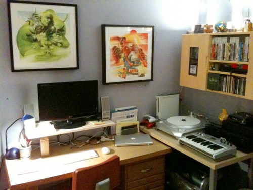
Working mostly from home (save for the occasional coffeehouse “office” day) for the last year and a half as a freelancer, my workstation set-up has been a slowly evolving arrangement. First I was in a bedroom on the main floor; now I’m in a dormer upstairs. I’ve been working exclusively with my MacBook for most of that time, but with increasing frequency I’ve had to work on large-layout web pages for clients with no access to a screen larger than 1280×800. Yesterday I finally decided it was time to make a change. I wasn’t up for the $899 outlay for a 23-inch Apple Cinema Display, so after a little (OK, very little) research, I settled on an LG 20-inch LCD that supports 1600×900 resolution, for $159 at Best Buy.

I quickly found that using the keyboard on my MacBook while looking at the LG display was not a satisfactory arrangement, so I also added an Apple Bluetooth wireless mouse. I also found that my desk surface was too low for the new monitor, so I solved that problem with a $6.99 wall shelf from IKEA. That shelf also works well for elevating my computer speakers — a change that makes a surprising difference to the sound. While I was at IKEA I also picked up a solar powered LED desk lamp. Anything to help reduce the number of cords on my desk.

The only problem I’ve encountered so far is the Mini DisplayPort jack on my MacBook. There’s… something… wrong with it. Not sure what, but the Mini DisplayPort adapter doesn’t fit properly. In fact, it requires a tremendous amount of force to insert the plug into the jack. So much so, that I was convinced at first that it was the wrong adapter. But it’s not. It works. But I’ve confirmed that forcing the plug into the jack has actually damaged the plug. But it still works, so for now I’m living with it.

Overall, I’m happy with the arrangement, even if some of the details (the intense brightness of the LCD display, the need to put the solar cell in the window to charge it during the day, along with a few other quirks) are imperfect. But my improved posture itself is enough to justify the effort.

And now, a crappy picture:

New workstation set-up

Added bonus: I hadn’t even thought about the awesomeness of dual displays when I set out to get the LCD. Also, it’s nice to put my Mighty Mouse to use again after it’s been sitting in the desk drawer for months. But the biggest unexpected change — I figured out that the vintage optometrist’s chair I use (along with the vintage optometrist’s desk you see in the picture) actually can be raised… so I cranked it all the way up.

On IKEA’s sad validation of Verdana

IKEA 2010 catalog, set in... GAACK! VerdanaAny use of a font is a validation of its aesthetics, and since I find the aesthetics of Verdana appalling, I am sad to see it get validation from the likes of IKEA.

I feel like I got a bit of a scoop here, because I first noticed the use of Verdana at IKEA about a month ago. At the time I thought it was a fluke — I saw it on one of their vertical banners, posted near the cafe, and it appeared to be a locally-produced sign advertising some particular regional specialty they were temporarily adding to the menu. It looked like someone at the local store had tried to design a banner to match the corporate standard, but was ignorant of the nuances of fonts, and used Verdana because they either didn’t have Futura or couldn’t tell the difference (gasp!)… or both.

But then earlier this week I was leafing through the 2010 IKEA catalog that was sitting on our coffee table, when it struck me that the whole bloody thing was set in Verdana. How could this be?!

As I said, I feel like I got a bit of a scoop here, because I mentioned this observation on Twitter three days ago, and only now is it showing up on Daring Fireball via lonelysandwich via Hunk-O-Mass via jhn brssndn via hellaposer via Typophile. And apparently Typophile does not yet have the bandwidth to handle being “fireballed” and “sandwiched” (and… uh… “34ed”… yeah, that’s it), since I can’t get it to load right now.

I feel like I’m in good company though, because these guys are echoing my longstanding sentiments towards Verdana. From Gruber:

I have never seen Verdana look good in any way other than in small sizes on-screen.

And, even more on-the-money, from Lisagor:

Sure, Gruber uses it tastefully, but at anything larger than 11pt, it feels to me a bit squat and dopey. Friendly and readable, but a little bit simple, in the way you’d say a person is simple, but only behind his back.

Well played. Part of IKEA’s rationale is that “they want to be able to give the same visual impression both in print and the web.” Well, that can be done without resorting to this abominable solution. Especially with the imminent ascension of @font-face.

Here’s hoping 2011 will bring a return to sanity.

The humble quest for cheap furniture

Last night was not unlike so many other nights in my household, although it was imbued with a special sense of purpose. Far more than the usual preparations had taken place: I made the great trek to the basement to retrieve the tape measure and actually determine with some level of accuracy the physical dimensions of a space in our house that we envisioned filling with yet more cheaply priced, cheaply made, pressed-sawdust-and-glue-with-fake-woodgrain-laminate-surface, some-assembly-required (OK, all-assembly-required, and-with-a-tiny-awkward-metric-Allen-wrench-at-that) furniture, courtesy of IKEA.

IKEA is a mystical place with a rabid cult-like following, and for many years SLP and I have counted ourselves among them. We pined for the big blue-and-yellow box when we left California, and we praised the heavens when we learned it would finally grace the adopted homeland of 99% of the world’s Swedish emigrants. (C’mon, what took so long?)

But I gotta say, the magic is wearing thin. Too many meals of dried-out overcooked meatballs and new potatoes for which the adjective can only be intended as irony. Too many cheap pieces that took way too long to assemble and then never quite matched anything else and eventually ended up in the basement, on the curb, or in pieces (for sport).

Alas, last night was just such a time. We were on a mission to locate and acquire at least five, perhaps more, short bookcases to line a knee wall below an angled ceiling in our upstairs. But the $20 “Kilby” (or was that “Billy”… or “Fjørnårsl” or some such nonsense) bookcases we had our eyes on happened to be 2 inches too tall. Oh well, at least we fed the entire family for under $11.

What to do… I know! Let’s try Target! 80% of the cheap, DIY furniture in our house may be from IKEA, but the other 20% is from Target, and the bookcases we already have and know will fit, which we thought we had gotten at IKEA, must’ve actually been from Target.

The problem is, Target’s gotten too big for its britches. In trying, admirably, to position itself in stark contrast to Wal-Mart, they’ve gone and done away with all of the basics, like the cheap, no-frills Sauder (slogan: “Good furniture made possible”… yes, possible!) bookcases and such that they used to carry for years and years. My wife constantly complains that Target is lacking this or that simple necessity, but for me, now, it finally hit home.

Faced with having my grand mission of obtaining approximately 25 cubic feet of book storage for less than $100 devolve into nothing more than a rambling trek along American Boulevard, with nothing to show for a wasted evening besides a mediocre meal and my son’s Blue’s Clues jigsaw puzzle (which just goes to prove Target Axiom #2*), I pulled out one last possibility.

Well… we could always try Menards.

Now you have to understand, I am deeply scarred from a lifetime of unwilling exposure to the Menards guy (yes, I was just as shocked as you are). He’s long since retired, but the mind-melting jingle (“Save big money at Menards!”) endures. I have nothing against the place, in particular; it’s just not a place I generally think to go to for… you know… anything.

But it just so happens that there was one a convenient distance from Target. On our way home, in fact. So, why not check it out? I was amazed. They had a mountain of just the cheap Sauder bookcases I was looking for… but a new model… wider… and on sale for $15.88! So we actually ended up getting more precious cubic feet and saving about $20 from what we’d expected to pay at IKEA or Target.

I was a bit disheartened, though, to notice the bookcases are apparently a part of Sauder’s “Beginnings” product line. Ten years of marriage, and we’re still stuck on “Beginnings.”

Anyway… tonight came time for assembly. Now I’ve put together enough cheap furniture (and then some) in my lifetime. I’ve seen so many of that particular sort of cam locking screw mechanisms (and the wooden support pegs that always seem to be paired with them) that I could probably put together something assembled with them without instructions… or tools… using my feet… while sleeping… in another house.

Sadly, it was not enough humiliation for them to simply call these bookcases “Beginnings.” No, no. The cam locks are gone, and in their place a new device of such cunning design, given the almost sinister appellation “hidden connector,” that I am convinced that the only reason Sauder still retains designers in its employ is to concoct ever more devious, counterintuitive, and downright impossible means of sticking two boards together. What’s so bad about, you know, a screw?

The hidden connector consists of a circular piece of brown plastic, about the size of a quarter and 1/4 inch thick, with two opposing holes on the edge and a large angled hole on one side. These are pounded with a hammer into circular holes that just slightly overlap the edge of the shelf boards. Then you insert special screws into the angled side hole and stick them through the edge hole that lines up with the place where the hole in the wood overlaps the edge (are you still with me?), although actually you should have put the screw in the plastic piece first… that’s easier.

Next, try to figure out a way to stick a screwdriver in the hole at an angle and actually make solid contact with the screw head. Good. Next, attach the shelf to the side pieces, and repeat for the other shelf… but don’t attach it too well, or you’ll never get the bottom bracing board, held in with four metal pegs, in place without having to use undue force and, in the process, scratch the hell out of the thin layer of laminated oak pattern lithographed paper that’s glued to the outer surface of the pressed-sawdust-and-glue boards that constitute this fine piece of furniture, the best you can buy for the price of a CD or an extra large supreme pizza.

OK, how long did that take, 45 minutes? Great! One down, four to go!

Ah, the things I’ll do to save a buck.

* Target axioms: 1) If you go into Target set on buying one small thing, and only that one small thing, you will still somehow end up spend at least $50 and needing one of those jumbo plastic shopping bags to hold your purchases; 2) Even if you are absolutely convinced that you will walk out of Target empty-handed, if only just this once, you’ll still end up buying at least one item.

Addendum (October 27, 2006): I’m sad to report that it appears the “Menards Guy” website is no more. As for the Menards Guy himself, I do not know…