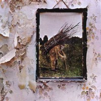
 It’s so cliched that it barely even registers anymore. In fact, even though I consider myself a Led Zeppelin fan (I own all of their albums except In Through the Out Door), I have generally spurned “Stairway to Heaven” as decent, but overrated and definitely overplayed (on classic rock radio). So great has been my disdain that I have not actually listened to the song in years, and come to think of it I’ve generally avoided the entire fourth album as a result, tending to prefer Houses of the Holy and Physical Graffiti instead, and I usually think of “No Quarter” as “Stairway to Heaven” done right.
Well, last week I was at a Joe Satriani concert, and his monster bassist, Stu Hamm, played a familiar snippet of a tune in his crazed, unaccompanied bass solo. I couldn’t place it but my companion identified it as “Going to California.” At that point, I realized I had shunned this album for too long. So anyway, tonight I am sitting here listening to some music on my headphones and I decided, “What the heck, let’s listen to ‘Stairway to Heaven.'” I guess the fourth album has just been on my mind lately. So… yeah. I’m kind of hearing the song with fresh ears for the first time since probably high school, when I actually did hear the song for the first time. And wow, it’s actually a really good song. Great compositional structure; I love how it builds up dynamically from beginning to end. Great guitar playing from Jimmy Page (even if a bit out-of-tune but, come on, how can you possibly sound in-tune when you’re playing along with a recorder trio?), unusually delicate singing from Robert Plant, John Bonham is is usual inimitable self, and John Paul Jones provides excellent bass and keyboard support, as always.
If you haven’t listened to it in a while, give it another chance. I’m glad I did. And now I’m listening to “Going to California.”
