Come on Apple, give me more control over the stupid crap I don’t want in your interfaces

I can sometimes get hung up on small, seemingly trivial details of things. A perfect example of that is the absolutely stupid “bounce” animation on Liquid Glass on/off toggles in the “26” OSes.

I have been wanting a tidy way to get rid of that annoying nonsense from the moment I first saw it. It’s one of many things about Liquid Glass that annoyed me enough that, as soon as the “27” OS betas were available, I immediately installed them on all of my devices — my Mac, my iPad, and my iPhone. Even though betas can be unstable. I’d rather have instability than the hideous mess that macOS 26, in particular, has been for the past several months.

So anyway, I’m not entirely sure if the “Reduce Motion” option had this particular effect in 26, but in 27, one of the (many) things it changes in the interface is that it removes the bounce. Yes!

I don’t really like some of the other motion reductions, especially the transitions between apps and the home screen in iOS, but I’ll live with it.

Unfortunately, and honestly quite surprisingly, I discovered that one of the things it reduces is animation in web pages. Including animated effects I might be working on within websites I’m building for clients. While in the Block Editor on a site I’m currently building, I noticed the following alert:
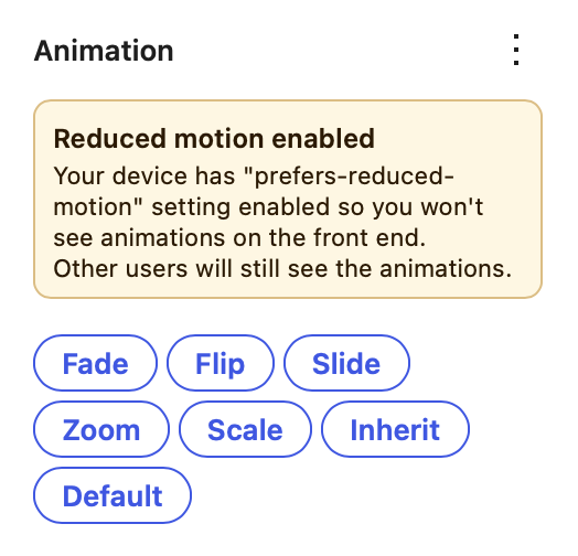
So, in other words, the only way I can get my Mac to not have that dumb bounce effect on OS interface toggles is to turn off my ability to see animated effects I’m creating in websites I’m building.

This is a very small problem in the grand scheme of everything in the world going completely off the rails. And yet, it’s a part of it.


I also don’t like the fact that Pages and Numbers have AI auto-suggested filenames when saving new documents. Just stop.
A brief reflection on Facebook’s anti-UX

I am convinced that Facebook designs its user experience (UX) as anti-user experience. Their goal is not to make their site intuitive, friendly and convenient. It’s not to surprise and delight. (Well, surprise maybe.) It’s all about doing everything it can to dangle just enough of a carrot in front of you that you’ll click more times than you want to, exposing yourself to more ads, which translate to more revenue than they could reasonably justify if the advertisers knew just how brief and worthless those “impressions” really are.

Anyway… here’s an example of the latest annoyance, in the form of a Your Memories on Facebook block. This is what I saw in my browser window:

It’s an extremely brief teaser of and old post of mine that, yes, I actually am interested in seeing, since I am really missing the Minnesota State Fair this year. So I click on See more… but nothing happens.

I’m sure most users are just utterly confused by this, and may or may not understand that what they’re seeing is a preview of what their friends will see if they share this “memory” on their timeline. It doesn’t matter if they understand or not though, because Facebook has done enough user research to know that they’ll still keep clicking things to try to see more, leading them to the only links here that actually do anything, the Send and Share buttons.

Clicking Share pops up another window that shows a bit more of the post, but still not all of it, and another non-functional See more… “link”. But the only way to actually see the entire post is to share it on your timeline. Which is the only thing Facebook wants you to do here, because it “drives engagement”.

I’d insert an eye-roll emoji here but I’ve turned off that feature in WordPress, because I hate every part of everything right now.

Since I’m sure you’re dying to know how this all ends… here’s a screenshot of the shared post on Facebook.

See more…

Seriously, DNC?

It’s at times like this that I begin to question my membership in the Democratic Party. This bit of ridiculousness arrived in the mail today.

kitchencabinet