A configuration-based solution to the translucent menu bar in Leopard

I had forgotten I’d even found and tried this until I looked up at my menu bar today after changing my desktop image and noticed it was opaque. I can’t find the site where I originally got the code, but I’ve found another blog that mentions it. The code to execute at the command line is:

sudo defaults write /System/Library/LaunchDaemons/com.apple.WindowServer 'EnvironmentVariables' -dict 'CI_NO_BACKGROUND_IMAGE' 0.63

(The code all needs to be entered on one line, of course; I need to work on my CSS for displaying code, probably employing Google’s Syntax Highlighter. So add that to my gigantic and ever-growing — at an increasing rate — to-do list. At my present trajectory, I will get this done approximately 10 million years after never.)

As the poster notes, the number 0.63 at the end can be any decimal value from 0 to 1. It represents the lightness of the opaque menu bar: 0 is black, 1 is white, and anything in between is shades of gray (surprise!); all non-white values have a subtle gradient as well.

This works great, which is not surprising, since this is the way Apple designed it to be managed. (In other words, they didn’t intend for the end user to be able to adjust it at all… but they built a way into the code to allow their programmers to adjust it.)

Of course, in the meantime since I first complained about it, I have actually come to tolerate (if not like) the translucent menu bar. But for now I’ll leave it as it is. If I do decide to change it back, I’ll run this:

sudo defaults delete /System/Library/LaunchDaemons/com.apple.WindowServer 'EnvironmentVariables'

And of course, because these are system-level changes, you need to reboot for them to take effect (which is probably why I had forgotten I’d done it in the first place; I didn’t restart immediately and surely got distracted by whatever it is in my life that’s constantly distracting me… two kids, perhaps).

Fear of a Blank Planet

No, I’m not referring to the most recent Porcupine Tree album (although I do highly recommend it). I am referring to my rather strange phobia.

This fear — well, not really so much a fear as just a source of inexplicable anxiety — is something that’s been with me for so long (and is so inconsequential most of the time) that I scarcely think about it, and even more scarcely ever think about how weird it is. But today in conversation with a couple of co-workers, I happened to mention it for some reason, and I really think they thought I was nuts.

So what is this phobia of mine? I’m afraid of blank spaces on maps. What does this mean exactly? It means that studying a map, and letting my eyes drift off into an unmarked void (or even worse, scrolling Google Maps to a point where recognizable features disappear) freaks the shit out of me. It’s even worse when I have Google Maps in aerial view, and I scroll off into open water, or God forbid, zoom in to a level where they don’t have any photos. (And don’t even talk to me about the cheese on Google Moon!) I’m immediately overcome with a visceral agitation at the site of, well… nothing, and I have to scroll the map back to civilization (or at least non-nothingness) or close the window immediately.

I searched for any sign online of anyone else with this particular quirk, but came up empty. The promising term “cartophobia” turned out to refer to the much more mundane (and much more understandable, I suppose) “fear” of maps in the sense that a person is intimidated by maps and doesn’t understand how to read them. My problem, I think, is precisely the opposite: I love maps and can study their minutiae in detail for hours. And I think that is exactly why “voids” on the maps freak me out so much… it’s like stepping into non-existence.

Although I don’t know the date, I can pinpoint the first moment in my life when I was struck by this fear: I was probably around 10 or 11, and my parents had gotten me a large poster-sized map of the world, for which I was quite grateful. I enthusiastically unrolled it and began examining it in detail. After what was probably several hours, I got ready to put it away, and then I made that most dreadful mistake: I looked at the blank reverse side. It’s nearly impossible to convey this in a way that doesn’t sound completely stupid, or that effectively communicates the apocalyptic panic that ensued. It really felt like I was staring right into the heart of nothingness, like the universe didn’t exist.

Certainly this phobia of mine is a minor inconvenience at best. It is not incapacitating in any way. As I said, I rarely think of it, and although I think I’ve talked to SLP about it, this is probably the first time I’ve ever mentioned it to anyone else in my entire life. But still, it’s real. And still, I wonder if anyone else has ever experienced it.

Update (September 1, 2021): Uhh… this…

So cool, and yet so… not.

Amazon.com has a big announcement for us today: its new product, the Kindle. I want to like this thing, mainly because it’s the first major consumer product (that I know of) to feature electronic paper. This is not just a high-resolution backlit LCD; it’s a completely new and revolutionary kind of display that apparently (I’ve never seen it in person) really does look like printed paper. But what’s printed on it can change, electronically. And it’s actually usable in the form of flexible sheets, albeit quite a bit thicker than regular paper.

Cool.

One natural application of this technology is to combine it with that languishing gadget category, the e-book reader. You could even have a reader that has multiple pages (literally) of electronic paper. (Think about spreads spanning multiple pages.) Now we’re getting somewhere.

So then, why does the Kindle suck so much?

If I had to pin it on one flaw, it’s the overall form factor: so big; so much extra space on the sides and top of the display (for no apparent reason), the weird angles, etc.

It just looks… weird. And retro-futuristic (in a bad way) like something Atari would’ve prototyped in 1983. On top of that, it’s expensive ($400). This already disappointing picture is apparently even further sullied by the snare of DRM. But most of all, the Kindle lets me down on the coolest aspect of electronic paper (other than the fact that it exists at all): the flexibility. No “sheets.” No fold-out spreads. No bendy. I want bendy.

In the end, I’m reminded of early electric and hybrid cars: though I have no proof of this, I remain convinced that the auto makers deliberately made them goofy looking to discourage sales, ensuring that there would not be a market for them. The difference is, I can see in that case how someone (the oil companies) could stand to profit from forestalling innovation. I’m not sure what the model is where someone would strongly benefit from killing the e-book.

Of course, what it comes down to is that I just want my electronic paper. I want it everywhere. A coworker was telling me about how another potential use not far down the line (once costs drop) is to use electronic paper for multimedia business cards. Savoring that possibility, it just occurred to me that the day may not be that far off when the wonders of J.K. Rowlings’ chocolate frog cards will finally be available to us Muggles.

But not today.

I suppose if you fall for this, you probably have it coming…

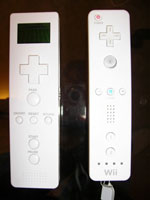
Wiimote ripoff

…but still, this pathetic handheld football game, a blatant Wii remote ripoff, is pretty appalling. When I see something like this, I just try to imagine being the kind of person who would mastermind a product like this. But I just can’t. I really cannot understand valuing a quick buck over having any kind of integrity.

Giving Microsoft a ribbin’ over the ribbon

OK, that was an incredibly lame title; I guess I’ve just read too many headline puns in Entertainment Weekly over the years.

Anyway, I’d like to take a moment out of my ongoing obsession with translucent menu bars and open source operating systems (OSOSes?) and turn to the “dark side,” if you will. (That’d be Microsoft.)

A few weeks ago I took a training course for work. The course was not actually on Office 2007, but the computers in the training room were equipped with it, and it did come into play a few times. This was my first exposure to this version of Office, and needless to say I was stunned (and not necessarily in a good way) by the radically altered user interface.

I wouldn’t say I have any kind of unhealthy attachment to the lowly menu bar, but it is, after all, one of the cornerstones of a graphical user interface. I suppose being a Mac user has an effect on my sense of its importance, since it is ever-present at the top of the screen. I do think the Windows approach, where the menus are integrated into the application window, makes more sense and is — perhaps (gasp!) — more intuitive for novice users. But regardless of where it is, in most applications it just needs to be there, and without it I’m as lost as I’d be if I were looking not at a computer screen but at the inscrutable LCD display of a photocopier or a fax machine. (Have I ever mentioned how much I hate photocopiers and fax machines?)

If you’ve not yet seen Office 2007, you may not understand where I’m going with this, but, yes… it’s true… the menu bar is gone — GONE!!! — in all Office 2007 applications. Instead, you have… this:

Microsoft Word 2007 ribbon

Credit where credit is due (so Microsoft will not sue, since this image is surely copyrighted), I swiped this screenshot from here.

Maybe it’s just the effect of Steve Ballmer‘s voice ringing incessantly in the ears of their developers, but Microsoft actually has the audacity to suggest that this “ribbon” reduces clutter. Never mind the fact that you likely will have no idea where your formerly familiar menu options have gotten off to in this sea of buttons. And do not for a moment ask yourself why, if the tabbed ribbons have replaced the menus, they couldn’t have at least given them familiar names and organization (“File, Edit, View,” etc.).

Maybe I’m too “old school.” Maybe I’m a “dinosaur” or a “curmudgeon.” Some have made the valid argument that this interface may in fact be more intuitive to a new user who’s not familiar with the older versions of Word, Excel and the rest (yes, PowerPoint and Outlook are the Professor and Mary Ann of Office). But I have to ask this: how many people who are going to be using this really have never used Word (or for that matter, a computer with a GUI) before? And even if they haven’t, is an interface that assaults the new user with no less than sixty-one (according to my count in the above screenshot) buttons, tabs, or other clickable thingamabobbers, really going to instill in them a sense of ease, comfort and self-confidence at the keyboard?

But the ironic beauty (for us Apple fanboys) of this new interface is more than skin deep. For me, the most, erm, (I’ll use the word again) stunning thing about the interface is the magical, shiny, multi-colored and oh-so-enticing (yet strangely off-putting) Office button in the upper left corner, which not only beckons to you like a mercury-flavored Spree in this screenshot, but in fact pulses (yeah, that effect was cool in 2001) to the point of literally begging you to click it.

Go ahead. Click it.

But only click it once. For if you click it once, it spreads before you the most wondrous, the most essential (and for that matter, just about the only) menu in the entire application, containing options for opening, saving, printing and whatnot.

Click it twice, though, and guess what. No really, come on. Take a wild guess. That’s right, it closes the program. Brilliant! That’s really taking the novice into consideration. If there’s one thing I know about novice computer users, it’s that they don’t understand the difference between a single click and a double click. In fact, it seems the human brain must be hardwired to intuitively grasp that any quick poking motion with a finger should be done twice in rapid succession, and it’s only through years of experience with a computer that the tech savvy among us have trained ourselves out of this habit. Why else would so many websites (the first realm in computing that so boldly ventured into the netherworld of the single mouse click) have to plaster their pages with warnings not to click “Submit” buttons twice, lest Amazon.com should send you a duplicate copy of The Birds in My Life. (For the record, I found that particular item by going to Amazon and typing “stuff old clueless people like” into the search box.)

Now where was I? Oh yeah… my desktop. Because that’s what I’m looking at now that I accidentally double-clicked the mercury Spree. I assume that button is intended to be the Office counterpart to the new Start menu icon in Windows Vista. I have yet to use Windows Vista, or even to encounter a computer that has it installed. Nor have I yet talked to anyone who’s actually purchased it or a computer that came with it, but I’d guess that’s mainly because I don’t know anyone like this guy:

A typical Windows Vista user

Yes, that guy was in a picture on this page. I went to Microsoft’s website, looking for information about Windows Vista, and the first human face I encountered was that of Andy Samberg‘s stoner (or would it be “stoner-er”?) little brother.

OK, well… I don’t really know how to wrap this up. It’s almost 2 AM and I’m spent. I might go weeks minutes before I can find anything more to criticize about Microsoft. But don’t worry, when I do, you’ll be the first to know.