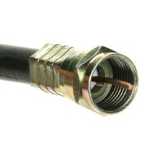
Am I the only person who thinks coaxial cable connectors suck?

It’s no secret that I hate cords. In fact, one of my earliest blog entries, dating all the way back to April 2002, covered the topic. That’s how much I hate them.

But what I really hate, even more than cords themselves, is the craptastic connectors on coaxial cable (i.e. the kind of cable used for cable TV). They suck! They are utterly terrible! The push-on kind are at least somewhat easy to use, but they can slide loose very easily. The screw-on kind, the much more common kind, are just plain absolutely terrible. If the cable isn’t lined up precisely, you can turn it and turn it and it won’t screw on. Other times, the moving screw-on tip doesn’t move freely enough, and when you try to turn it — if you can at all — it causes the entire cable to turn with it. Worthless!

I’m just in the process of mounting a flat-panel TV on the bedroom wall and moving our cable modem to a new room, hence the need to deal with these stupid cables and, as usual, piss and moan about how much they suck. But now, the whole world can know that I hate them! Am I the only one???

Obamangst? Jw and I are not alone…

It is perversely reassuring to know many other Obama supporters like myself are both optimistic and worried: Today’s New York Times discusses the phenomenon. Wednesday can’t get here soon enough!

Remind me never to get insomnia again

Two nights after having spent the entire night awake in the Children’s Hospital ER with a sick daughter, my sleep routine is completely off. So last night I was awake in bed watching TV until nearly 2 AM. After The Colbert Report ended, and deciding as usual that I was not interested in leaving it on Comedy Central to watch South Park (why, exactly, is that show still on?), I flipped over to MSNBC to see if Countdown or Rachel Maddow was being replayed. Well, no, it was Hardball, but I decided to just leave it on and wait.

First observation: Wow. An hour is a really long time. Although I found moments entertaining, and perhaps a few nanoseconds informative, I developed a newfound understanding for Einstein’s simple explanation of relativity:

Put your hand on a stove for a minute, and it seems like an hour. Sit with a pretty girl for an hour, and it seems like a minute.

He couldn’t anticipate the third corollary: Sit with Chris Matthews for an hour, and, like Meat Loaf, you’ll be praying for the end of time.

The end of time did arrive eventually, and Keith Olbermann appeared. It was, perhaps, not his best show, but I can’t recall how many times I’ve actually watched an entire episode of Countdown. Usually I just see clips on YouTube. I was glad to see that he (and all three hosts, to be sure) wasn’t going to let John McCain’s Joe the Plumber debacle in Defiance, Ohio (can’t make this stuff up) slip by. Rachel Maddow actually did the best filling in the details of the McCain rally there, though. Nowhere else all day long did I hear the fact that I personally found most interesting (and revealing) about the event: of the 6000 people in attendance, 4000 consisted of the entire student body of the Defiance public school system. The schools were closed for the day, and the students were bussed to the rally. Attendance, apparently, was required.

But the most regrettably memorable moment of the long 180 minutes I spent with MSNBC in the wee-est of wee hours last night, the moment that made me most wish I could be asleep right now, occurred not during one of the programs, but during a commercial break on the Rachel Maddow Show. I saw this:

The first two computers you see in the commercial are Macs. But I knew something was amiss when I saw the woman’s iBook (yes, I can see in a freeze-frame at 0:10 that it’s definitely an iBook, despite having the brand masked over) displaying a BSOD. If it were a MacBook, that would at least be possible — however unlikely, and I will acknowledge that’s at least in part because Macs don’t run versions of Windows before XP SP2, and how often does that BSOD?

Then we see at 0:42 an on-screen notice: “FinallyFast.com is for PC Computers Only.” Well, yeah.
No-show Joe

An awkward moment for John McCain.

The Guardian gets newspaper web design right

Most newspaper websites are cluttered but utilitarian at best. Many, like my local paper, have undergone elaborate and expensive redesigns in recent years but still suck ass, if for no other reason than that they can’t really get the interface right and so are interminably tweaking it, not to mention that they allow their advertisers to shit all over the page layout with intrusive Flash overlays that jump out unexpectedly and cover what you’re reading if you let your mouse hand drift across the wrong spot on the page.

I’ve noticed in general that the British media seems to have more design sense, in that they actually seem to care about making things usable — in other words, facilitating the dissemination of information — as opposed to first and foremost making a buck, no matter how crass the means.

I don’t think I’ve ever looked at a newspaper website, though, and said, “Wow, that’s really good design!” but that all changed today when I saw the new site for the Guardian.

Maybe it’s the fact that there’s no advertising whatsoever on the home page. At least that’s a start. The layout is clean and well-organized, and doesn’t feel crowded or overwhelming, even though there are four columns and approximately 85 gazillion links on the page. Something else that helps: color coded sections. There’s risk in using a lot of different colors in a design. The page could easily end up looking like My Little Pony barfed all over it. But the nine different thematic colors are represented solely by colored type in the navigation bar at the top (no colored rectangles or obnoxious 3-D tabs) and by thin horizontal bands identifying the beginning of each section’s home page real estate.

True, on my 1280×800 display, the home page scrolls to the height of seven screens. A bit much, but the aforementioned organization keeps things manageable.

Ultimately, the designers have somehow managed to find the optimal midpoint between bland, utilitarian black-and-white monotony and retina-scorching, brain melting sensory overload. And in the land of newspaper websites, the space between the two is surprisingly small.

It’s no wonder that they won Website of the Year in the British Press Awards. Kudos!