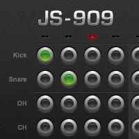
 You can’t change the tempo, and the visualizer slows it down big time (at least on the Mac, which seems less efficient at some client-side browser technologies like JavaScript and Flash for whatever reason). But nonetheless, I am in utter and total awe at this achievement in JavaScript.
18 November
You don’t run across this kind of stuff every day (anymore)
 It used to be that the web was nothing but sites like this: rambling, semi-coherent… well, webs of absurdist humor with no interest in or consideration of making money or doing anything other than amusing an inner circle and confusing everyone else. Speaking of inner circles, there’s a fair amount of stuff on here devoted to Ayn Rand, but not as a genuine disciple of her grandiose quasi-philosophizing; rather, in parody and/or mockery of it.
I was particularly intrigued when I read the microprint at the bottom of the page and saw a passing thanks to someone who, while surely not the singular worldwide owner of his particular name, is nonetheless unique enough that I suspect he is in fact the same person I went to high school with, but who now lives in Sweden. I’m not sure what he’s up to these days, but seeing as his greatest claim to fame in the early ’90s was having screen printed a number of t-shirts featuring a blow-up of a frame from Bloom County, wherein a generic “Liberal” — who happened to bear an uncanny resemblance to our band director — is popping prairie dog-like out of a hole in the ground* and shouting “No nukes!”, the connection would not surprise me.
And if you’re able to make any sense out of that last sentence, then you might enjoy reading on…
*OK, it’s not a hole in the ground; it’s a bush. But I was describing it from memory prior to my excessive amount of searching for the image finally bearing fruit, and afterwards I didn’t feel like rewriting the sentence.
Dog inequality in Walt Disney’s world
 As I would have suspected, I am clearly not the first person who’s wondered about this.
I generally don’t think too much of Disney cartoons. (Interpret that sentence how you wish.) I appreciate the technical achievement of their older hand-drawn animated features, and I love the Pixar films, but, to paraphrase a political term, those are DINO — Disney in Name Only.
As a kid I had little interest in Disney. I preferred the sardonic, slightly (and sometimes not-so-slightly) twisted humor of Looney Tunes to the ingenuous, wholesome tone of Mickey and friends. But my kids these days are obsessed with Mickey Mouse Clubhouse on the Disney Channel. (“Hot dog hot dog hot diggity dog!” It’s on right now.)
With this increased exposure to the Disney cartoon characters lately, I am reminded of a particular aspect of these cartoons that has always troubled me. There are two dogs in these cartoons. You’ve got Goofy. He wears clothes, he walks upright, he talks, and he’s generally considered an equal and peer to the likes of Mickey, Minnie, Donald, etc. Then you’ve got Pluto. No clothes, all fours, mute (does he even bark?), pet of Mickey Mouse. (Yes, a mouse with a dog as a pet. What a world!)
I suspect that the problem here is that we’re talking about characters who were never initially intended to appear together in the same cartoon. Looney Tunes has suffered the same fate in recent times, such as with the abominable Baby Looney Tunes (which my kids also like), wherein infantile, diapered (yet surprisingly verbal) incarnations of Bugs, Daffy, Taz, Sylvester, Tweety, and a few other latter-day characters who previously occupied overlapping but distinct cartoon universes now all live in the same house with Granny as their caretaker. It’s fine if one character bridges these gaps — Bugs might appear in cartoons with both Daffy and Taz, but not at the same time; Kermit the Frog might appear on both Sesame Street and The Muppet Show, but you’ll never see Fozzie in a twin bed with an F on the headboard, next to Bert and Ernie.
So really… maybe it’s not Walt’s fault. It’s probably just a case of latter day marketing “geniuses” who’ve twisted and combined these previously disparate, carefully constructed cartoon worlds into an illogical hodgepodge… and then thrown in just enough educational content to be able to stick the “E/I” badge in the corner of the screen to meet the FCC’s requirements. (Never mind the fact that cable channels like Disney aren’t subject to FCC regulation.)
OK, I guess I have no explanation. It just makes no sense. (After all, Pluto has been, since day one, the pet of a much smaller animal.)
Giving Microsoft a ribbin’ over the ribbon
OK, that was an incredibly lame title; I guess I’ve just read too many headline puns in Entertainment Weekly over the years.
Anyway, I’d like to take a moment out of my ongoing obsession with translucent menu bars and open source operating systems (OSOSes?) and turn to the “dark side,” if you will. (That’d be Microsoft.)
A few weeks ago I took a training course for work. The course was not actually on Office 2007, but the computers in the training room were equipped with it, and it did come into play a few times. This was my first exposure to this version of Office, and needless to say I was stunned (and not necessarily in a good way) by the radically altered user interface.
I wouldn’t say I have any kind of unhealthy attachment to the lowly menu bar, but it is, after all, one of the cornerstones of a graphical user interface. I suppose being a Mac user has an effect on my sense of its importance, since it is ever-present at the top of the screen. I do think the Windows approach, where the menus are integrated into the application window, makes more sense and is — perhaps (gasp!) — more intuitive for novice users. But regardless of where it is, in most applications it just needs to be there, and without it I’m as lost as I’d be if I were looking not at a computer screen but at the inscrutable LCD display of a photocopier or a fax machine. (Have I ever mentioned how much I hate photocopiers and fax machines?)
If you’ve not yet seen Office 2007, you may not understand where I’m going with this, but, yes… it’s true… the menu bar is gone — GONE!!! — in all Office 2007 applications. Instead, you have… this:

Credit where credit is due (so Microsoft will not sue, since this image is surely copyrighted), I swiped this screenshot from here.
Maybe it’s just the effect of Steve Ballmer‘s voice ringing incessantly in the ears of their developers, but Microsoft actually has the audacity to suggest that this “ribbon” reduces clutter. Never mind the fact that you likely will have no idea where your formerly familiar menu options have gotten off to in this sea of buttons. And do not for a moment ask yourself why, if the tabbed ribbons have replaced the menus, they couldn’t have at least given them familiar names and organization (“File, Edit, View,” etc.).
Maybe I’m too “old school.” Maybe I’m a “dinosaur” or a “curmudgeon.” Some have made the valid argument that this interface may in fact be more intuitive to a new user who’s not familiar with the older versions of Word, Excel and the rest (yes, PowerPoint and Outlook are the Professor and Mary Ann of Office). But I have to ask this: how many people who are going to be using this really have never used Word (or for that matter, a computer with a GUI) before? And even if they haven’t, is an interface that assaults the new user with no less than sixty-one (according to my count in the above screenshot) buttons, tabs, or other clickable thingamabobbers, really going to instill in them a sense of ease, comfort and self-confidence at the keyboard?
But the ironic beauty (for us Apple fanboys) of this new interface is more than skin deep. For me, the most, erm, (I’ll use the word again) stunning thing about the interface is the magical, shiny, multi-colored and oh-so-enticing (yet strangely off-putting) Office button in the upper left corner, which not only beckons to you like a mercury-flavored Spree in this screenshot, but in fact pulses (yeah, that effect was cool in 2001) to the point of literally begging you to click it.
Go ahead. Click it.
But only click it once. For if you click it once, it spreads before you the most wondrous, the most essential (and for that matter, just about the only) menu in the entire application, containing options for opening, saving, printing and whatnot.
Click it twice, though, and guess what. No really, come on. Take a wild guess. That’s right, it closes the program. Brilliant! That’s really taking the novice into consideration. If there’s one thing I know about novice computer users, it’s that they don’t understand the difference between a single click and a double click. In fact, it seems the human brain must be hardwired to intuitively grasp that any quick poking motion with a finger should be done twice in rapid succession, and it’s only through years of experience with a computer that the tech savvy among us have trained ourselves out of this habit. Why else would so many websites (the first realm in computing that so boldly ventured into the netherworld of the single mouse click) have to plaster their pages with warnings not to click “Submit” buttons twice, lest Amazon.com should send you a duplicate copy of The Birds in My Life. (For the record, I found that particular item by going to Amazon and typing “stuff old clueless people like” into the search box.)
Now where was I? Oh yeah… my desktop. Because that’s what I’m looking at now that I accidentally double-clicked the mercury Spree. I assume that button is intended to be the Office counterpart to the new Start menu icon in Windows Vista. I have yet to use Windows Vista, or even to encounter a computer that has it installed. Nor have I yet talked to anyone who’s actually purchased it or a computer that came with it, but I’d guess that’s mainly because I don’t know anyone like this guy:

Yes, that guy was in a picture on this page. I went to Microsoft’s website, looking for information about Windows Vista, and the first human face I encountered was that of Andy Samberg‘s stoner (or would it be “stoner-er”?) little brother.
OK, well… I don’t really know how to wrap this up. It’s almost 2 AM and I’m spent. I might go weeks minutes before I can find anything more to criticize about Microsoft. But don’t worry, when I do, you’ll be the first to know.