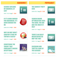
 As I mentioned the other day, the initial launch of this new site design was just phase one — window dressing. Window dressing I happen to like a lot, but still… same old clunky underlying structure. But not anymore.
WordPress has a pretty rudimentary home page structure by default. Everything’s just *SPLAT* right out there on the home page. Sure, you can use the <!--more--> tag to trigger some automagic stuff with “Read more” links, but overall, it’s not too fancy. Which isn’t to say it’s bad. Now, the default page layouts for some other open source CMSes like Drupal or Joomla, on the other hand… yeah, they’re bad. (Or at least they were, the last time I bothered to care.)
So while WordPress out of the box doesn’t do much fancy stuff with the home page layout, it’s extensible enough that a crafty developer (or a well-read tinkerer) can do some pretty nifty stuff with it. And that was my goal with this new redesign: I’ve got hundreds of posts dating back over seven years now, and most are eternally buried in the archives. I’m hopeful this new approach will bring some of that older content to light, with the random articles list on the home page and the related articles list at the end of each article page.
I didn’t do it all alone… I had some help from a nifty article from Smashing Magazine: 10 Exceptional WordPress Hacks. In particular I made use of numbers 5 through 8 on this list… with some modification. Some of my changes were purely to suit my taste, but others were to improve the usability of the features and in at least one case to fix a bug in the provided sample code. It’s probably worth discussing the details here.
5. Display Related Posts Without A Plug-In
I set this up in single.php so it will appear at the end of each of my articles. I experimented a bit with matching both tags and categories, but I found (for reasons I didn’t dig deep enough to explain) that WP_Query() does well with either tags or categories, but not both.
And, most importantly, I found (or actually, SLP did) that this sample as given breaks comments on the page. Some commenters on the original post mentioned this problem too, along with its solution: you need to call wp_reset_query(); at the end, to tell WordPress to go back to working with the original post’s content.
I also modified the example to look at all of the tags associated with the post, not just the first (can’t really figure out why the original version did that), and tweaked the HTML/CSS output to suit my design. Here’s a simplified version of the code I’m running:
<?php
// Get related posts
$tags = wp_get_post_tags($post->ID);
if (!empty($tags)) {
  $tag_list = array();
  foreach ((array)$tags as $tag) {
    $tag_list[] = $tag->term_id;
  }
  $args = array(
    'tag__in' => (array)$tag_list,
    'post__not_in' => (array)$post->ID,
    'showposts' => 5,
    'caller_get_posts' => 1,
    'orderby' => 'date'
  );
  $related_posts = new WP_Query($args);
  if ($related_posts->have_posts()) {
    ?>
    <h2>Related Posts</h2>
    <ul>
      <?php
      while ($related_posts->have_posts()) {
        $related_posts->the_post();
        ?>
        <li>
          <a href="<?php the_permalink() ?>"
          rel="bookmark" title="<?php the_title_attribute(); ?>"><?php the_title(); ?></a>
        </li>
        <?php
      }
      ?>
    </ul>
    <?php
  }
  wp_reset_query();
}
?>
My version also uses a special truncation function I wrote to display a short excerpt of each post, not shown here. (And yes, eventually I am going to get syntax highlighting set up.)
6. Automatically Retrieve The First Image From Posts On Your Home Page
This one worked pretty well. I changed the function name to something a little less quirky, and I also added some code to verify that the image actually exists, instead of just looking for an <img src> and assuming everything’s OK. This involved inserting the following block of code into the function immediately before if (empty($first_img)) {:
// Check that file exists
if (!empty($first_img)) {
  // remove http/ https/ ftp
  $src = preg_replace("/^((ht|f)tp(s|):\/\/)/i", "", $first_img);
  // remove domain name from the source url
  $host = $_SERVER["HTTP_HOST"];
  $src = str_replace($host, "", $src);
  $host = str_replace("www.", "", $host);
  $src = str_replace($host, "", $src);
  if (!file_exists(ABSPATH . $src)) {
    unset($first_img);
  }
}
If some of that code looks familiar, that’s because I copied it straight out of the next item. If I were writing it myself, or bothering to rewrite it, I would swap out that slightly cumbersome-looking three lines of str_replace() with a single preg_replace() — although perhaps the original coder knows something I don’t, like that doing it this way is actually faster. It very well could be; I know regular expressions are significantly slower than straight-up string replacements.
7. Resize Images On The Fly
I’m using this in conjunction with all of the other items here, no big surprise. I left it mostly as-is, although I did make one small change. I know well the dangers of scaling images up — they look like crap, basically. But a little scaling up doesn’t hurt. At least, it’s much less glaring than having a big set of uniform-looking images marred by one image that’s slightly smaller than the rest. That happened to me as I was putting this together, so I tweaked the script to allow images to be enlarged up to 1.5 times their original size. In timthumb.php I changed lines 103-109 to be:
// don't allow new width or height to be more than 50% greater than the original
if( $new_width > $width * 1.5 ) {
  $new_width = $width * 1.5;
}
if( $new_height > $height * 1.5 ) {
  $new_height = $height * 1.5;
}
8. Get Your Most Popular Posts Without A Plug-In
There was something about the way this one was written that really bothered me. Maybe it’s just that I have a knee-jerk reaction to seeing SQL code appear directly in a page template. But mostly it was that this didn’t match #5 closely enough. Luckily I discovered along the way that regardless of whether you retrieved post data using WP_Query (which returns an object) or with the $wpdb->get_results() method (which returns an array), you can use the same post functions once you’ve called setup_postdata(). So I kept everything from this example up through that, and then I used my modified version of the output code from #5 and it worked like a charm.
One other thing I’d recommend changing: it’s kind of silly to have the if ($commentcount != 0) conditional in there. Much better to just put WHERE comment_count > 0 in the SQL. I also added a date range to the SQL, to keep the list dynamic. In my case, it’s only looking at the most popular posts over a 3-month range. More active blogs could shorten that time frame. My full query looks like this:
$popular = $wpdb->get_results("SELECT * FROM " . $wpdb->posts .
" WHERE post_date > '" . date('Y-m-d',mktime(0,0,0,date('n')-3,date('j'),date('Y'))) .
"' AND comment_count > 0 ORDER BY comment_count DESC LIMIT 4");
There may have been some other changes I made that were relevant here but I think I covered all of the major ones. The tips on the Smashing Magazine site were invaluable in kick-starting my overhaul of the home page. It was uncanny that I stumbled upon this page today, just as I was getting down to this task anyway. It saved me a ton of time. But it still kept me on my toes, since all of the so-called “hacks” required some additional hacks of my own to get them working, or at least, to get them working the way I wanted!


 As I
As I 

