Stravinsky on that chord

Up to now I’ve only really been documenting it on Facebook (for some reason), but over the past 3 months I’ve been working on one of my most ambitious music projects yet, a prog/post-rock interpretation of Stravinsky’s Rite of Spring. It’s been an interesting exercise that has helped me to get very (very) familiar with the piece, and encouraged me to research more about its origins.

Today I discovered this delightful video of Stravinsky humorously recounting the early history of the piece. Specifically, demonstrating the chord at the beginning of “Augurs of Spring” to Sergei Diaghilev, the ballet producer who had commissioned the work.

I like very much this chord. It was a rather new chord, you know? An 8-note chord. But the accents were even more new. And the accents were really the foundation of the whole thing.

When I finished composing The Rite of Spring, I played it for Diaghilev, and I started to play him this chord. Fifty-nine times the same chord. Diaghilev was a little bit surprised. He didn’t want to offend me. He asked me only one thing, which was very offending. He asked me, “Will it last very long time this way?” And I said, “’Til the end, my dear.”

And he was silent. Because he understood that the answer was serious.

What is that chord? I think just to mess with us, Stravinsky notated it rather absurdly with F♭s and C♭s. From the bottom up, the notes are: F♭ A♭ C♭ F♭ G B♭ D♭ E♭. So, that’s… um… well, if it were written as E instead of F♭, with ♯s instead of ♭s, it works out to an Emaj7/♯9/♯11/13 chord. Another way to look at it is an E (F♭) major chord with an E♭7 (in first inversion) stacked on top of it. Since Stravinsky was exploring bitonality, this is the most likely explanation, but really there’s no good way to notate it. Over a hundred years later, this is still difficult to grasp.

Arial vs. Helvetica, Part II

Here we have another exhibit in the battle of Arial and Helvetica: two signs posted side by side, and obviously designed with some intention of consistency. Sort of. Their sizes are different, their shapes are different, and, of course, one is in Helvetica (the left) and one is in Arial (the right). But someone was clearly trying to make them match, to the best of their limited abilities.

This photo was taken this evening in the west parking garage of the Mall of America, near the Best Buy entrance.

Any guesses on which sign came first? I don’t know myself, but I have a hunch it’s the one on the left. The rounded corners and use of Helvetica suggest the work of a trained designer; the shortcut copycat approach of the sign on the right — sharp corners and Arial, seems characteristic.

I’m pretty sure the No Smoking sign would precede the Authorized Parking Only sign chronologically for logical reasons as well: the concern about misplaced smoking existed long before the concern about misplaced parking at MOA, the latter only becoming a serious issue within the last five years as both IKEA and light rail transit have considerably increased non-mall traffic to the area.

Arial vs. Helvetica at the Mall of America parking garage

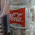
Mmmmmmexican Coke

I had noticed for some years that it was increasingly common to see, in the Mexican food sections of most local grocery stores, stocked in amongst the numerous flavors of Jarritos soda, a few glass bottles (the old-time returnable kind) of Coke. Mexican Coke. I never really “got it” or, frankly, cared too much to figure out what might be different about it and why it would be sold here, but lately it seems that the Cuba Libre (more commonly known simply as a Rum-and-Coke, or, if you prefer, a Rum-‘n’-Coke) is becoming trendy… for some reason. But along the way to that discovery, I also learned what’s different about Mexican Coke and why people, especially those who are used to it, would bother to buy it instead of the American version. The recipe still includes cane sugar.

Yes, although we’ve had “Coke Classic” here in the U.S. since the Coca-Cola company gave up on the insipid “New Coke” concept (although, interestingly, you can still buy it as “Coke II” in certain parts of Chicago), it’s not really the original formula, and not just because it doesn’t include cocaine. (I’m not talking that original here.) The U.S. version had the cane sugar replaced with America’s most beloved ingredient, high-fructose corn syrup, in the mid-1980s, around the same time that particular ingredient started showing up in everything. Click the link above to learn more about why Americans, or at least American corporations, love the stuff so much. It’s also worth checking out some of the commentary on the failed 1985 launch of New Coke and the reintroduction, a few months later, of Coke Classic. One almost has to wonder if the whole New Coke thing wasn’t just a risky ploy to ultimately get away with switching Coke Classic from cane sugar to corn syrup, since this was the moment when that transition occurred. Perhaps going straight to HFCS would have enraged customers, since it does taste slightly different, but the few months enduring the original drink’s miserable replacement made Coke Classic seem great, even if it was slightly different than before. But I digress… (Then again, isn’t digression the defining characteristic of this blog?)

Tonight SLP and I decided to try the “traditional” Cuba Libre, not just the college freshman’s intoxicant of choice, so although we still lamed out on the rum with Bacardi, we got a bottle of Mexican Coke, and took the extra step of including a lime wedge in the drink.

I didn’t actually try any of the Mexican Coke on its own, since I needed all of it for the mixed drinks, but even with the rum and the lime mixed in, I could tell the difference in the Coke. The drink overall lacked the cloying, slightly chemical-y taste I am now accustomed to in Coke. For a moment I had a flashback to the taste of my youth (minus the rum, of course). I look forward to trying a bottle of Mexican Coke on its own soon, preferably consumed straight from the bottle, since they’re the same shape and thickness as the old returnable bottles of yore… just slightly larger, since the Mexican bottles hold 500 mL (16.9 oz) instead of 16 oz.

I’ve noticed that Mexican Coke is getting easier and easier to find in the U.S. these days, so for those of you who, like me, are old enough to remember (though you may have long since forgotten it) the taste of pre-corn syrup Coke, I recommend picking up a bottle sometime soon!

Print (or save) that photo!

It’s come to my attention that printing from the new Gallery tool on the Offspring page is not as easy as it could be. Paying for Shutterfly prints is an option, of course, but you can also print the images right from the site or save them to your hard drive. Here are some instructions…

1. Click on the picture you want to print, so it appears by itself on the page in the larger size.

picture-1.png2. In the gray area above the picture, on the right side, you’ll see the date, owner, and size information. There’s a menu that allows you to pick other sizes to view, and the “full size” appears below that as an orange link (see picture). Click the orange link next to “full size.”

3. The page will reload displaying the full-size picture, which will most likely be too big to fit in your browser window.

4. To print the picture, you’ll want to open it up in a window by itself. Do this by right-clicking (on a Mac, hold the Ctrl key down and then click) on the picture, and in the menu that appears, choose “View image” or “Open image in new window” something similar. (The exact wording varies depending on your web browser.)

5. Now you can print the photo by choosing “Print” from the browser’s “File” menu (or by clicking the print button, if your browser has one).

6. If you want to save the picture, do everything up through step 4, but instead of choosing “View image” from the menu, choose “Save target as…” or “Save image to disk” or something to that effect.