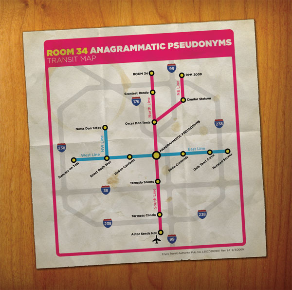
I liked the look of my Anagrammatic Pseudonyms cover art, but I realized it just didn’t look that much like a real publication. The map design was cool, but you’d never get a publication that just had the map like that, with the map part itself full-bleed on the page and no micro-text at the bottom. So this revised design is an attempt to remedy that. I also changed the creases to make it look like a tri-fold. See if you can spot all of the changes from the original!
