Little by litl, I’m being won over…

litlLast week I ripped on longwinded, narcissistic douchebag tech bloggers, indirectly ripping on the fandango that is (or appears to be) the JooJoo along the way. I can be a bit of a snark at times, and I take pleasure in ripping on things. But it’s a hollow pleasure, and it leaves a bad taste in my mouth.

On the other hand, I do occasionally take the much rarer pleasure of delighting in something really cool… in Steve Jobs’ words, from the days of the original Macintosh project, something insanely great. But those “insanely great” things don’t come along very often. And along the way, there are a lot of false alarms. Many things claim to be the “next big thing” (even if big means being… “little”)… some even go so far as to claim to be… “it.” But in the end, they just turn out to be the Segway. No thanks.

Netbooks have been the “next big (little) thing” for a while now, and although I do see their appeal, they all just seem like cheap, underpowered, too-small laptops. Building a tiny device and then putting Windows XP on it is not going to change the world. Yawn.

But then a few weeks ago I heard about another next big thing, called the litl. Part of the hubbub surrounded the fact that there were some heavy hitters in the design world involved in its creation. This was not just another tiny computer made out of cheap plastic, running an 8-year-old OS from Microsoft. This was something different.

But still, it seemed kind of silly to me. Why would I want a netbook that stored all of its data in “the cloud” (especially given some of the notorious problems “the cloud” has had lately), and especially why would I want one that doubles as a digital photo frame. Yawn… maybe.

Tonight I was reading Slashdot when… of all things… a banner ad caught my attention. I’ve clicked on banner ads maybe 3 times in my entire life, but this was a banner ad for the litl, and it intrigued me. So I clicked, and began to discover that there may, in fact, be some really cool things about the litl that make it worth some serious attention. There’s a litl blog where you can read some press the litl’s been getting, along with some background info on (and from) the team, including some pretty interesting videos. My curiosity is piqued. I’d love to see one of these things in person. I think, as superficial as it may sound, whether or not I would ultimately be interested in a netbook of any kind is determined largely by how cheap the plastic it’s made out of feels. It’s kind of hard to tell from the videos, but one thing I can tell is that a lot of care and love went into creating this thing, and it’s unlike any netbook out there today. Have a look at these videos to see what I mean:

The card concept is cool. This is truly a revolutionary interface… it’s what the JooJoo dreams of being.

I’m still hesitant about having all of my data in the cloud — does this mean you have to be connected to WiFi to be able to do… well… anything with the litl? I didn’t see anything about 3G access. And what happens if there’s a catastrophic server failure? Does litl (the device) become a fancy paperweight while litl (the company) scrambles to get things back up and running? What about privacy and security? (I’d be surprised if these questions aren’t addressed somewhere on their site; I just didn’t encounter those answers yet. And they’re questions any sensible potential customer is going to want answered before they hand over their money.)

Not quite an Apple package design, but close. And this looks like it might actually be made out of post-consumer recycled materials. That’s a plus. I like the overall attention to detail. The people who made the litl love their work, and they want you to love it, too.

Will I get one? I’m not exactly itching to drop $699 on this, or anything else, at the moment. I’d like to see it priced at $499 or less. I’d also like to, you know, see it. In person, I mean. I like the money-back guarantee, but I still think they need to have some retail presence for the litl to really take off.

Consider me impressed. I think this has the potential to be something “insanely great.” I’ll be interested in seeing where this leads… and, if the long-rumored Apple foray into this niche actually happens, how the litl will affect it, or not, and vice versa.

On the other hand, maybe I’m just being seduced by decadent marketing.

Panic’s “Atari” game art, framed and hung at Room 34 HQ

The other day I mentioned the super-cool watercolor-and-pencil game art Panic recently commissioned as part of a reimagining of their Mac software as early ’80s Atari 2600 games.

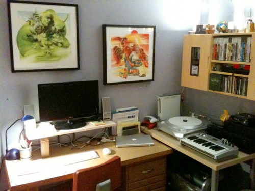
I ordered both the reproduction game boxes and the art prints, and they arrived just four days later (i.e. yesterday). They look amazing. As recommended by Panic, I headed out to IKEA this morning and picked up a couple of Ribba frames. The art prints were specifically designed to fit perfectly into these frames. I contemplated getting frames for all four of them, but at $20 a pop it seemed a bit much. So I went with two, for the two Panic programs I actually use (Coda and Transmit). It was just as well, anyway. Since they’re so big, two is all that fit on the wall above my desk!

The photo below shows Room 34 HQ, now graced with these fantastic looking prints. This wall was blank for months, and I had just been thinking I really needed to hang something up there, when these prints became available. The timing was perfect and I couldn’t be happier with the results! (Unfortunately the photo probably reveals, more than anything else, the limitations of the iPhone camera, especially indoors at night. I had every light in the place turned on but this was the best I could manage.)

panic_at_room34

No design is good design

Design.

I’ve been noticing an interesting trend of late with blogs I find interesting: their design is minimal to non-existent. And sites that did have elaborate designs are severely scaling them back or removing them entirely.

A few examples:

Daring Fireball
Of course. This is one of the most “designed” of the sites I’m talking about today. It actually has color. Well, if you call gray a color.

43 Folders
Merlin Mann’s site may be the inverse of my own, and not just in name. It was once loaded up with “clever” design elements suitable to its “get your (creative) work life organized” philosophy: manila folders, paper clips, etc. But in its latest incarnation it’s stripped down to a bare minimum of design. The only remnant of the old look is the red color of the title at the top of the page, and outside of images and a subtle yellow highlight hover state for links, that’s the only color on the site.

rc3.org
Rafe Colburn’s site is the very definition of minimalist design. White background, black text. But clearly a lot of thought went into the choice of font (yes, even though it’s Helvetica), relative text sizes, and the sporadic use of shades of gray for things like block quotes.

Subtraction.com
Khoi Vinh’s site is masterfully designed, even though (or perhaps specifically because) it’s black-and-white-and-Helvetica-all-over. Oh, except for the slap in the face of bright orange when you mouse over a link. Pow! Bort! Mint! Snuh! (That one’s for CheckersSpeech.)

Jeffrey Zeldman Presents The Daily Report
Zeldman’s site is an explosion of designy-ness compared to the others on this list. But compared to something like Web Designer Wall it’s strikingly spartan, and deliberately retrograde. (And, in trying — unsuccessfully — to find his old post where he discussed this latest incarnation of the site, I discovered that he also covered this exact topic six months ago. Looks like I’m late to the party, as usual.)

If less is more, then none is all.

Top 5 Albums of 2009

A few weeks ago I announced the contenders for this year’s best albums, and now here are the winners. Keep an eye open for a “Top 5 Albums of the Decade” post coming soon as well.

5. The Decemberists: The Hazards of Love

The Decemberists: The Hazards of LoveThe Decemberists are one of the most idiosyncratic bands recording today, at least among those that have achieved a modicum of success. Despite their mostly rock-oriented instrumentation (drums, electric guitars and bass, Nord synthesizer), the band frequently supplements their sound with antiquated — or at least rarely-used-in-rock — instruments like the accordion, upright bass, banjo, bouzouki. And their lyrical content has typically been somewhat Victorian. They outdid themselves, however, with this year’s release: an hour-long rock opera, the most grandiose and polarizing concept album since Tales from Topographic Oceans by Yes in 1973. As with that album, I fall on the side of “getting it.” Whether it’s art that transcends its idiom, or pompous self-indulgence, is a matter for subjective debate, but I think it’s hard to argue with the fact that Colin Meloy and company achieved what they were going for. Even better, they took the show on the road, performing the album in its entirety during this summer’s tour. I got to see the band at Rock the Garden in Minneapolis and loved every minute of it.

4. Porcupine Tree: The Incident

Porcupine Tree: The IncidentA few years ago, it looked as if Porcupine Tree was about to break into the big time. The anachronistic prog band’s fan base has grown steadily over its now 20-year history, but mainstream success (if that’s not an oxymoron) has remained elusive. If 2002’s In Absentia was a tantalizing step towards mass popularity, the band’s subsequent three albums: 2005’s Deadwing, 2007’s Fear of a Blank Planet, and this year’s double album, with the title suite occupying the entire 55 minutes of the first disc, have seen them retreat back into their prog rock niche, while continuing to… you know… progress as a band. I’ve liked each album more than the last, and yet at the same time I can’t help feeling a little disappointed at unrealized potential. This band is so good, I want everyone in the world to hear them. But with each new album it seems more apparent that Steven Wilson has resigned himself to the limited appeal of the band’s core audience. At least he’s staying true to the aesthetic that drew us to his music in the first place.

3. The Bird and the Bee: Ray Guns Are Not Just the Future

The Bird and the Bee: Ray Guns Are Not Just the FutureThis is perhaps the album that surprised me the most this year. I was not familiar with this band before the improbable hit “Diamond Dave” (yes, it’s about David Lee Roth) became a staple on The Current. This band’s unique retro-futuristic sound carries immense appeal. Equal parts ’60s lounge music and modern-day electronica, with Inara George’s beautifully delicate vocals deftly concealing the twisted humor of most of the songs’ lyrics, this is the band to bring prog rock dinosaurs who are stuck in their Yes / Steely Dan / National Health rut up to date with the exciting things that are happening in popular music today. Sure, there are no tracks on this album that stand out quite as much as “Fucking Boyfriend” from the band’s self-titled debut, but the hilariously ironic “Polite Dance Song” and the mysterious, James Bond-esque “Witch” come pretty close.

2. Grizzly Bear: Veckatimest

Grizzly Bear: VeckatimestAmong this year’s contenders, probably no album took longer for me to learn to appreciate than Grizzly Bear’s lo-fi masterpiece. But once I stopped trying to impose my own expectations on this album and just gave in, met it on its own terms, a wonderful, strange world opened up before me. This is not easy listening, to be sure, but it’s wonderfully crafted, and the hazy, distant production shrouds meticulous arrangements. The result is a darker, more challenging counterpart to last year’s debut by Fleet Foxes. This album probably won’t appeal to everyone, but the broad critical acclaim it has received is not unwarranted.

1. Phoenix: Wolfgang Amadeus Phoenix

Phoenix: Wolfgang Amadeus PhoenixPerhaps an easy choice. French pop-rock band Phoenix has been around for most of the decade, but they seem to have just really hit it big in the States this year, with an appearance on SNL and constant exposure of the track “1901” in Cadillac commercials. That probably screams sellout, but if so, it’s the weirdest-sounding sellout in years. Adventurous, experimental deep cuts, like the two-part “Love Like a Sunset” show that the band isn’t just on auto-pilot. The album’s production is absolute perfection — crisp and up-front without sounding distorted (even though the loudness wars are in effect here), the arrangements are inventive despite fairly straightforward rock instrumentation, the vocals are distinctive, and every track on the album is catchy. Despite its short run time of just over 36 minutes, this album is worth listening to on repeat.

Plus, as someone who’s always felt Mozart’s music is vastly overrated, I get some twisted pleasure out of the fact that searching for “Wolfgang Amadeus” on Amazon now brings up Phoenix before Mozart. Blasphemy! (Or not.)