Custom-designed <select> menus without a wrapper <div>

Most of the time I tell clients we can’t customize the appearance of <select> menus (a.k.a. “dropdowns”), along with checkboxes and radio buttons. I lay out a whole rationale on the part of OS and browser developers for why these elements can’t be customized, which is perhaps marginally factual. I do think these elements are, by intention, difficult to customize, in order to avoid confusing users. But designers want to design and, to be honest, the browser defaults for these elements are pretty freaking ugly.

Often there are complicating factors that really do make it effectively impossible to customize these elements. And so far I have not found any way to customize radio buttons and checkboxes that don’t involve “faking” them with images and hidden inputs. Solutions that may achieve the desired appearance but that are oh so ugly on the inside.

I’ll also admit that I am usually the developer on a project, not the designer. But at the moment I am working on a project where, OK, I’m still not the designer, but I have taken responsibility for extending the design, which affords/requires of me making some design decisions. And when I’m the one designing things, I care a lot more about finding a way to make them look exactly like what I’ve envisioned.

So, we come to <select> menus. While it’s not really possible to do much with radio buttons and checkboxes, there at least are some CSS properties that these menus will take. Unfortunately they vary a lot between browsers and don’t solve every problem.

Most solutions I’ve seen for modifying the appearance of <select> menus involve wrapping the menu in a container <div> or <span> tag, essentially removing all of the CSS properties from the menu element itself, and then styling the container as desired.

I hate this solution. I want to be able to style the <select> itself, and be done with it. And at last I have found a solution that mostly accomplishes this, with the caveat that it does not work in Internet Explorer before version 10. But I have a fallback for IE 9 and earlier that does almost everything. And I haven’t tested in Opera because… come on. (OK, I’ve heard Opera is popular in Europe, but to be honest all of my clients are in the United States and do not do business in Europe, so it doesn’t matter. No one I have dealt with has ever cared if their site worked in Opera. Or probably even known it exists.) I should also probably just note that my company no longer supports Internet Explorer 7 or earlier, so we’re only concerning ourselves here with making sure it at least looks OK in IE 8.

OK, so how does this work?

Pretty much every browser supports some basic customizations of the <select> menu with CSS, like changing the background color, font, text color, size, etc. But there’s extra browser “appearance” junk we need to get rid of. Mostly the little up/down arrow at the right end of the menu that is the visual cue to users that it is a menu. That’s an important thing… we need to still provide some visual cue that it’s a menu. But I want to make it look the way I want to make it look.

Let’s start by getting rid of the browser junk.

select {
  -moz-appearance: none;
  -webkit-appearance: none;
  appearance: none;
}

That removes all of the standard browser styling from Mozilla (Firefox) and WebKit (Chrome and Safari). I’m not sure we really need appearance or if it actually does anything in any known browser, but I saw it in an example somewhere and I hate using vendor prefixes without also including the non-prefixed version of the same property, so there it is.

So that covers three of the four major browsers. But what about Internet Explorer? There’s a tidy solution that works in IE 10 and later:

select::-ms-expand {
  display: none;
}

Now we have a <select> menu with none of the standard browser junk, and we can apply our styles as needed. As for Internet Explorer 9 and earlier, you’ll just have to live with the arrow thing at the right end of the menu. I’ll explain in a bit the way to add separate styles just for those earlier versions of IE, using conditional comments, in case you’re not familiar.

I do recommend designing your own “arrow thingy” icon for the right side of the menu, so users can still tell it’s a menu. Here’s an example of how your full <select> CSS might look. (This is fairly close to what I am using in the site I’m actually working on, although the colors, fonts and padding differ slightly.)

select {
  -moz-appearance: none;
  -webkit-appearance: none;
  appearance: none;
  background: rgb(238,238,238) url('images/select.png') right 5px center no-repeat;
  background-size: 9px 15px;
  border: 1px solid rgb(221,221,221);
  border-radius: 0;
  color: rgb(34,34,34);
  font-family: ‘Proxima Nova’, sans-serif;
  font-size: 100%;
  height: 2em;
  line-height: 2em;
  min-width: 60%;
  padding: 0 25px 0 10px;
  width: auto;
}
select::-ms-expand {
  display: none;
}

Here’s what the results look like in different browsers.

custom_select_browser_samples

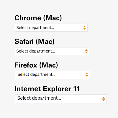
So, there’s an issue with the text alignment in Internet Explorer. As of this writing I’m working on resolving that. There are also some more minor variations between browsers in size and alignment, but that’s the nature of this business. Firefox also antialiases differently than Chrome and Safari, and I (usually) don’t bother trying to compensate for that. (The significant size difference in the IE sample is due to scaling at different breakpoints in my responsive layout… just a side effect of how I took the screenshots.)

That just leaves IE 9 and earlier. As I said, there’s no equivalent to select::-ms-expand before IE 10, so while we can change many aspects of the appearance of the menu, we can’t get rid of the standard arrow button thing. Unfortunately, if we implement the code above, we end up with both our custom arrows and the default ones, side-by-side. The only solution here is to get rid of ours, and remove the extra padding we gave it. This is where conditional comments come in. They’re well named: conditionals within HTML comments, recognized only by Internet Explorer. You can even target specific versions of IE with them. In this case, we just need to target versions before 10.

One common convention for conditional comments has you wrap the <html> tag itself in them, applying a class (e.g. ie8 that can then be used throughout your HTML everywhere else to target that browser. That’s great, but I never use it myself because I’ve gotten to a point where I rarely need to write any IE-specific CSS. So I just use the conditionals to load a separate ie.css file when I need it.

Here’s an example of how this might look. It should go in your <head> section, after you’ve included the main CSS file:

<!–[if lt IE 10]>
  <link rel="stylesheet" type="text/css" href="css/ie.css" />
<![endif]–>

And then in your ie.css file, you’ll need to override the background and padding:

select {
  background-image: none;
  padding-right: 0;
}

…and this is what it looks like in IE9 (and, just for fun, IE8 as well):

custom_select_browser_samples_ie

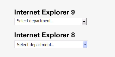
Obviously my styles are extremely basic — not really that different from what older versions of IE show anyway — but this does the job. As a test, I made the background bright red to prove it worked across the board. It does. But the results made my eyeballs bleed, so I’ll spare you.

But here’s something fun… how it looks on an iPhone with high resolution.

custom_select_browser_samples_ios

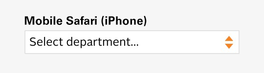
The arrow graphic is replaced with a high-res version using CSS3 media queries.

@media only screen and (-moz-min-device-pixel-ratio: 1.5),
  only screen and (-o-min-device-pixel-ratio: 3/2),
  only screen and (-webkit-min-device-pixel-ratio: 1.5),
  only screen and (min-devicepixel-ratio: 1.5),
  only screen and (min-resolution: 1.5dppx)
{
  select { background-image: url('images/select_x2.png'); }
}

(Yes, there’s an Opera vendor prefix in there. Forget about what I said earlier. Or not. This is just a standard block of code I always use for high-res images in my media queries.)

Depending on the complexity of your design, this approach may not offer quite as much control as you need, compared to the <div> wrapper approach, but if you’re just trying to get something clean and simple, with customized colors and fonts and without the outdated 3D styles most browsers stick you with, this should do the trick.

Some problems just never go away… especially where CSS3 multi-columns are concerned

Note: This post has been updated.

I don’t use CSS3 multi-columns (based around the column-count and column-gap properties) very much, mainly because a) I don’t need columns in my layouts very often and b) usually when I do need columns, this method is inadequately flexible for what I’m trying to accomplish.

Today I have a good use case though. A simple (but long) list of links, that I want to display as 3 columns on wide screens, 2 columns on tablets and a single column on phones. Great, except when I got it working, I found that — in Chrome only, which is a bit odd — the top of the first column is higher than the rest. It looks fine in Safari and Firefox.

I googled, as always, for a solution, and found several suggestions that seemed like they should work, and people claimed they did work, but for me, they didn’t. Then I found this comment on a post on the topic, and decided to try the column-break-inside property, which is something I normally only use in print CSS.

It still didn’t work. But then, vendor prefix to the rescue! I needed the -webkit prefix, and it worked. This needs to be applied to the elements inside your column container, not the container itself. Here’s my full CSS block:

.columns {
  -moz-column-count: 3;
  -webkit-column-count: 3;
  column-count: 3;
  -moz-column-gap: 3em;
  -webkit-column-gap: 3em;
  column-gap: 3em;
}

/* Fix for unbalanced top alignment in Chrome */
.columns > * {
  -webkit-column-break-inside: avoid;
  column-break-inside: avoid;
}

You’ll also want to repeat the .columns section (or its equivalent for your class/element names) in your media queries, changing column-count appropriately where you want to collapse down to fewer columns.

Since other solutions worked for other people, I’m guessing my solution might not work for everyone either. But I hope it helps someone… maybe you!

Update (6/28/2017)

This problem really does never go away. And I’ve just run into a situation where the above fix doesn’t work. This is only affecting Safari — I think Chrome has actually fixed the bug. But some trial and error led to this new solution that fixes the problem in Safari as well.

/* New fix for Safari */
.columns > * {
  display: inline-block;
  width: 100%;
}

I’m still not totally sure why display: inline-block; is the magic bullet for column alignment issues, but it works. Adding width: 100%; is what keeps these inline blocks from actually appearing on the same line, if they’re short enough. (Also note that I removed the column-break-inside stuff… don’t seem to need it with this change.)

Update (6/12/2020)

Wow… it really never goes away, does it?

Now I’ve found that if I am applying my .columns class to a <ul> tag, its <li> tags lose their bullets, because they apparently need to have display: list-item (or have it implied). When did display: list-item get added to the CSS spec anyway? I’d swear it didn’t even exist when I was first working on this issue, but I’m an old fart now and time has lost all meaning.

Anyway… I did manage to figure out a workaround to this. So add the following after the update above (which you’ll still keep):

/* New fix for Safari */
.columns > li {
  display: list-item;
  margin: 0 !important; /* Maybe you won’t need !important */
  padding-bottom: 0.5em; /* Add some padding to make up for any margin you’re losing above */
}

Fixing background “bleed” on elements that use CSS3 border-radius property

It’s kind of funny that I never encountered this problem before… it must just be extra-noticeable because of the colors on this particular website I’m working on. Anyway, I found that the nice buttons I was creating with CSS3 border-radius were displaying an ugly “bleed” of the background dark blue color beyond the edges of the white border. No good.

before

A little googling led to Mike Harding’s solution, a simple background-clip property in the CSS. (Yet another of the preponderance of new properties in CSS3 that I’m finding it harder and harder to keep up with.) If w3schools.com is to be believed, the vendor prefix is unnecessary. Let’s just go with this:

background-clip: padding-box;

Ah, that’s better!

after

Bracing for the HD web

Joshua Johnson has an excellent new post over on Design Shack called Ready or Not, Here Comes HD Web Design, discussing adapting your web design techniques for the imminent HD revolution, being led by the new iPad.

I’ve been adapting my designs for the Retina Display on the iPhone 4/4S for a while now, but it’s easy enough to build a responsive web design that just shrinks down large desktop website images to half their size for display on a tiny iPhone screen. Making an essentially desktop-sized display support high-resolution graphics is a whole other story, and even though I knew (or presumed, along with the rest of the world) that a Retina iPad was coming, I think some small part of me was still in denial about what it would mean for web design.

Well, that future is here. Sure, most of the world is not browsing the web on a Retina Display iPad. But if you think the HD revolution ends there, think again. It’s just getting started. I’m about to enter the implementation phase on a handful of big web projects over the next month. Accommodating the new iPad’s display is going to be one of my top tasks.

I’ve been thinking for the past month or so that I was going to need to address this, and I’ve made the decision that, moving forward, on any site that has responsive web design as a component (which will probably be all sites I do), full-size “Retina Display” graphics are essential.

I posted a comment on Joshua Johnson’s post, where I noted that “Retina” (or, to avoid using Apple’s marketing term, “HD web”) graphics don’t really need to be 326 pixels per inch (ppi), the iPhone 4/4S’s resolution, or even 264 ppi, the new iPad’s resolution.

The standard practice with web images has always been to render them at 72 ppi, but the fact is, browsers don’t care what resolution an image is set to. A pixel is a pixel, and web images get displayed at the screen’s native resolution (unless, of course, you resize the image dynamically in the browser using HTML dimension attributes or CSS). The Retina Display approach Apple uses is to simply double the resolution (quadrupling the number of pixels). Web images by default get “pixel-doubled” in this scenario, displaying at the same relative size as they would if the iPad still had a low-res display, but appearing pixilated or blurry as a result.

You don’t need to render your images at 264 ppi for display on the new iPad. In fact, you can leave the resolution at 72 ppi, because the browser still doesn’t care. (Well, maybe it does; I haven’t actually had an opportunity to test it, but I strongly suspect the answer is no.) You just need to make the pixel dimensions of the image twice what they were before. In fact, even if you do change the resolution, you still need to double the dimensions. That’s the key.

After mulling all of this over for the past week, I’ve decided I’m going to have to get a new iPad (what a hardship, I know). I could technically do this work without it, but I think it’s important to be able to see what I’m producing, if for no other reason than to remind myself how important it is.

This is going to be an ongoing process, and because web design (or, more accurately, web design implementation — I usually work with designers who produce the initial UI in Illustrator or Photoshop) is only one part of my job, I can’t give it my undivided attention. But it’s something I am preparing now to immerse myself in as fully as possible. From now on, this is just how I do things. And with that in mind, there are some key points to consider:

1. Some images are more important to represent high-res than others. Logos, absolutely, 100%. Design elements that are on all pages (backgrounds, borders, navigation) come next. One-off photos are not as critical, but probably still are if they’re on the home page. But consider the next point as well.

2. Bandwidth is a concern. I’ve been somewhat dismissive of this up to now, as I’ve been focusing on high-res logos for the iPhone’s Retina Display — it can just take the regular web images and show them at half size to achieve high-res — but if you’re suddenly talking about downloading 4 or 5 high-res photos for a home page slideshow, it’s going to be a problem. Making users with standard resolution download unnecessarily large images is bad; making iPad users eat up their 4G data plan downloading your perfect-looking photos is bad too. Most of the attention paid to bandwidth in this discussion that I’ve seen so far has focused on the former, but both need to be addressed.

3. CSS and SVG. Joshua Johnson talks about this in his post. If we can render elements using CSS instead of images (things like curved corners, gradients, shadows, etc.), we should do that. More complex vector graphics can be displayed in SVG. All modern browsers now (finally) support SVG. Up to now it’s been a cool but essentially useless technology, due to lack of widespread support. But IE8 and earlier don’t support SVG, so if those browsers matter (and unfortunately they probably still do), you need a backup plan.

It is an exciting time to be working in web design and development. More and more, the challenges center around adapting your techniques to take advantage of cool new features and capabilities, not accommodating the limitations of crap browsers. But they’re still challenges, and we’re just beginning to discover their depth, along with their solutions.

Update: Over at Daring Fireball, John Gruber just linked to Duncan Davidson’s post detailing an issue with WebKit (the rendering engine inside Safari) automatically scaling down images above a certain size, specifically over 2 megapixels. Looks like sending huge, high-res images to the new iPad might present even more challenges than the ones I’d been considering.

I still don’t have that new iPad, so we’ll see what happens when I get it. (Tomorrow?)

Update #2 (March 25, 2012): A few more days have passed, and more has been learned on this topic. Duncan Davidson has a follow-up post that further explores the issue and a tentative path forward.

P.S. I did get that new iPad, and Duncan’s demo of an 1800-pixel JPEG on the iPad’s Retina Display is truly impressive. But what I find really interesting about it is that the 1800-pixel version of the photo looks better than the 900-pixel version even on a regular computer display… because, as I’ve observed, WebKit downscales images better than Photoshop does.

Web standards: a Win-Win-Win situation

Today is the fourth annual “Blue Beanie Day,” a tradition established by the father of web standards, Jeffrey Zeldman.

What are web standards? Simply put, they’re awesome. But seriously… the goal of web standards is to establish a set of best practices for web designers and developers, and a set of open, shared languages and tools for building websites and displaying them in a consistent manner.

At the heart of the modern web standards movement are a set of three core languages: HTML5, for organizing and structuring content; CSS3, for designing the presentation of that content; and JavaScript, for providing rich interaction with that content.

HTML5, CSS3, and JavaScript are all open standards. The specifications are published for anyone to see; they’re open and evolving, for anyone to contribute to; and they’re freely available for anyone to build an application for rendering content delivered via these languages (in common parlance, a web browser, but we’re starting to see “web” content appearing in all sorts of applications for computers and mobile devices these days).

But why are these three web standards so great? Because they create a win-win-win situation:

A win for web designers/developers. By establishing a common set of tools that are open and free to anyone, web designers and developers can get started with no barriers to entry. Plus, by standardizing these tools, the same skills can be applied anywhere a website is being built. And as web browser makers adopt these standards, the last 15 years’ worth of browser-to-browser inconsistency will fade. Our job is made easier, we can get more done in less time, and, with powerful frameworks like jQuery built on top of these standards, this power to do more with less will grow exponentially.

A win for site owners. If you’re paying to build a website, you want to know you’re spending your money wisely. You want your investment to last, and you want to make sure everyone who wants to access your site, can. Web standards are the key to an accessible, reliable, “future-proof” website. Some Internet technologies may come and go; jumping on the latest trend may make your site seem “with it” today, but tomorrow it will be painfully dated… if it even works at all. But these three core web technologies will always be at the heart of the web. Plus, a site built with web standards will automatically be structured well for search engine listings, without the need for expensive and questionable SEO tactics.

A win for Internet users. Web content that is built and delivered with a diligent adherence to web standards will work reliably with any device, any software, that is used to access the Internet. Plus, no well-formed, standards-compliant HTML page ever crashed a web browser.

Web standards: Win-Win-Win.