Please, web font vendors, learn how to use CSS @font-face properly!

This has been bugging me for years and I can’t believe it’s still happening.

Being able to use custom fonts has been a huge boon to web design. And font hosting services like Typekit (sorry, I will never call it Adobe Fonts) and Google Fonts make using custom fonts easy.

But sometimes you still buy a font license that involves hosting the font files directly on your own server, and that’s where things get absolutely maddening because, for some reason, someone early on grossly misinterpreted how to use @font-face and that error has been perpetuated by countless unthinking others.

(Yes, I’m being harsh. But this is really not that complicated. And getting it right makes writing your CSS and HTML so much easier.)

Here’s an example of some font-specifying CSS you might receive from a font vendor:

@font-face {
    font-family: 'Font-Name-Regular';
    src: url('Font-Name/Font-Name-Regular.woff2') format('woff2'),
         url('Font-Name/Font-Name-Regular.woff') format('woff');
    font-weight: normal;
    }
.Font-Name-Regular {
    font-family: 'Font-Name-Regular';
    }

@font-face {
    font-family: 'Font-Name-Regular';
    src: url('Font-Name/Font-Name-Regular-Italic.woff2') format('woff2'),
         url('Font-Name/Font-Name-Regular-Italic.woff') format('woff');
    font-weight: normal;
    font-style: italic;
    }
.Font-Name-Regular-Italic {
    font-family: 'Font-Name-Regular';
    font-style: italic;
    }

@font-face {
    font-family: 'Font-Name-Bold';
    src: url('Font-Name/Font-Name-Bold.woff2') format('woff2'),
         url('Font-Name/Font-Name-Bold.woff') format('woff');
    font-weight: normal;
    }
.Font-Name-Bold {
    font-family: 'Font-Name-Bold';
    }

@font-face {
    font-family: 'Font-Name-Bold';
    src: url('Font-Name/Font-Name-Bold-Italic.woff2') format('woff2'),
         url('Font-Name/Font-Name-Bold-Italic.woff') format('woff');
    font-weight: normal;
    font-style: italic;
    }
.Font-Name-Bold-Italic {
    font-family: 'Font-Name-Bold';
    font-style: italic;
    }

This is, in fact, the exact code I just received yesterday from a font vendor when I purchased a license, with the actual font name removed to protect the guilty innocent.

What’s so bad about this, you might ask? Aside from the conventions I dislike of indenting the closing } and using 4 spaces instead of tabs, there are two glaring problems with this:

  1. Because the font-family name defined for each weight and style is different, when you go to use this font, you need to specify the font-family every time you want to use bold or italics in your HTML, or at least use the custom CSS classes defined here. No! No no no! You should not have to apply a class to get bold or italics to render properly. The <strong> and <em> tags should do that on their own!
  2. Don’t f***ing define a bold font with font-weight: normal;! If you don’t realize from this, alone, that something is wrong with your approach, stop coding right now.

So, how should this be done, you ask?

Well, it’s simple. Each @font-face declaration has four properties. One is src: which tells the browser where to find the correct font file(s) for this face. The other three properties work together to define the context in which this particular src should be used: any time this combination of font-family, font-weight and font-style come together.

You can use the same font-family in different @font-face declarations as long as font-weight and font-style are different. In fact, you’re supposed to! That’s the way it’s designed to work!!!

When you do this properly, you don’t need any custom CSS classes. Try this on for size:

@font-face {
    font-family: 'Font-Name';
    src: url('Font-Name/Font-Name-Regular.woff2') format('woff2'),
         url('Font-Name/Font-Name-Regular.woff') format('woff');
    font-weight: normal;
}

@font-face {
    font-family: 'Font-Name';
    src: url('Font-Name/Font-Name-Regular-Italic.woff2') format('woff2'),
         url('Font-Name/Font-Name-Regular-Italic.woff') format('woff');
    font-weight: normal;
    font-style: italic;
}

@font-face {
    font-family: 'Font-Name';
    src: url('Font-Name/Font-Name-Bold.woff2') format('woff2'),
         url('Font-Name/Font-Name-Bold.woff') format('woff');
    font-weight: bold;
}

@font-face {
    font-family: 'Font-Name';
    src: url('Font-Name/Font-Name-Bold-Italic.woff2') format('woff2'),
         url('Font-Name/Font-Name-Bold-Italic.woff') format('woff');
    font-weight: bold;
    font-style: italic;
}

Aside from the fact that this eliminates 1/3 of the lines of code, it also will make your HTML much cleaner and more properly separates content from styling.

Here’s an example of some HTML you might have to write using the first approach:

<p class="Font-Name-Regular">This is some regular text, which also
includes a bit of <em class="Font-Name-Regular-Italic">italics</em>
and even a dash of <strong class="Font-Name-Bold">bold</strong>.</p>

Now, granted, my version does require you to define the font-family for your <p> tags in your CSS file. But guess what… you’re supposed to do that! Put this in your CSS:

p { font-family: 'Font-Name'; }

With that in place, the proper HTML for the same appearance becomes this:

<p>This is some regular text, which also
includes a bit of <em>italics</em>
and even a dash of <strong>bold</strong>.</p>

So, again… when thinking about @font-face, just remember these two simple things:

  1. All @font-face declarations for the same font family should have the same font-family. (Seems kind of obvious when I put it that way, doesn’t it?)
  2. The value for font-weight should be the actual weight of the font. Only the “regular” weight should have font-weight: normal; or font-weight: 400;. If you’re using font-weight: normal; on a bold font, you’ve done something wrong.

This change makes for cleaner code, easier maintenance, and proper separation of content from design.

Addendum

Shortly after I posted this, I went back and looked at the unnamed font vendor’s sample page, because I knew it referenced “the @font-face standard since 2017”. I could not believe that this approach was actually a “standard,” so I tracked down the source, an article Bram Stein published on A List Apart in 2017 called Using Webfonts.

Guess what… Bram Stein’s examples do it the right way!

I do know one place where I’ve consistently seen this wrong way I’m railing against… it’s the code generated on FontSquirrel (no link, on principle) whenever you download a font. Other “web font generator” sites like FontSquirrel probably do it to. They’re all wrong… but Bram Stein isn’t. Don’t drag him down with this bad code!
Responsive horizontal scrolling tables for phones in CSS with no additional HTML

For some reason I always forget how to do this, and most tutorials out there suggest wrapping your table in a container <div> tag but as long as you’re using <tbody> (and, ideally, not using <thead> or <tfoot>) then it’s easy with a small bit of CSS and no HTML changes at all.

The trick is to display your <table> as a block, and your <tbody> as a table!

Here’s the code. Fit it into whichever breakpoint makes sense for your site. Mine shown here is the standard phone width breakpoint for WordPress (782 pixels):

@media screen and (max-width: 782px) {

  table {
    display: block;
    overflow-x: auto;
    width: 100%;
  }

  table tbody {
    display: table;
    width: auto;
  }

}

Of course, right after I posted this I found that I had already written about it two years ago with a slightly different solution. Never hurts to have a slightly different perspective.

It’s REALLY SIMPLE to add horizontal scroll to a table in CSS

Noted for future reference (by me). Tables aren’t that common on websites anymore, but sometimes they’re legitimately needed (you know, for tabular information).

One thing that I always struggle with is adding horizontal scroll to tables on responsive phone layouts. I know it involves overflow, but for some reason I always make the solution way more complicated than it needs to be.

You don’t need a container element. All you need to do is add these two CSS properties to your tables:

table {
  display: block;
  overflow-x: auto;
}

The StackOverflow post that illuminated the answer also has you add white-space: nowrap; but that can be problematic if your cells have enough text that they need to wrap. I found a better solution was to set a minimum width on cells:

th, td {
  min-width: 120px;
}

You may want to experiment on any given site to see what min-width works best.

A passable but imperfect solution for full-bleed background images on Android and iOS

I’m working on a site right now that has a fixed, full-bleed (i.e. background-size: cover) background image on the <body>. The content flows over it, mostly obscuring it completely, but the background is occasionally revealed in the spaces between content blocks. Some blocks have a semi-transparent background so you can see the fixed background as if through frosted glass.

Here’s the CSS:

body {
  background: rgb(255,255,255) url('../images/ui/body_bg.jpg') center center no-repeat fixed;
  background-size: cover;
}

It’s a cool effect, but it really, really does not want to play nicely on mobile. Various odd things happen on both Android and iOS, and they are completely different.

Quick side note: Yes, the background image is a JPEG. Normally I only use PNG or SVG images in UI elements, but I had good reason to use JPEG here: even though it’s only two colors (with some in-between colors due to antialiasing), the pattern in the background is incredibly complex, and a JPEG version of the file is about 1/5 the size of the PNG. And since it’s an illustration, I tried making an SVG version first, but the pattern is so large that the SVG was about 2 MB! So JPEG it is… which may be a factor in the issue I’m having on Android, but I haven’t tested a PNG version of the image to verify that.

iOS Problems

I’m an iPhone user, so I mainly test responsive sites on iOS. I do own an Android phone (a Motorola Moto E, which I highly recommend as a cheap-but-decent Android phone for testing), but I generally only break it out during the final round of browser testing prior to launching a site.

The issues with background images on iOS are well-known to most web developers. iOS has a number of rather arbitrary seeming limitations imposed upon the Mobile Safari browsing experience, generally for one of three reasons: 1) performance, 2) touch interface usability, 3) the whims of the ghost of Steve Jobs. In the case of background images, background-attachment is not supported. I’m not really sure how this would impact either (1) or (2) — although I think with the early underpowered iPhone generations, it did impact performance — so I think we’re dealing mostly with (3) here. At any rate, because you can’t have an attached background on iOS, I added this in my media queries:

@media screen and (max-width: 782px) {

  body {
    /* For background handling on iOS */
    background-attachment: scroll; background-repeat: repeat;
  }

}

Another quick side note: Why is my phone break point at 782 pixels, you ask? Because that’s where WordPress has its break point for the admin interface. I’m not exactly sure why the WP team chose that number, but why fight it?

Besides the background attachment, there’s also the issue that background-size: cover on a phone is going to make the background image huuuuuuuuuge because it’s scaling it to fit the height of the page content, not the screen size. I initially solved that with background-size: 100%;, since we’re now allowing the background to repeat. As you’ll see, however, that led to problems on Android, so I ended up scrapping it.

Android Problems

Yes, Android has problems. Don’t even get me started! But I wasn’t prepared for this.

I opened the page in Android, and, although the background image was displaying as I expected in terms of size and attachment, it looked… awful. The original source image I am working with is a generous 2400 x 1857 pixels, enough to look reasonably sharp on most displays, even at high resolution. And it looks great on my Mac, great on my iPhone. But on the Android phone it was splotchy and low-res looking… like it had been reduced to 200 pixels and then upscaled (which is maybe what Android is doing, somehow… and here is where I’m wondering if the image being a JPEG is a factor, but that’s just a stab in the dark).

I tried a number of possible solutions, the most obvious being to set exact pixel dimensions for the image. I tried 1200 x 929, basically a “x2” size for high-res devices. Still looked like crap. I even tried setting it to 2400 x 1857, the actual dimensions of the image, and it looked like crap… and I don’t mean pixel-doubled, which is what it actually should be; I mean the same splotchy weirdness I had been seeing at other sizes.

And then I discovered David Chua’s solution:

html {
  /* For background image scaling on Android */
  height:100%; min-height:100%;
}

Yet another quick side note: Here I am not placing this inside a media query. We don’t want to only fix this issue on phone screens. Granted, the iOS solution above needs to work on iPads, too… something I haven’t really solved here. I’m workin’ on it!

This change for Android worked perfectly! By this point I had, temporarily at least, removed the iOS workarounds I mentioned above, so on Android the background image was not only perfectly scaled to the browser window, looking sharp and clean, but it was even fixed-position, just like on desktop!

But… the image was back to being huuuuuuuuuge on iOS. Apparently this html trick for Android does absolutely nothing on iOS, so you’re left trying to find another solution that won’t simultaneously break Android.

An uneasy compromise

It’s not perfect, but I found that if I put both of these tricks together, everything works… the only thing we lose is the fixed-position treatment that Android allows but iOS does not. But the background looks great on both platforms and most importantly, behaves consistently on both.

Here’s the complete code I’m rolling with, for now:

html {
  /* For background image scaling on Android */
  height:100%; min-height:100%;
}

@media screen and (max-width: 782px) {

  body {
    /* For background handling on iOS */
    background-attachment: scroll; background-repeat: repeat;
  }

}

As noted above, this doesn’t really address iPads. A simple solution would be to change the media query to @media screen and (max-width: 1024px), but a) that doesn’t account for the larger iPad Pro and b) it also means a desktop display will lose the proper background effect if the window is smaller than that size. I don’t really have a solution; an adaptive treatment using either server-side or JavaScript-based browser detection would be a consideration, but I don’t really like resorting to that sort of thing for something as basic as this.

It doesn’t help that I recently gave my iPad to my daughter so I don’t currently have a tablet of any kind for testing. That’s about to change as I have a newly ordered Kindle Fire arriving today, but of course that’s not going to give me the answer for an iPad. I can try Responsive Design Mode in desktop Safari, but that’s not always a perfect representation of the quirks of an actual mobile device.

Still… this combined solution for phones is an improvement over the default behavior in both cases.

Custom-designed <select> menus without a wrapper <div>

Most of the time I tell clients we can’t customize the appearance of <select> menus (a.k.a. “dropdowns”), along with checkboxes and radio buttons. I lay out a whole rationale on the part of OS and browser developers for why these elements can’t be customized, which is perhaps marginally factual. I do think these elements are, by intention, difficult to customize, in order to avoid confusing users. But designers want to design and, to be honest, the browser defaults for these elements are pretty freaking ugly.

Often there are complicating factors that really do make it effectively impossible to customize these elements. And so far I have not found any way to customize radio buttons and checkboxes that don’t involve “faking” them with images and hidden inputs. Solutions that may achieve the desired appearance but that are oh so ugly on the inside.

I’ll also admit that I am usually the developer on a project, not the designer. But at the moment I am working on a project where, OK, I’m still not the designer, but I have taken responsibility for extending the design, which affords/requires of me making some design decisions. And when I’m the one designing things, I care a lot more about finding a way to make them look exactly like what I’ve envisioned.

So, we come to <select> menus. While it’s not really possible to do much with radio buttons and checkboxes, there at least are some CSS properties that these menus will take. Unfortunately they vary a lot between browsers and don’t solve every problem.

Most solutions I’ve seen for modifying the appearance of <select> menus involve wrapping the menu in a container <div> or <span> tag, essentially removing all of the CSS properties from the menu element itself, and then styling the container as desired.

I hate this solution. I want to be able to style the <select> itself, and be done with it. And at last I have found a solution that mostly accomplishes this, with the caveat that it does not work in Internet Explorer before version 10. But I have a fallback for IE 9 and earlier that does almost everything. And I haven’t tested in Opera because… come on. (OK, I’ve heard Opera is popular in Europe, but to be honest all of my clients are in the United States and do not do business in Europe, so it doesn’t matter. No one I have dealt with has ever cared if their site worked in Opera. Or probably even known it exists.) I should also probably just note that my company no longer supports Internet Explorer 7 or earlier, so we’re only concerning ourselves here with making sure it at least looks OK in IE 8.

OK, so how does this work?

Pretty much every browser supports some basic customizations of the <select> menu with CSS, like changing the background color, font, text color, size, etc. But there’s extra browser “appearance” junk we need to get rid of. Mostly the little up/down arrow at the right end of the menu that is the visual cue to users that it is a menu. That’s an important thing… we need to still provide some visual cue that it’s a menu. But I want to make it look the way I want to make it look.

Let’s start by getting rid of the browser junk.

select {
  -moz-appearance: none;
  -webkit-appearance: none;
  appearance: none;
}

That removes all of the standard browser styling from Mozilla (Firefox) and WebKit (Chrome and Safari). I’m not sure we really need appearance or if it actually does anything in any known browser, but I saw it in an example somewhere and I hate using vendor prefixes without also including the non-prefixed version of the same property, so there it is.

So that covers three of the four major browsers. But what about Internet Explorer? There’s a tidy solution that works in IE 10 and later:

select::-ms-expand {
  display: none;
}

Now we have a <select> menu with none of the standard browser junk, and we can apply our styles as needed. As for Internet Explorer 9 and earlier, you’ll just have to live with the arrow thing at the right end of the menu. I’ll explain in a bit the way to add separate styles just for those earlier versions of IE, using conditional comments, in case you’re not familiar.

I do recommend designing your own “arrow thingy” icon for the right side of the menu, so users can still tell it’s a menu. Here’s an example of how your full <select> CSS might look. (This is fairly close to what I am using in the site I’m actually working on, although the colors, fonts and padding differ slightly.)

select {
  -moz-appearance: none;
  -webkit-appearance: none;
  appearance: none;
  background: rgb(238,238,238) url('images/select.png') right 5px center no-repeat;
  background-size: 9px 15px;
  border: 1px solid rgb(221,221,221);
  border-radius: 0;
  color: rgb(34,34,34);
  font-family: ‘Proxima Nova’, sans-serif;
  font-size: 100%;
  height: 2em;
  line-height: 2em;
  min-width: 60%;
  padding: 0 25px 0 10px;
  width: auto;
}
select::-ms-expand {
  display: none;
}

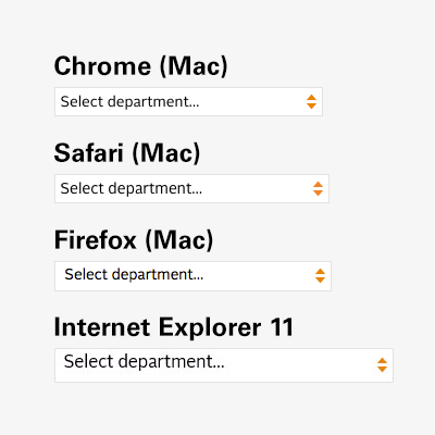
Here’s what the results look like in different browsers.

custom_select_browser_samples

So, there’s an issue with the text alignment in Internet Explorer. As of this writing I’m working on resolving that. There are also some more minor variations between browsers in size and alignment, but that’s the nature of this business. Firefox also antialiases differently than Chrome and Safari, and I (usually) don’t bother trying to compensate for that. (The significant size difference in the IE sample is due to scaling at different breakpoints in my responsive layout… just a side effect of how I took the screenshots.)

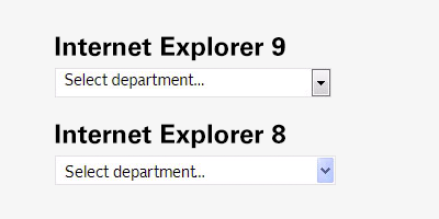
That just leaves IE 9 and earlier. As I said, there’s no equivalent to select::-ms-expand before IE 10, so while we can change many aspects of the appearance of the menu, we can’t get rid of the standard arrow button thing. Unfortunately, if we implement the code above, we end up with both our custom arrows and the default ones, side-by-side. The only solution here is to get rid of ours, and remove the extra padding we gave it. This is where conditional comments come in. They’re well named: conditionals within HTML comments, recognized only by Internet Explorer. You can even target specific versions of IE with them. In this case, we just need to target versions before 10.

One common convention for conditional comments has you wrap the <html> tag itself in them, applying a class (e.g. ie8 that can then be used throughout your HTML everywhere else to target that browser. That’s great, but I never use it myself because I’ve gotten to a point where I rarely need to write any IE-specific CSS. So I just use the conditionals to load a separate ie.css file when I need it.

Here’s an example of how this might look. It should go in your <head> section, after you’ve included the main CSS file:

<!–[if lt IE 10]>
  <link rel="stylesheet" type="text/css" href="css/ie.css" />
<![endif]–>

And then in your ie.css file, you’ll need to override the background and padding:

select {
  background-image: none;
  padding-right: 0;
}

…and this is what it looks like in IE9 (and, just for fun, IE8 as well):

custom_select_browser_samples_ie

Obviously my styles are extremely basic — not really that different from what older versions of IE show anyway — but this does the job. As a test, I made the background bright red to prove it worked across the board. It does. But the results made my eyeballs bleed, so I’ll spare you.

But here’s something fun… how it looks on an iPhone with high resolution.

custom_select_browser_samples_ios

The arrow graphic is replaced with a high-res version using CSS3 media queries.

@media only screen and (-moz-min-device-pixel-ratio: 1.5),
  only screen and (-o-min-device-pixel-ratio: 3/2),
  only screen and (-webkit-min-device-pixel-ratio: 1.5),
  only screen and (min-devicepixel-ratio: 1.5),
  only screen and (min-resolution: 1.5dppx)
{
  select { background-image: url('images/select_x2.png'); }
}

(Yes, there’s an Opera vendor prefix in there. Forget about what I said earlier. Or not. This is just a standard block of code I always use for high-res images in my media queries.)

Depending on the complexity of your design, this approach may not offer quite as much control as you need, compared to the <div> wrapper approach, but if you’re just trying to get something clean and simple, with customized colors and fonts and without the outdated 3D styles most browsers stick you with, this should do the trick.